• 🏆 Texturing Contest #33 is OPEN! Contestants must re-texture a SD unit model found in-game (Warcraft 3 Classic), recreating the unit into a peaceful NPC version. 🔗Click here to enter!
  • It's time for the first HD Modeling Contest of 2024. Join the theme discussion for Hive's HD Modeling Contest #6! Click here to post your idea!

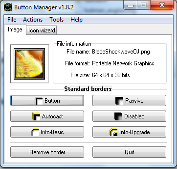
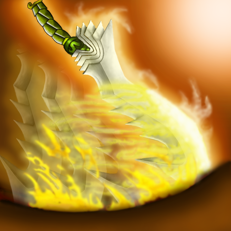
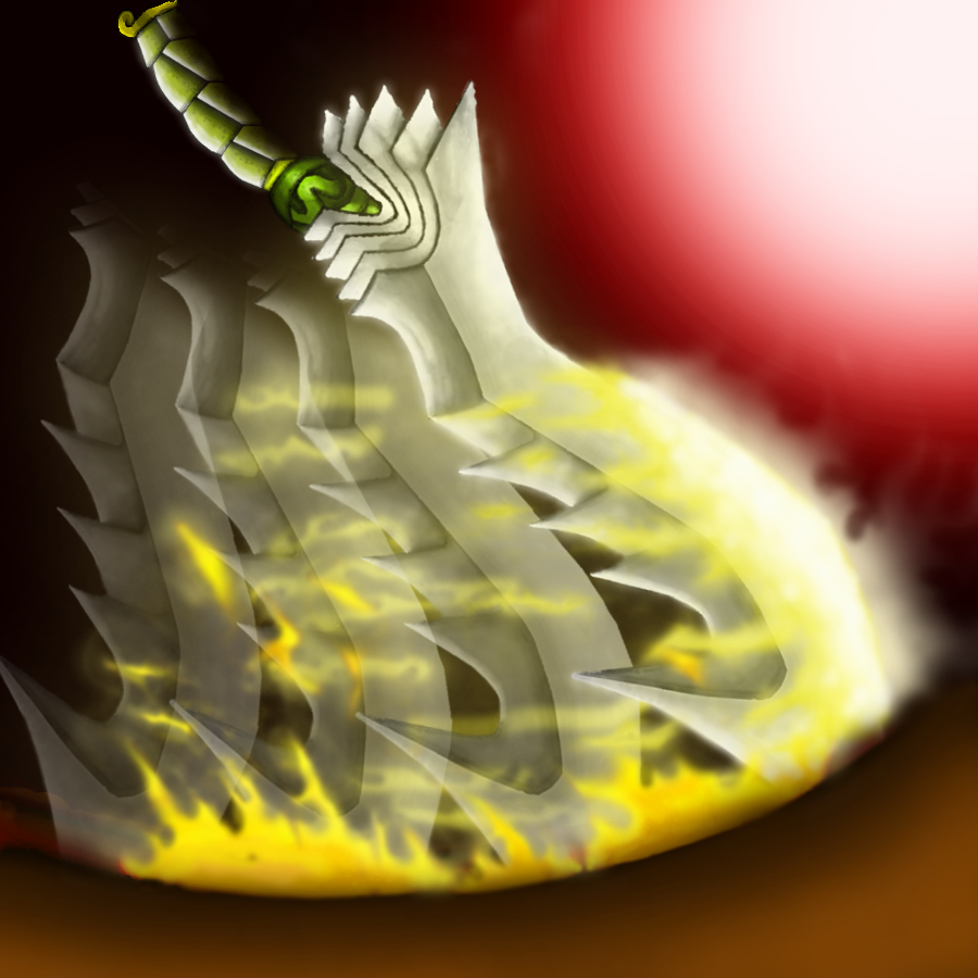
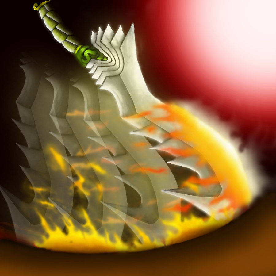
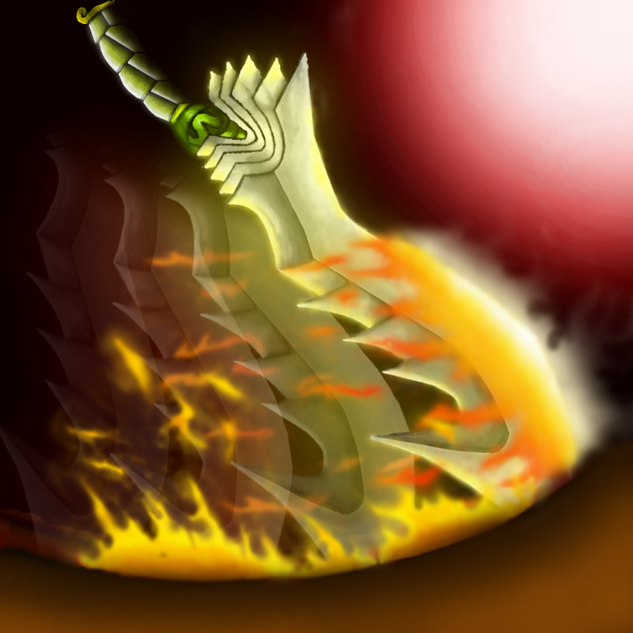
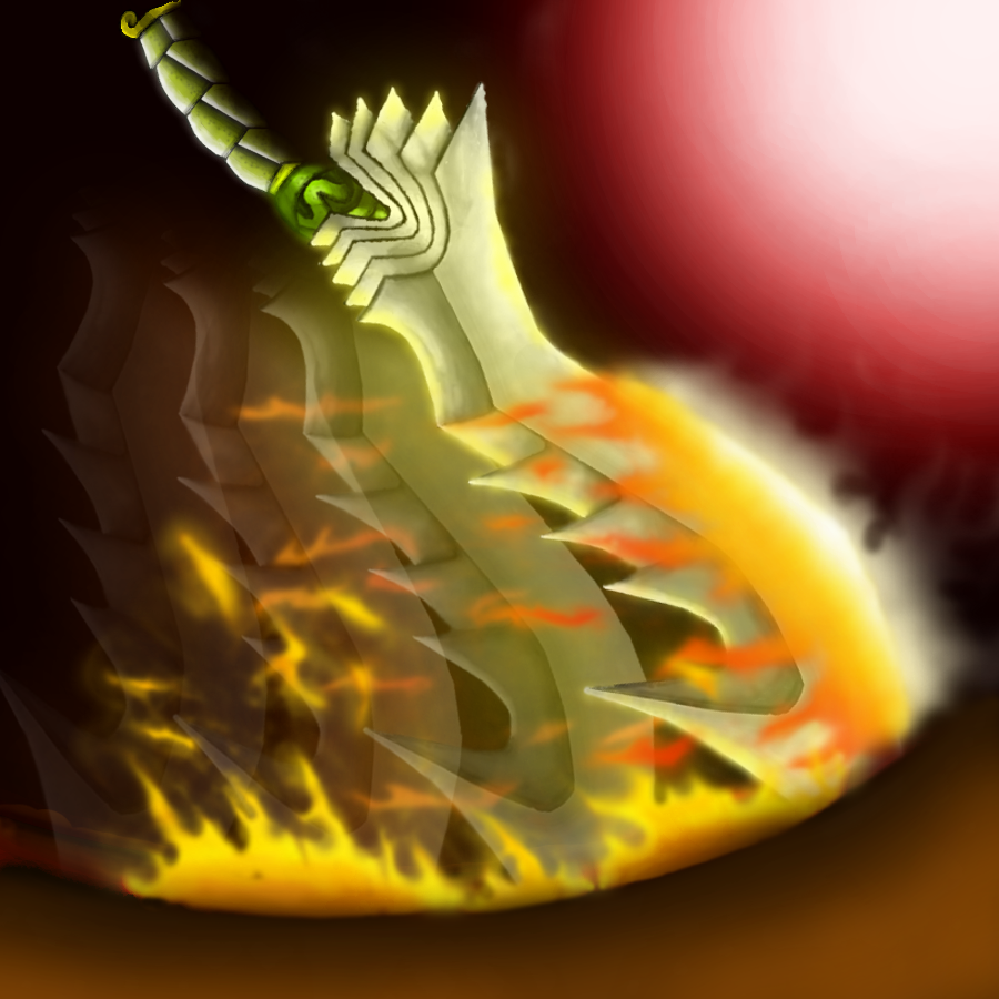
BTNBladeShockwaveWM

This bundle is marked as useful / simple. Simplicity is bliss, low effort and/or may contain minor bugs.
  • Like
Reactions: Stefan.K
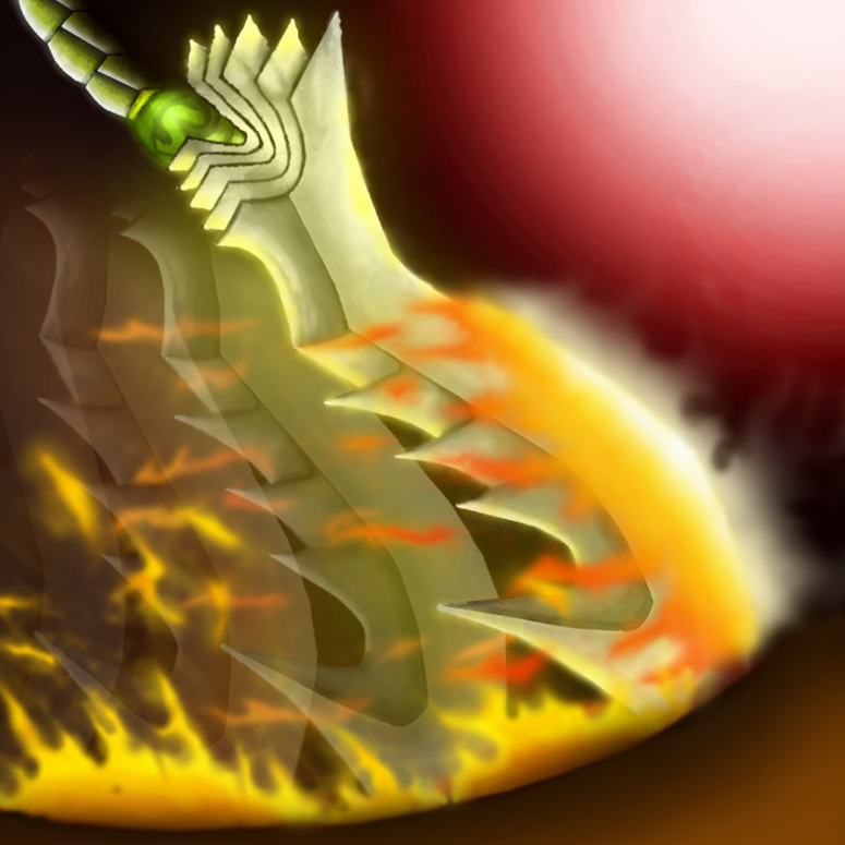
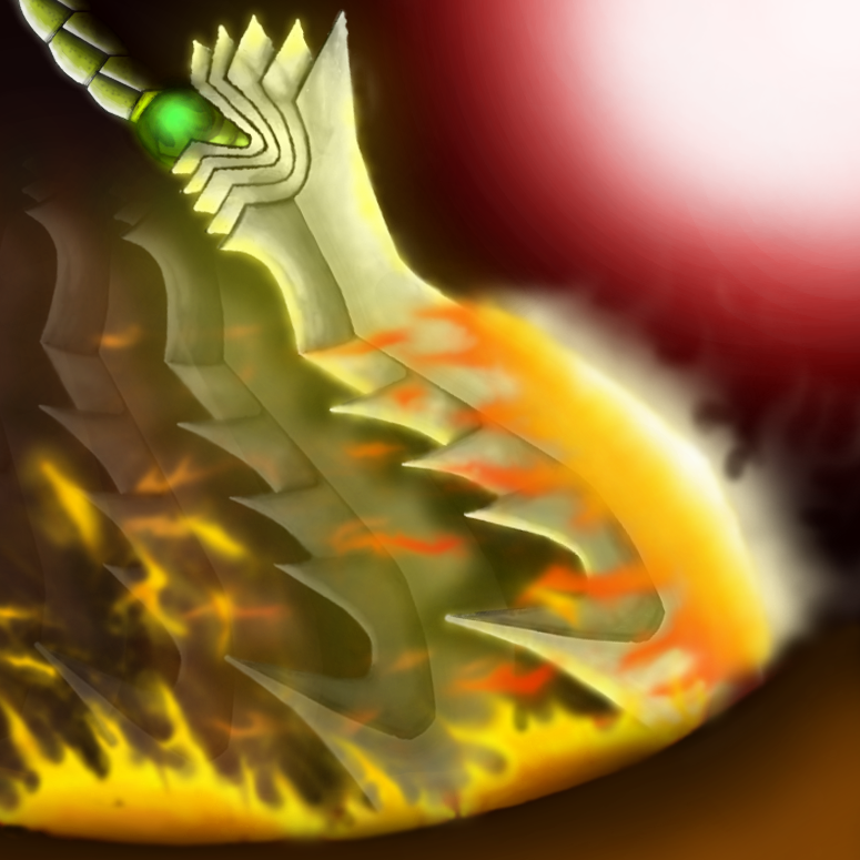
Icon usage: An alternative for shockwave icon, typically used on blade hero which has the shockwave spell.

Used tools:
  • Gimp
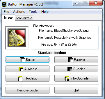
  • Button Manager


245746-albums8339-picture102175.jpg


Changelogs:


  1. 245746-albums8220-picture102174.png


  2. 245746-albums8220-picture102199.png


  3. 245746-albums8220-picture102200.png


  4. 245746-albums8220-picture102213.png


  5. 245746-albums8220-picture102218.png


  6. 245746-albums8220-picture102221.png


  7. 245746-albums8220-picture102233.png


  8. 245746-albums8220-picture102234.png


  9. 245746-albums8220-picture102247.png


  10. BladeShockwaveOJ v1.0
    Sharpen it in 64x64 size.

  11. BladeShockwaveWM v0.1
    Change its name from "BladeShockwaveOJ" to "BladeShockwaveWM".

  12. BladeShockwaveWM v0.2
    Forget to set the compressed quality percentage from 50% to 100% in Button Manager.

Credits:
  • Gimp
  • Button Manager

I will try to apply metallic texture to the blade. :)

Keywords:
Shockwave, blade, burn, flame, fire, slash, strike
Contents

BTNBladeShockwaveWM (Icon)

Reviews
19:56, 21st Oct 2015 Sin'dorei300: Commented. Awaiting update.

Winimasker

W

Winimasker

Stefan.K said:
Maybe try to define the blade a little more. It's barely visible at the moment.
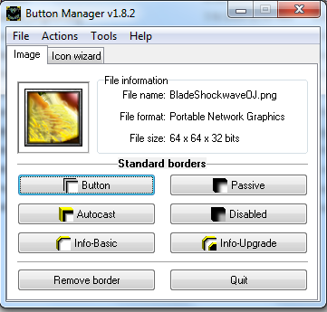
Yeah, but... How to make the icon to be clearer? :l

I have done my best. :l

Edit:
It is much clearer but its handle is gone. Can I just focus on the blade edge? But if the blade's handle part is not seen, then it seems to be weird (because it doesn't has handle in the view :l ).


245746-albums8220-picture102192.png


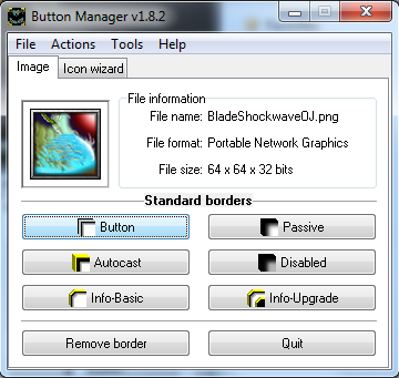
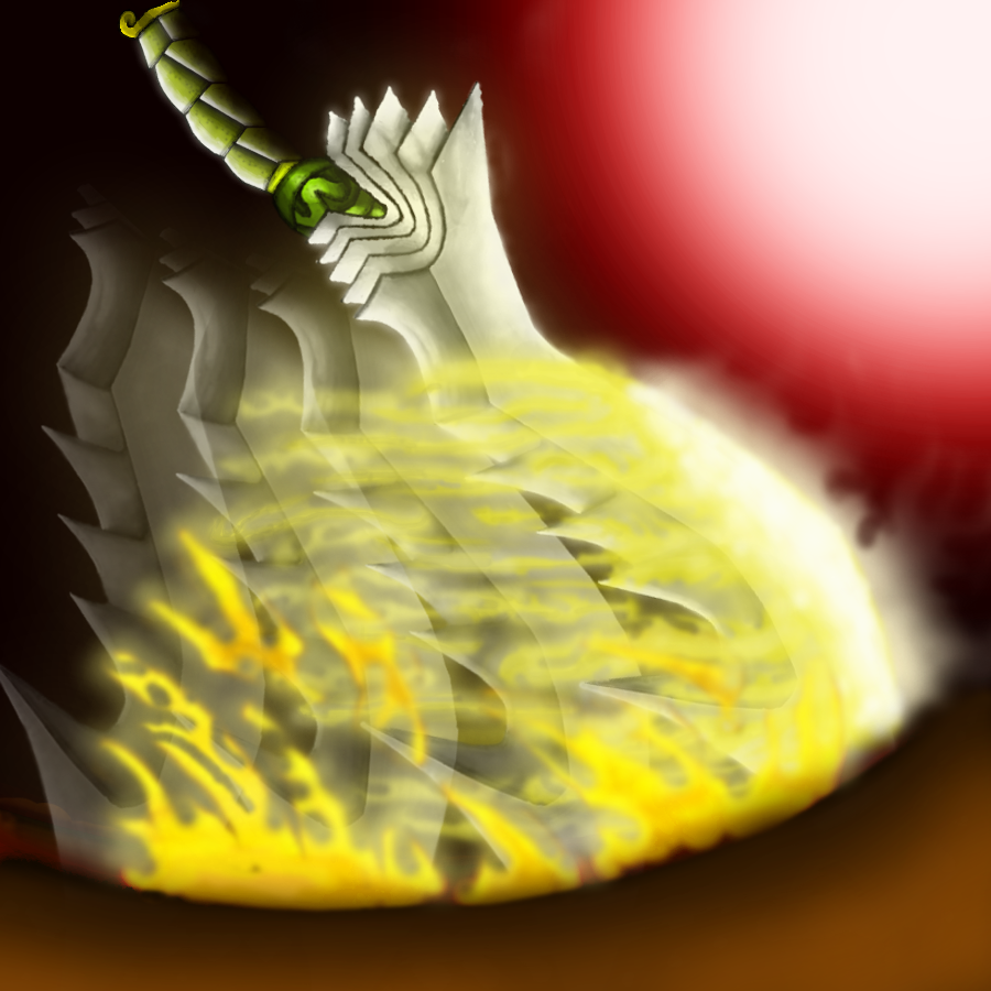
Is the red background better than the brownish-orange colour background? Ahh... The brownish-orange colour top-left part is still there. If the red background fits this kind of icon, then I will change the colour of the background as the red background will make this icon to be much obvious. :)
 
Last edited by a moderator:

Roland

R

Roland

Your painting is so large You should require the whole painting to be 64x64, Don't oversize the icon.. But.. I Love the big version!
 

Winimasker

W

Winimasker

Quiet tricky... I mean this icon. :l

If all details are included, then it will be super-messy.

If some details are added, then it will be messy too.

So I guess that... To make this icon to be much clearer, the better way is to just focus on the main blade. :(


245746-albums8220-picture102194.png


Are there more ways to make this icon to be much more clearer? The effects make the blade to be messy in viewing. :(

Edit:
What kind of colours can I use on this icon to fit the icon's title well and make the icon to be much more clearer and cool? :l

Should I change the colours of the effects?

I think the blue colour will be a better representive of yellow colour which is used on blade effects because the blade is white colour. :l


245746-albums8220-picture102196.png

 
Last edited by a moderator:

Winimasker

W

Winimasker

pick-a-chew said:
I think the flame makes it harder to tell what's going on in the icon.
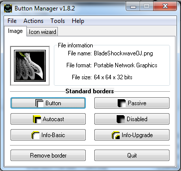
Yeah...!


245746-albums8220-picture102198.png


This is the example of this icon's blade without any effects, excluding illusional slashing effect.
 

Winimasker

W

Winimasker

Updated! :|

I ask somebody in chat and somebody said "define" and "clear form".

Does "define" mean "make the icon to be much clear"?

Do you guys mean that I need to add more shading and highlights to that blade or??? (define...)

Can I just focus on the blade edge?

Edit:
Zoomed-in Icon. Is it much more defined?

245746-albums8220-picture102201.png


If it is much more defined, then I update it again...
 
Last edited by a moderator:
Level 12
Joined
May 28, 2015
Messages
382
Updated! :|

I ask somebody in chat and somebody said "define" and "clear form".

Does "define" mean "make the icon to be much clear"?

Do you guys mean that I need to add more shading and highlights to that blade or??? (define...)

Can I just focus on the blade edge?

Edit:
Zoomed-in Icon. Is it much more defined?


245746-albums8220-picture102201.png


If it is much more defined, then I update it again...


Much better than the last one.. but try to make the handle visible. like reduce the length of the blade a little bit.. "Just a little bit".

Edit: Oh sorry, the handle is more visible now. One more thing, i suggest making the motion like effect more transparent to make the main blade really stand out.

Edit 2: There, much better.. 4/5 from me :D
 
Last edited:

Winimasker

W

Winimasker

Is it defined if I zoom it?


245746-albums8220-picture102223.png


Is it better???
 
Last edited by a moderator:

Winimasker

W

Winimasker

Updated! :)

I make shading in .xcf file but I make brightness in .png file. I forget to add brightness so I edit it again (I want edit it fast, that's why I choose .png file because the brightness of top right corner doesn't overlap the other stuffs). I edit it in a wrong file (.png) and save to existed .xcf file when I attempt to save it to existed .png file... No more layers... No...!

So... I think it is over. :| Maybe I must click "Save" instead of clicking "Save As...". I prefer to save file as rather than save file. :)

Hope you all enjoy in looking my final icon and...

Yes, it is finished... (no more layers, I cannot edit it layers by layers except... Except that I edit it very carefully in just a single layer :| )

Ahh...! I have checked... I still have the old version of .xcf file (I mean this icon's image).
 

Winimasker

W

Winimasker

BETABABY said:
How do you attach photos in your resources?? Refering to your reference photos

First, you can create an album in "Albums" section of your profile and upload an image in that album. Then, click the image you would like to post. Next, you move your mouse cursor to the image (I mean you aim the image you wish to post) and right-click then click "Open image in new tab". Here, you can copy the link of that image then type it (BBCode) ...

[hidden=Reference][img]yourlink[/img][/hidden]

It is better for everyone to hide the image because the image is quiet annoying as some images are extremely large in size.

BBCode is very useful in formatting your signature, visitor message, comments, resources' description and threads' contents (make them to be clear and plain).
- - - - - - -
One more thing, ... There are tabs tags.

[tabs][tab=???]Content[/tab][tab=???]Content[/tab][/tabs]

These tabs tags are not found in THW's BBCode list. These tags are used to make a table which allows the users to click the tab. Each tab can contain its own content. It just behaves a table but its difference is that its tabs are clickable (similar to button's function).
 
Last edited by a moderator:
Level 12
Joined
May 28, 2015
Messages
382
First, you can create an album in "Albums" section of your profile and upload an image in that album. Then, click the image you would like to post. Next, you move your mouse cursor to the image (I mean you aim the image you wish to post) and right-click then click "Open image in new tab". Here, you can copy the link of that image then type it (BBCode) ...

[hidden=Reference][img]yourlink[/img][/hidden]

It is better for everyone to hide the image because the image is quiet annoying as some images are extremely large in size.

BBCode is very useful in formatting your signature, visitor message, comments, resources' description and threads' contents (make them to be clear and plain).
- - - - - - -
One more thing, ... There are tabs tags.

[tabs][tab=???]Content[/tab][tab=???]Content[/tab][/tabs]

These tabs tags are not found in THW's BBCode list. These tags are used to make a table which allows the users to click the tab. Each tab can contain its own content. It just behaves a table but its difference is that its tabs are clickable (similar to button's function).


Oh Thanks
 

The Panda

Icon Reviewer
Level 57
Joined
Jun 2, 2008
Messages
8,912
Im sorry what i meant by defining more is making it more clear too the viewers eye, you want people too look at your icon and see what you see. In this case a sword swinging while having a fiery trail.. here is an example of how to do the trail and here is an example of how to make the opacity of each flame so everything doesn't glob together making it hard too tell what is going on in the icon, which at this moment is very confusing.
 
The icon is too crowded by a lot of details that can't be clearly seen.
If u want to emphasize the swing effect of a sword/a sword in motion, there's no need to draw such a detailed and complicated sword, coz all those details are blending in the small icon, and the outcome is confusing. Plus, that reddish bg is distracting.
The fire effect is barely visible and blends with the sword, which is lacking a metallic texture.
Maybe it just seems to me, but u tend to overcomplicate things(in ur icons). :)
If u want such a detailed and complicated sword, u can draw only the sword(preferably a part of it, like in the majority of the approved sword icons).
So, it depends on u, if u want to focus on the effect or on the sword.
 
Top