- Joined
- May 4, 2010
- Messages
- 614
lol dragonson i think you should close it earlier because ur going to get spammed with request

Maybe a knight or a Deathknight?
")

If possible, I'd like to add a avatar to my current request, or just add this to the bottom. (Avatar Request)
Size - No bigger than 90x90 pixels
Text - Bottom Middle, "Salvation"
Theme - Angel/heaven golden kinda style.
Color - More gold!
Image - http://newsimg.ngfiles.com/173000/173566_Arch_Angel.jpg
Im aware that the image would need serious downsizing, but if it would still look good, please use it. Thanks!


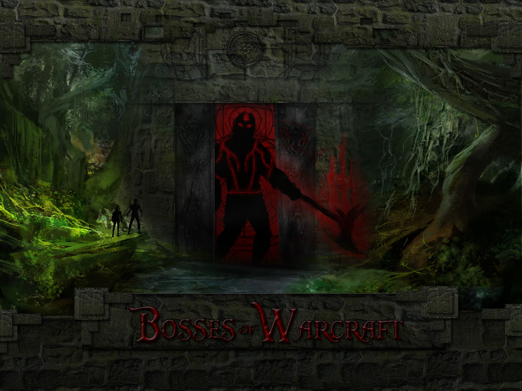
Its good but, im a critic so heres what i think! left and right have a good balance. The only thing is the middle, its good but the shadowy figure throws it off. It seems more cartoony then the rest of the pic, rounder edges and not a definite shape. Just a curvey silhouette oh sorts. But if i put my hand in the middle of the pic i like it! lol =P good work nonetheless
It just doesnt blend the best. And the axe kind of throws off the feel of it, mayb a daul axes would make it look better, eviler looking eyes. Or the axe along his back and instead of holding it, going to grab it.
Oh and the hand-axe angle is not correct. From what it looks like, hes holding a broken peice of the end of the handle, or a bent part of it =P the hand isnt angled correctly, or the axe isnt angled correctly. If this were uploaded to hive, and i was a art moderator. this will be in Pending, in need of revision xD
Also, based on how his right bicep is angled, and his forearm, u should be able to see part of his right hand. Also his right bicep is twice the size of his left bicep.
This is my opinion, the fiery lines should look more like cracks, it would make it look more sinister.
Lol dragon, atleast im not saying
OMG ITS SO AWESOME
It just doesnt blend the best. And the axe kind of throws off the feel of it, mayb a daul axes would make it look better, eviler looking eyes. Or the axe along his back and instead of holding it, going to grab it.
Oh and the hand-axe angle is not correct. From what it looks like, hes holding a broken peice of the end of the handle, or a bent part of it =P the hand isnt angled correctly, or the axe isnt angled correctly. If this were uploaded to hive, and i was a art moderator. this will be in Pending, in need of revision xD
Also, based on how his right bicep is angled, and his forearm, u should be able to see part of his right hand. Also his right bicep is twice the size of his left bicep.
This is my opinion, the fiery lines should look more like cracks, it would make it look more sinister.

Its good but, im a critic so heres what i think! left and right have a good balance. The only thing is the middle, its good but the shadowy figure throws it off. It seems more cartoony then the rest of the pic, rounder edges and not a definite shape. Just a curvey silhouette oh sorts. But if i put my hand in the middle of the pic i like it! lol =P good work nonetheless
Edit your first post, first of all. And I think you can still change.
I'm back
Wait I see the waiting list, its from the top to button? where is all the other requests?
dragonson please change my request name in the signature with the name
''RedClaw''
WEELLLLL just a heads up, the site will be outdated until end of August, my computer crashed last week, can't fix it and im gona buy a new one in the end of august Q_Q