• 🏆 Texturing Contest #33 is OPEN! Contestants must re-texture a SD unit model found in-game (Warcraft 3 Classic), recreating the unit into a peaceful NPC version. 🔗Click here to enter!

Arthas.blp

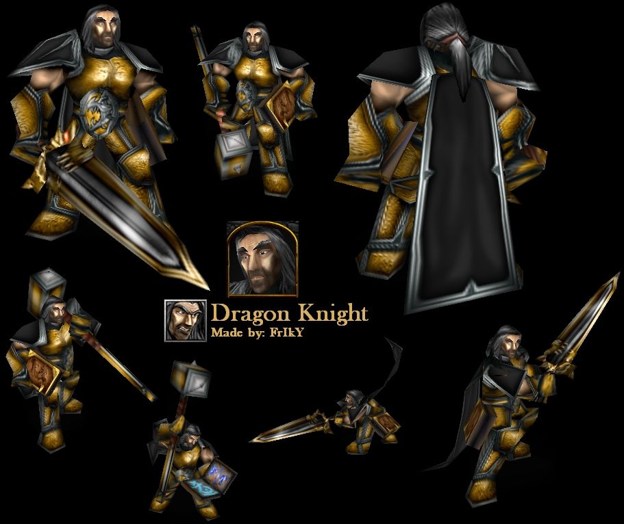
You don't have to call him "Dragon Knight", it's just a name. Use it well in your map/campaign!
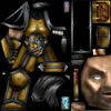
Anyway, everything's freehand except neck, that's recolored

Do not upload this skin to any other website or here, give credits if you're using it in your map/campaign! You may edit the skin (only with my permission) so it matches your map/campaign better, but do NOT upload it here or anywhere else!

Feel free to leave a comment and a rating! ^_^

1. Update: Made it less sharp and added different color scheme.
2. Update: Different hair style, new face and sword added. Special thanks to Dionesiist for letting me use his pony-tail idea

Don't forget to download the sword skin, too!

Keywords:
Dragon, Knight, Warrior, Soldier, Paladin, Arthas, Holy, Power, Drake, Saint, yellow, gold, golden
Contents

Dragon Knight (Texture)

Reviews
15:58, 3rd May 2009 Dan van Ohllus: Damn. This skin looks really nice. I forsee some great usefulness in this.

Moderator

M

Moderator

15:58, 3rd May 2009
Dan van Ohllus:
Damn. This skin looks really nice.
I forsee some great usefulness in this.
 
Level 34
Joined
May 1, 2008
Messages
3,212
The face is pretty much the most important part of a texture.
Alright, will try doing something tomorrow. At first, I did make it freehand, but it sucked so... I'll try better this time!
Also, this is shockingly similar to AR's style :O
Really?! Well, that's good to hear! ^_^
 
Level 1
Joined
Jun 30, 2008
Messages
6
Very Nice Skin, Good Job!!

5/5, I'll vote it.

It would be cool when u make an dragon symbol on his Cape :)
 
boots and the spauldrons are a bit sharp on the edges, a lill thing for you FrIkY ^_^

If u only could fix the chest, it drives me mad, when I see such a great skin with a bug
The arthas model is notorious for its bad wrap and FrIkY's skin perfectly solves that. there ain't a THING that would fix that better.
 
Level 11
Joined
Jun 7, 2008
Messages
144
This is a good, solid skin. I like the way you used the trimming, especially on the shoulder, cape, and hammer. There is one thing though that I think really needs to be fixed. The way you skinned the hair may work for the front, but the back is definetly lacking. I would probably try to make all the hairs go in the same downwards direction to avoid that weird wrap. 4/5
 
Level 11
Joined
Jun 28, 2008
Messages
2,362
Skin is good. Aldo the face on portrait (its good on the main model) looks little wierd, mostly around the mouth. Maybe its the wrap or something. Thry fix that and you get 5/5 and +rep. For now 4.60/5
 
Level 30
Joined
Sep 30, 2008
Messages
1,460
I definately prefer this one to the old :D While the colour scheme doesnt make much difference, and extra detail in the armour is outstanding ;)

It makes him look more like hes seen a few wars, rather than fresh off the production line :)

However, is it just me, or is the bottom bit of the belt emblem (below the dragon) meant to be gold too? :S

Apart from that, you've got my 4.9/5 ;)
 
Level 34
Joined
May 1, 2008
Messages
3,212
However, is it just me, or is the bottom bit of the belt emblem (below the dragon) meant to be gold too? :S
xD I didn't even notice that... I'll fix it. Thanks!
Point is that you FUCKING STEAL ART!!!¤R"Q#Y&T¤"#Y/ (you wanted to hear that? -.-)

The real point is that you have been improving -.-
It sounded like that... damn bolding.
 

frostwhisper

Media Manager
Level 49
Joined
May 25, 2007
Messages
4,221
You should bless Dio for the pony tail idea. Seriously.

Btw, considering that you've made such awesome details on the armor, you could perhaps make little bear-like dots on his face. Cause it's kiiiiiiinda blurry compared to te rest atm.
 

Similar threads

Top