• Listen to a special audio message from Bill Roper to the Hive Workshop community (Bill is a former Vice President of Blizzard Entertainment, Producer, Designer, Musician, Voice Actor) 🔗Click here to hear his message!
  • Read Evilhog's interview with Gregory Alper, the original composer of the music for WarCraft: Orcs & Humans 🔗Click here to read the full interview.

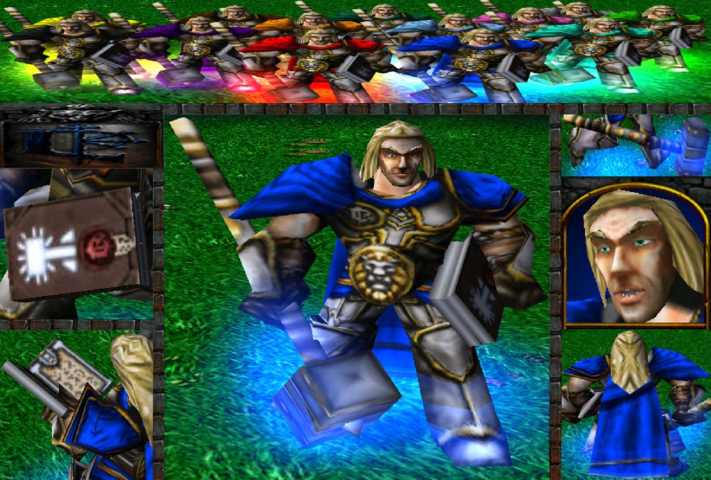
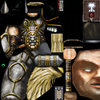
Arthas.blp

This bundle is marked as useful / simple. Simplicity is bliss, low effort and/or may contain minor bugs.
This skin is heavily based on Arthas WoW model.

Update:
1:1 Changed the shadows, ''Unsharped'' the skin and made it less contrasted.

1:2 Made a few overall tweeks. Remade the hammer and the book, and added team colors.

Keywords:
Arthas, WoW, World of Warcraft, Stratholme, Culling of Stratholme, Prince, Prince Arthas, Lordaeron, Alliance, Paladin
Contents

Arthas.blp (Texture)

Reviews
23:00, 8th Feb 2015 Kwaliti: I like where this is going, but there's a lot of room for improvement. The first offender is the eyebrow texture which wraps really oddly. The second thing is the shading, which is very imprecise. Layered metal...

Moderator

M

Moderator

23:00, 8th Feb 2015
Kwaliti:

I like where this is going, but there's a lot of room for improvement.

The first offender is the eyebrow texture which wraps really oddly. The second thing is the shading, which is very imprecise. Layered metal plating should have really tight lines and shading. The hair seems somewhat lifeless. Work on those and we can approve this.
 
Level 9
Joined
Feb 16, 2011
Messages
595
The face seems blurry to me and the legs look bulky and that the cape and shoulder pads are awesome, the hair looks ridiculously overdone or something along those lines, the armor also doesn't look like it fits all together in it's current state it looks kind of cluttered but other than those little details just improve on those a little and keep up the good work 3.8/5
 

SpasMaster

Hosted Project: SC
Level 24
Joined
Jan 29, 2010
Messages
1,994
The face seems blurry to me and the legs look bulky and that the cape and shoulder pads are awesome, the hair looks ridiculously overdone or something along those lines, the armor also doesn't look like it fits all together in it's current state it looks kind of cluttered but other than those little details just improve on those a little and keep up the good work 3.8/5

You are criticising the model and its shape on some places, which has nothing to do with the skin.
 
The face seems blurry to me and the legs look bulky and that the cape and shoulder pads are awesome, the hair looks ridiculously overdone or something along those lines, the armor also doesn't look like it fits all together in it's current state it looks kind of cluttered but other than those little details just improve on those a little and keep up the good work 3.8/5

That's how the texture wraps on the model itself, which is quite derpy at places you know.
I used no filters at all.
For starters, you used the texturizer filter on the cape tbh.

...also way too much Burn for shadows.

I'm not saying that you don't have to use the Burn tool but maybe not so much.
 
Top