Community
Maps
Tutorials
Gallery
Support Us
Install the app
-
🏆 Texturing Contest #33 is OPEN! Contestants must re-texture a SD unit model found in-game (Warcraft 3 Classic), recreating the unit into a peaceful NPC version. 🔗Click here to enter!
-
🏆 Hive's 6th HD Modeling Contest: Mechanical is now open! Design and model a mechanical creature, mechanized animal, a futuristic robotic being, or anything else your imagination can tinker with! 📅 Submissions close on June 30, 2024. Don't miss this opportunity to let your creativity shine! Enter now and show us your mechanical masterpiece! 🔗 Click here to enter!
You are using an out of date browser. It may not display this or other websites correctly.
You should upgrade or use an alternative browser.
You should upgrade or use an alternative browser.
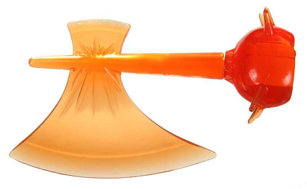
Searing Axe

- Author(s)
- Marcos DAB
- Tags
- Item, Spell / Ability, Demon, Orc
- Size
- 31.42 KB
- Rating
-
(8 ratings)
- Downloads
- 254
- Created
- Jul 5, 2018
- Updated
- Jul 6, 2018
- Resources
- 2
- State
 Approved
This bundle is marked as recommended. It works and satisfies the submission rules.

Please enter a description of at least 100 characters.
Please enter a description of at least 100 characters.
Please enter a description of at least 100 characters.
Please enter a description of at least 100 characters.
Please enter a description of at least 100 characters.
Please enter a description of at least 100 characters.
Please enter a description of at least 100 characters.
Contents
Searing Axe (Icon)

btn

disbtn

pas
dispas
- Size
- 19.23 KB
- Uploaded
- Jul 5, 2018
- Updated
- Never
Searing Axe2 (Icon)

btn

disbtn

pas
dispas
- Size
- 12.19 KB
- Uploaded
- Jul 6, 2018
- Updated
- Never
Reviews
Good work, second variation looks sexy.
- Joined
- Mar 24, 2011
- Messages
- 1,082
1/5 seems a bit harsh.Looks like a piece of plastic, and have nothing to do with metal or fire.
It is most definitely NOT a flaming axe, just an orange one.
Looks decent to me from looks perspective. Ofc, my art specialization is almost non-existent, I just see a shiny or not...
Usefulness ? Not as a weapon, I am not entirely sure who would go around walking with an orange axe...
Could be used for some sort of Blacksmithing, like put metal in furnace >> take out piece of hot metal >> start hammering into axe >> turn it into this icon >> ??? >> profit
Description is just a killer.
I'd say 2/5
Would hold on giving any ratings out for the moment.
regards
-Ned
- Joined
- Nov 19, 2017
- Messages
- 184
Looks like an unfinished heated treatment before quenching the axe head
deepstrasz
Map Reviewer
- Joined
- Jun 4, 2009
- Messages
- 19,165
It's pretty nice.
- Joined
- Mar 26, 2011
- Messages
- 1,276


I honestly don't know why I still spending my time trying to keep hive alive in memory of peoples who aren't longer here.
Some Blizzard ability icons doesn't has material differentiation, they are just monochromatic, this way I tagged "Spell/Ability".
The light definitely doesn't behave this way on the plastic material. This should be taken in consideration, before comments that I couldn't describe otherwise, unless inexperienced comments.
I'm sure my platic axe, has more techinical elements than mostly of 1/5 icons.
- Joined
- Feb 19, 2015
- Messages
- 898
Oh, really?The light definitely doesn't behave this way on the plastic material. This should be taken in consideration, before comments that I couldn't describe otherwise, unless inexperienced comments.
And please, don't be so proudful. It's counter-productive behaviour for cummunity. Try to compare your axe to others in Icon Section and you will realise that your one really aren't that great as you are trying to prove.I honestly don't know why I still spending my time trying to keep hive alive in memory of peoples who aren't longer here.
Also, from my experience, you do not pay any attention to comments of reviewers, so rating is a acceptable tool to draw your attention.
Last edited:
- Joined
- Mar 26, 2011
- Messages
- 1,276
I tryed to compare to others in Icon Section


Can't see how far they are much better.
Can't see how far they are much better.
- Joined
- Feb 19, 2015
- Messages
- 898
First of all I haven't asked you to compare your Icons with mine - I am not that prideful, and do not count myself the best artist on Hive. All that I was saying to you, to compare your Axe, and other really good Axe Icons examples that you can find in Icon Section.
- Joined
- Nov 19, 2017
- Messages
- 184


 Something like this?
Deleted member 247165
D
Deleted member 247165
For an icon reviewer, Maxwell, you seem to be a bit rude. Instead of launching "direct attacks" towards the author, you could have simply suggested him what improvements that icon needs. Doing that, kindly, btw.
- Joined
- Mar 22, 2016
- Messages
- 588


And please, don't be so proudful. It's counter-productive behaviour for cummunity. Try to compare your axe to others in Icon Section and you will realise that your one really aren't that great as you are trying to prove.
Also, from my experience, you do not pay any attention to comments of reviewers, so rating is a acceptable tool to draw your attention.
Using rating to make author update his work is a not productive behavior in a creative community either.
Because users are free to ignore or disagree with given reviews. For you it should be irrelevant whether they'll accept it or not, your only concern should be making sure that reviews contain constructive criticism upon which icon may be improved. When it happens that author doesn't accept review, you don't push them, you either approve or reject icon, based on its quality.
Also don't compare works to show that someone's icon is better or worse, do it to give ideas to author on how certain aspect can be made in a different way, shading for example. But then it needs to be explained why comparison is being made.
I don't think any legit drawn icon deserves 1/5 rating. And based on quality, this icon deserves more than 1/5 or 2/5 rating.
Deleted member 247165
D
Deleted member 247165
The best way!Using rating to make author update his work is a not productive behavior in a creative community either.
Because users are free to ignore or disagree with given reviews. For you it should be irrelevant whether they'll accept it or not, your only concern should be making sure that reviews contain constructive criticism upon which icon may be improved. When it happens that author doesn't accept review, you don't push them, you either approve or reject icon, based on its quality.
Also don't compare works to show that someone's icon is better or worse, do it to give ideas to author on how certain aspect can be made in a different way, shading for example. But then it needs to be explained why comparison is being made.
I don't think any legit drawn icon deserves 1/5 rating. And based on quality, this icon deserves more than 1/5 or 2/5 rating.
- Joined
- Feb 19, 2015
- Messages
- 898
I have compared works to show, that his Icon miss some things - for example axe sharpness. Or better hightlights that are common for metalic material.Also don't compare works to show that someone's icon is better or worse, do it to give ideas to author on how certain aspect can be made in a different way, shading for example. But then it needs to be explained why comparison is being made.
Deleted member 247165
D
Deleted member 247165
You could have come up with the rating, after he did the improvementsI have compared works to show, that his Icon miss some things - for example axe sharpness. Or better hightlights that are common for metalic material.
") By rating it instantly 2/5 on his first upload, will surely demoralize him a bit and might not work to improve it :/
By rating it instantly 2/5 on his first upload, will surely demoralize him a bit and might not work to improve it :/- Joined
- Feb 19, 2015
- Messages
- 898
Rating is the thing that can be changed anytime it is needed. As long as this icon do not break any rules it will be approved, so the rating is the last and main thing that can show my impression from it - this icon need improvements.You could have come up with the rating, after he did the improvements
Deleted member 247165
D
Deleted member 247165
You misunderstand me. I don't say you don't have to rate it, I just pointed out that would have been nice to do that after he did the improvements. For him feels different, trust me.Rating is the thing that can be changed anytime it is needed. As long as this icon do not break any rules it will be approved, so the rating is the last and main thing that can show my impression from it - this icon need improvements.


- Joined
- Jul 22, 2015
- Messages
- 3,485


Please take this discussion to VM or PM if you guys want to continue. Id rather not hit everyone here with an OT warning.
If the submitter has an issue with an unfair rating, they can report it.
If the submitter has an issue with an unfair rating, they can report it.
Shar Dundred
Community Moderator
- Joined
- May 6, 2009
- Messages
- 5,882

@KILLCIDE You know that your reviewers aren't doing a good job and still instead of actually,
you know, looking into the matter, you keep jumping around to protect them instead of even
taking into consideration that THEY might be to blame.
Take a look at recent events that made you come around to defend them. Tell me this:
do you actually, truthfully believe that SO MANY DIFFERENT USERS are to blame instead of,
you know the TWO ICON REVIEWERS?!
- Joined
- Jul 22, 2015
- Messages
- 3,485
I started a conversation with Maxwell about what he said / done before I made a post on this thread. I advise you stop jumping into drama making assumptions or else you'll like an idiot.
Shar Dundred
Community Moderator
- Joined
- May 6, 2009
- Messages
- 5,882
Oh yes, *I* am the one who is looking like an idiot because, unlike you, I don't just stay next
to the mess and am not like "This is fine. A single message that never helped before will help now".
I can totally see how *I* am wrong here.
I've had enough of you ignoring this matter.
to the mess and am not like "This is fine. A single message that never helped before will help now".
I can totally see how *I* am wrong here.
I've had enough of you ignoring this matter.
Deleted member 247165
D
Deleted member 247165
@KILLCIDE I think @Shar Dundred is pointing out the fact that you might be too easy and forgetful with the icon reviewer's verdict on this post and previous ones. It looks like he is abusing of the position he has. And @Shar Dundred is just trying to open your eyes, I guess.
- Joined
- Jan 18, 2005
- Messages
- 5,782


let it be a plastic axe then, there is nothing wrong with a plastic axe icon
deepstrasz
Map Reviewer
- Joined
- Jun 4, 2009
- Messages
- 19,165
Let's not jump into shaggy conclusions.@KILLCIDE I think @Shar Dundred is pointing out the fact that you might be too easy and forgetful with the icon reviewer's verdict on this post and previous ones. It looks like he is abusing of the position he has. And @Shar Dundred is just trying to open your eyes, I guess.
- Joined
- May 7, 2016
- Messages
- 2,121


What is wrong with you, guys? Everyone has a style. This must at least take a 4/5. It might be lacking in texture (which I doubt Blizz would also be perfect in that aspect), but this is great in perspective and really close to Blizzard's style. With some texture, a little more shading and maybe some fiery effects due to the name (which I think is not that important), this would be a 5/5 in terms of it's own style. This is not supposed to be metallic, it's a searing axe daring to be different from the other artists' icons found here, and I think deserves a 4/5.
Deleted member 247165
D
Deleted member 247165
Look, he actually improved it Searing Axe2What is wrong with you, guys? Everyone has a style. This must at least take a 4/5. It might be lacking in texture (which I doubt Blizz would also be perfect in that aspect), but this is great in perspective and really close to Blizzard's style. With some texture, a little more shading and maybe some fiery effects due to the name (which I think is not that important), this would be a 5/5 in terms of it's own style. This is not supposed to be metallic, it's a searing axe daring to be different from the other artists' icons found here, and I think deserves a 4/5.
Looks great. Also, your point of view is really nice and is the feedback that he should have received.- Joined
- Mar 24, 2011
- Messages
- 1,082
Whoa, definitely major improvement. I would love to smack somebody with that in combat!
I am still not feeling the fire in this weapon yet. There is just a little heat to be felt behind the blade. There isn't much Flame in the Flaming Axe. Currently it feels more like "Molten Edge Axe" or "Heat Blade Axe".
With those 2 icons being available, I can see two uses Blacksmithing, as described previous with more steps.
AND the axe becoming hotter and hotter in the wielders hand burning both enemy and wielder!
Still loving the description!
Currently 3/5 or 4/5
Give it some fire/heat effects and it would be the weapon of choice for leading the army.
4/5 or even 5/5?
regards
-Ned
- Joined
- Nov 19, 2017
- Messages
- 184
I would name it Axe of Searing Heat yes! It would be suitable addition in the WE item section no!Whoa, definitely major improvement. I would love to smack somebody with that in combat!
I am still not feeling the fire in this weapon yet. There is just a little heat to be felt behind the blade. There isn't much Flame in the Flaming Axe. Currently it feels more like "Molten Edge Axe" or "Heat Blade Axe".
With those 2 icons being available, I can see two uses Blacksmithing, as described previous with more steps.
AND the axe becoming hotter and hotter in the wielders hand burning both enemy and wielder!
Still loving the description!
Currently 3/5 or 4/5
Give it some fire/heat effects and it would be the weapon of choice for leading the army.
4/5 or even 5/5?
regards
-Ned
- Joined
- Mar 24, 2011
- Messages
- 1,082
Flaming Axe of Burning Searing Heat of Smithing Lava Fire !I would name it Axe of Searing Heat yes! It would be suitable addition in the WE item section no!
(I am trying to make a reference to that anime but I don't remember it exactly :| )
regards
-Ned
- Joined
- Nov 19, 2017
- Messages
- 184
Scorching Axe of Burning, Hephaestus Axe of FireFlaming Axe of Burning Searing Heat of Smithing Lava Fire !
(I am trying to make a reference to that anime but I don't remember it exactly :| )
regards
-Ned
- Joined
- Nov 12, 2016
- Messages
- 780
because obviously i had to jump in too, the axe can look however it cares to look like and the author is free in terms of that,
the quality looks smooth and sharp and the improved version is very nice, what maxwell did in my opinion was judge the axe because its named Searing Axe to which is what i myself did in another icon to which he told me i have no rights to tell an artist what to name his icon.
but i said the "name" was not proper yet in here he says the "icon" is not good just because it's not matching the name "searing as in fire and etc like idea"
so maybe you can learn from what you told me yourself deer maxwell.
as for Macros you can continue to "DAB" on dem haters
Last edited:
- Joined
- Feb 4, 2008
- Messages
- 3,488


It is a great icon. People is being silly.
Red hot metal does look somewhat like plastic too btw.
Red hot metal does look somewhat like plastic too btw.
Last edited:
- Joined
- Mar 24, 2011
- Messages
- 1,082
Unfortunately, it is in the rules that resources have to have fitting name.because obviously i had to jump in too the axe can look however its cares to look like and the author is free in terms of that,
the quality looks smooth and sharp and the improved version is very nice, what maxwell did in my opinion was judge the axe because its named Searing Axe to which is what i myself did in another icon to which he told me i have no rights to tell an artist what to name his icon.
but i said the "name" was not proper yet in here he says the "icon" is not good just because it's not matching the name "searing as in fire and etc like idea"
so maybe you can learn from what you told me yourself deer maxwell.
as for Macros you can continue to "DAB" on dem haters
ref: Icon Submission RulesSubmissions must bear a fitting title
Of course, the difference between an "elephant" and a "tree" is a few leagues above the difference between a "hot axe" and "searing axe".
The thing with the name in this case is more like nit-picking, and while it is 70-90% accurate, it can still be perceived as deception or false advertising by some.
Edit// It is also in the rules that a resource should have a proper description.
ref: General Resource RulesA proper description must go along with the resource.
As such, this should be set to need-fix.
Edit// I did not notice that this has not been moderated yet :|
regards
-Ned
Last edited:
- Joined
- May 20, 2013
- Messages
- 162
@Maxwell so what if you think it looks plastic? Does it pass the minimum standards? Please evaluate in those terms. Let the artist be the artist. Let the audience DL or choose not to DL. The artists are not here to recreate your imagination. They are here to expand their own, and hopefully expand ours too. Marcos has been a consistently excellent artist that has contributed phenomenally to the site. Hell, i PM'd him on the off chance that some day 2 or 3 years down the road he might see my post & if i was lucky, send a PM that he was retired. He didn't do that. He answered my post within 3 days, & posted material within 3 days after that! Marcos is a gentleman who honors his word, and has been gracing this site for many years now. Please don't treat him like a Newbie!
And i say that with no disrespect to you.
And i say that with no disrespect to you.
Last edited:
- Joined
- Jan 13, 2019
- Messages
- 284
GREAT 5/5