
 Approved


Moderator
M
Moderator
09:01, 14th Aug 2009
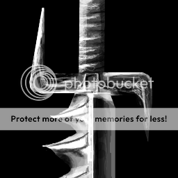
zombie2279: A more varietive color scheme would come in handy, since particular parts of the sword blend into each other, just like the shading. That would also ruin the altogether feeling of the icon, so I'll just approve this and you can choose whether or not to do some more improvements.
zombie2279: A more varietive color scheme would come in handy, since particular parts of the sword blend into each other, just like the shading. That would also ruin the altogether feeling of the icon, so I'll just approve this and you can choose whether or not to do some more improvements.
")


 ), but I still haven't got a nice armor to wear with it