
 Approved


Moderator
M
Moderator
zombie2279: The wips look fake. Give me a .psd or .xcf file, I won't accept anything else. There's a huuuuge difference between the final and the second wip.
08:39, 17th Aug 2009
zombie2279: No proper evidence shown. Notify me if it's otherwise.
9:04, 21st Aug 2009
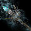
zombie2279: Some more contrast to distinguish the staff from the background would be welcome, and some more visible details to the middle, since the background is now more in perspective than the staff itself. Once you're done, add more shading. Use black outlines instead of white when doing icons.
29th Aug
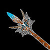
zombie2279: Improper direction of changes made, advise observation of other icons to achieve a better result. The messyness of the middle has to go.


")


