• 🏆 Texturing Contest #33 is OPEN! Contestants must re-texture a SD unit model found in-game (Warcraft 3 Classic), recreating the unit into a peaceful NPC version. 🔗Click here to enter!
  • It's time for the first HD Modeling Contest of 2024. Join the theme discussion for Hive's HD Modeling Contest #6! Click here to post your idea!

Personal Feedback Thread

Status
Not open for further replies.
Level 48
Joined
Apr 18, 2008
Messages
8,416
View attachment 371019
I'd say reading the title of the spoiler is less clear than before.
I'd recommend increasing the font size (and maybe the button image to keep the ratio) and/or switching the golden and white (golden becoming the Shortcut color) and/or removing "spoiler" from the title and/or putting the text in all caps (even though it would make it "no longer Reforged art style").

I think removing "Spoiler:" and adding a downward pointing arrow on the spoiler tag could work instead. The color scheme is consistent with Warcraft 3 which is good. I have no comment regarding font size / image resolution, seems fine to me but I don't know.

A couple more off-hand comments before I dive into it in earnest:

There is a lot of dead space on the margins of the screen (esp. on widescreen, QHD, 4K resolutions) which should work well for mobile but looks off on PC. Perhaps an option to toggle between the two modes?
unknown.png

An option to open a user's awards to see more than 4 will be nice (e.g, a button below the medals that says "see all", I know clicking the awards brings up the rest of them, but that's not very intuitive, and opening a new page rather than a small popup is also not very friendly), and better yet if there is some sort of award count icon or counter on the UI. I also think that 4 is too little to display by default, I think 6, 8 or even 12 would better serve the long-standing users who have proven themselves over and over in the Arena. :wink:

Bringing back user titles below the username would be super nice, also. Right now they exist - but only on profile pages. Having them visible everywhere a user posts would allow that little extra bit of personal flair to everyone.

And on a related note, are signatures gone? Because I don't want them to be gone. :bored:

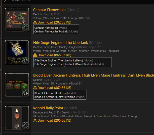
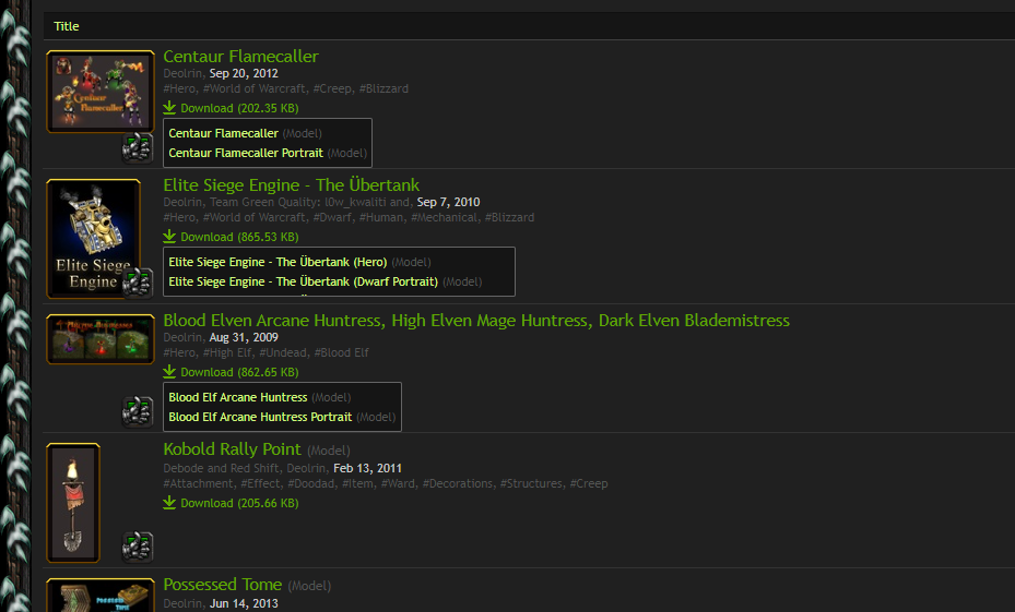
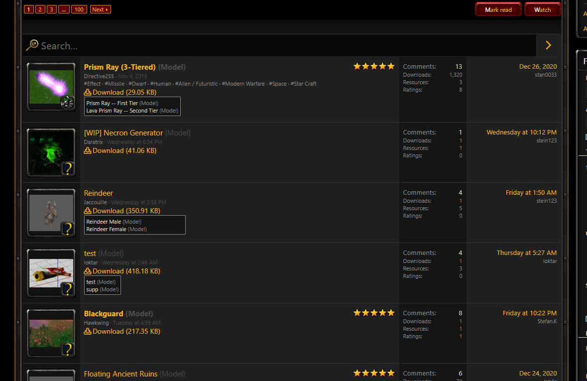
Non-square sized resource thumbnails look off (broken) with the new borders:
unknown.png
I liked the more organic, old style:
unknown.png

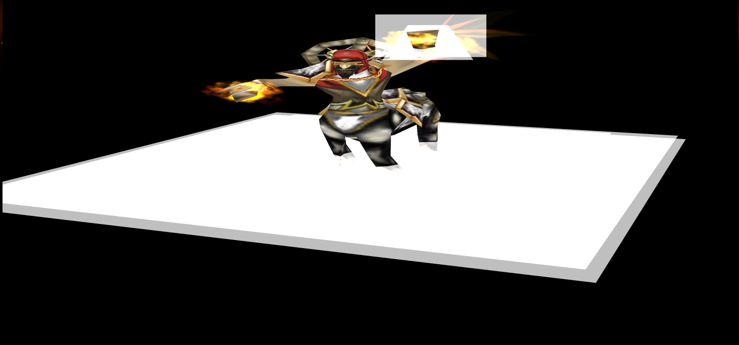
3D view seems broken. It's not full screen and the resolution is squished. Could be broken based on resolution. Here's how it looks for me:
unknown.png

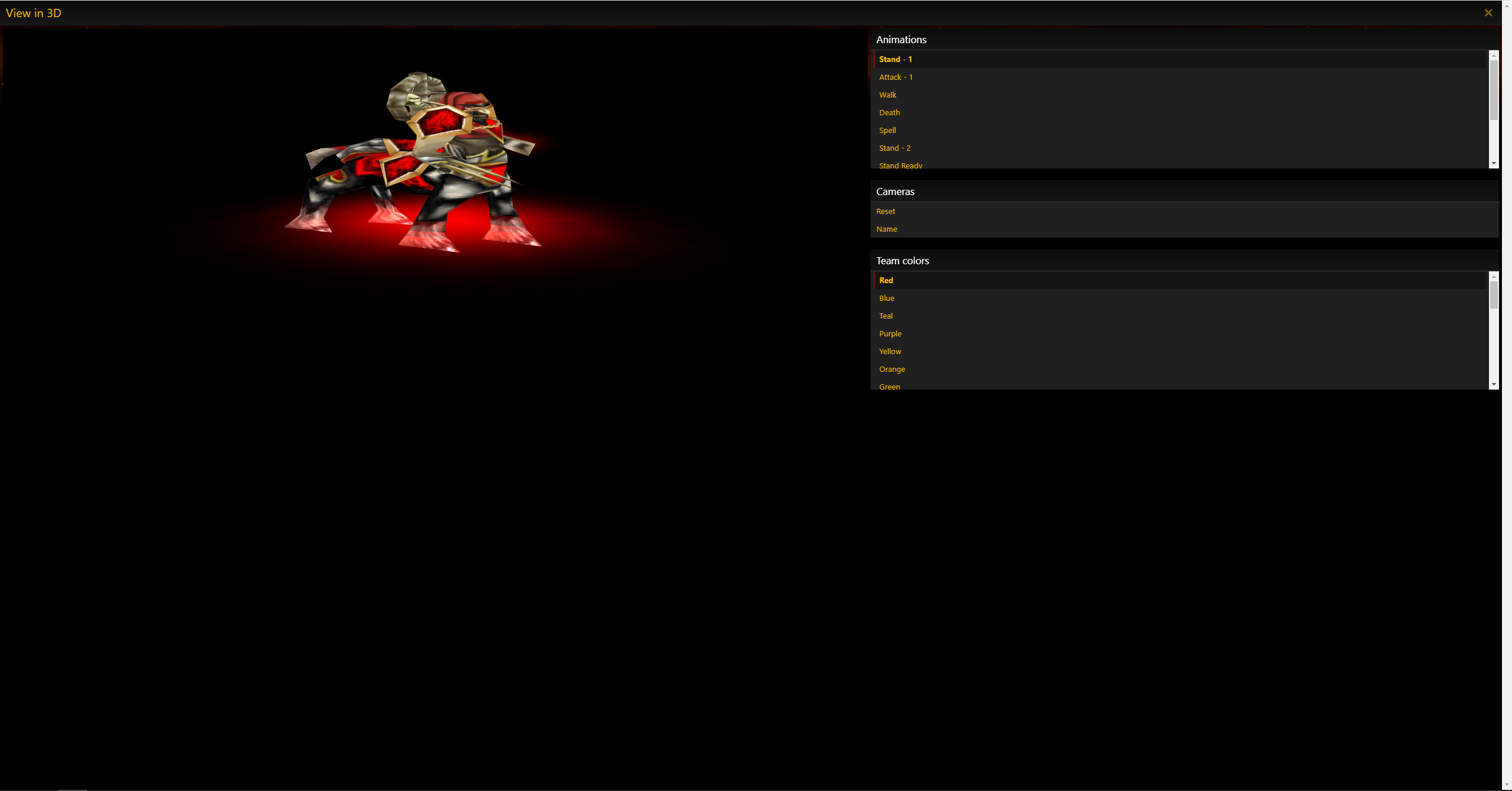
Also, new (Reforged) team colours are not working, they show as an ugly white texture:
unknown.png
 
Level 23
Joined
May 14, 2004
Messages
299
Not sure if this is the primary feedback thread, and I didn't feel like starting my own - Anyway, good job to everyone involved in the redesign, but there are issues as Deolrin pointed out.

thumb-jpg.371026

  • I'm using a smaller monitor and the site feels a bit cramped in the margins. Giving it a few pixels to breathe would be nice.
  • The giant navigation icons on the top are a cool idea, but it feels like there's too much visual noise? Maybe shrinking it would help not make it feel too busy?
  • When you scroll down, the navigation icons shrink and are moved to the top left of the screen which is nice, but kinda makes it harder to read? Maybe that should be made slightly bigger? or have words instead? I'm not sure.
  • Will all personal pastebin threads be ported over?
 
Will all personal pastebin threads be ported over?
They're present, but you can't see them until you have an existing pastebin open. So either you need a direct link or you need to create a new one when going to /pastebin
Seems like an oversight, will probably be fixed.
 
Level 48
Joined
Apr 18, 2008
Messages
8,416
Alright, got another gripe with the resource section.

unknown.png

The columns are unmarked and lack headers, making the rightmost column very confusing since it has a date and a name but it's not resource upload date nor the author's name.
I realize this is the "latest comment", but first of all, does that really need such a large amount of space on a resource page? And secondly, there should be some sort of indication that that's what it is.
I'd much rather see that space used for user and moderator ratings (separately once mod ratings become a thing again), just as an example.

Besides this, it could also be nice to have an "uploaded on..." and "last updated..." space here, possibly even with the ability to sort / filter by that.
 
Level 48
Joined
Apr 18, 2008
Messages
8,416
Please have a look now and let me know what you think.

I took a look and I really like all of the changes! There are a few things that are left unaddressed though. Most importantly the resource section's clarity that I brought up in my latest post in the thread:
Personal Feedback Thread
"Uploaded on..." / "Updated..." dates would be great, and that rightmost column is still unclear (a simple "last post:" header would probably fix that problem, but I still think it's taking too much space that could be used for something else, e.g mod rating).
I also think the number of users who rated a resource should be listed. A 5 star with 1 user rating is not the same as a 4.98 star with 500 user ratings, yet they are displayed practically the same.

The other gripes I have:

  • On the topic of spoiler tags, I think some sort of indication as to whether or not you opened a spoiler should be present. Whether that's a small yellow arrow at the right of the button that changes from top-to-bottom direction to left-to-right direction, or perhaps the spoiler button appearing "pressed down" (as in WC3) and the text changing color subtly, I believe this change will help alleviate confusion in spoiler tag heavy threads (which is basically every large project or news thread on the Hive :smile:).

An option to open a user's awards to see more than 4 will be nice (e.g, a button below the medals that says "see all", I know clicking the awards brings up the rest of them, but that's not very intuitive, and opening a new page rather than a small popup is also not very friendly), and better yet if there is some sort of award count icon or counter on the UI. I also think that 4 is too little to display by default, I think 6, 8 or even 12 would better serve the long-standing users who have proven themselves over and over in the Arena. :wink:

Bringing back user titles below the username would be super nice, also. Right now they exist - but only on profile pages. Having them visible everywhere a user posts would allow that little extra bit of personal flair to everyone.

Other than that - yeah! I love it. Great work!!
 
Last edited:
Status
Not open for further replies.
Top