- Joined
- Oct 25, 2006
- Messages
- 1,174

The Filter panel is so huuuuuuuuuuge.
It's absolutely necessary to have all these tools at our disposal.
(View at the end the sum up of how it would look like once re-ordered)
But it should be better ordered and I think the least common "filters" should be hidden by default, and we shall "expand" something to bring them up when needed.
Also, we might need the filter button both at the top and bottom of the panel, in order not to have to scroll all the way up or down based on which filter we switched (though, I believe the entire pannel should be way smaller by default, so we might not need this if you apply other changes to reduce the cluster).

Filters (Main)
-> Your submissions is a very low priority research for most users, I understand that a lot of modders use this as a quick link to their resources, but it adds a whole bunch of uneeded clusters for the majority of users, if needed, we might have these exact shortcuts elsewhere in quick access (for instance by hovering our profile)
-> Moderation Queue should be a tag at the bottom of the tag list (from the Filters (Main) panel)

Filters (Main)
-> This should be part of the previous panel basically "keywords" appearing just below "most downloaded" (and therefore the "Quick Links" title should become "Filters" or "Search")
-> Maybe "clicking" a tag should instantly perform a search with that tag only instead of toggling the tag (for instance, I'm going to model -> click buildings and it searches instantly instead of simply toggling the tag on/off). While this might disrupt the first three times you click it, I think it's worth the speed for every subsequent use.

Filters (Models)

-> This should definitely something I click to expand, it's rare to do research based on "the number of polygons"
-> Team Color and Team Glow is way more interesting and might be packed elsewhere (for instance below 'Keywords')
-> "Team Glow" should be renamed "Hero Glow" I think
Filters (Icons)

-> Do we really need the new "Icons" filters since you wonderfully added something to automatically add those? Maybe it's not retro-active. In any case, this array of settings should be contained within an expandable panel (maybe with the size/number of polygons, like it is now)
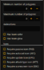
Filters (Asset Parameters)

-> This should go up the priority list, probably above the previous section
-> This might simply replace the previous "Pending Moderation" parameter
-> You might want to put this within an expandable panel
Resource Type (???)
-> I'm already looking within one of the specified sections (Models/Skins/Icons) so it's reducing the clarity for no particular reason. But maybe it's a common setting appearing regardless of your current research page, in this case it should be appearing at the very top of the filters panel in an expandable panel

Resource Type
-> These are too useful to be at the very bottom of the filter page I believe
-> This should be contained in the same expandable panel than the other parameters
-> Filters "Models" and Filters "Icons" should be below these ones

Re-ordered, it should look like that:


RESOURCE TYPE (EXPAND)


(bigger, centered FILTER)
OTHER FILTERS (EXPAND)
Expanded Content:


Expanding "Resource Type"
(this would come in between Keywords and Tags)
I think it should ease out the navigation")
It's absolutely necessary to have all these tools at our disposal.
(View at the end the sum up of how it would look like once re-ordered)
But it should be better ordered and I think the least common "filters" should be hidden by default, and we shall "expand" something to bring them up when needed.
Also, we might need the filter button both at the top and bottom of the panel, in order not to have to scroll all the way up or down based on which filter we switched (though, I believe the entire pannel should be way smaller by default, so we might not need this if you apply other changes to reduce the cluster).
Filters (Main)
-> Your submissions is a very low priority research for most users, I understand that a lot of modders use this as a quick link to their resources, but it adds a whole bunch of uneeded clusters for the majority of users, if needed, we might have these exact shortcuts elsewhere in quick access (for instance by hovering our profile)
-> Moderation Queue should be a tag at the bottom of the tag list (from the Filters (Main) panel)
Filters (Main)
-> This should be part of the previous panel basically "keywords" appearing just below "most downloaded" (and therefore the "Quick Links" title should become "Filters" or "Search")
-> Maybe "clicking" a tag should instantly perform a search with that tag only instead of toggling the tag (for instance, I'm going to model -> click buildings and it searches instantly instead of simply toggling the tag on/off). While this might disrupt the first three times you click it, I think it's worth the speed for every subsequent use.
Filters (Models)
-> This should definitely something I click to expand, it's rare to do research based on "the number of polygons"
-> Team Color and Team Glow is way more interesting and might be packed elsewhere (for instance below 'Keywords')
-> "Team Glow" should be renamed "Hero Glow" I think
Filters (Icons)
-> Do we really need the new "Icons" filters since you wonderfully added something to automatically add those? Maybe it's not retro-active. In any case, this array of settings should be contained within an expandable panel (maybe with the size/number of polygons, like it is now)
Filters (Asset Parameters)
-> This should go up the priority list, probably above the previous section
-> This might simply replace the previous "Pending Moderation" parameter
-> You might want to put this within an expandable panel
Resource Type (???)
-> I'm already looking within one of the specified sections (Models/Skins/Icons) so it's reducing the clarity for no particular reason. But maybe it's a common setting appearing regardless of your current research page, in this case it should be appearing at the very top of the filters panel in an expandable panel
Resource Type
-> These are too useful to be at the very bottom of the filter page I believe
-> This should be contained in the same expandable panel than the other parameters
-> Filters "Models" and Filters "Icons" should be below these ones
Re-ordered, it should look like that:
RESOURCE TYPE (EXPAND)
(bigger, centered FILTER)
OTHER FILTERS (EXPAND)
Expanded Content:
Expanding "Resource Type"
(this would come in between Keywords and Tags)
I think it should ease out the navigation
Attachments
Last edited:


