• 🏆 Texturing Contest #33 is OPEN! Contestants must re-texture a SD unit model found in-game (Warcraft 3 Classic), recreating the unit into a peaceful NPC version. 🔗Click here to enter!
  • It's time for the first HD Modeling Contest of 2024. Join the theme discussion for Hive's HD Modeling Contest #6! Click here to post your idea!

My Progress study drawings that started from sucky ones

Status
Not open for further replies.
Level 16
Joined
Jan 21, 2011
Messages
999
i was having Artblock for two days. When i started drawing, i almost forgot how to draw a face
in here, i was trying a cartoony style. long neck, big head, small slender body. But something in me wanted to make the face slightly more realistic.
this was the result. My only regret is i couldn't make it more cartoony enough. His head seemed out of place
KyanFiltiarn.jpg
 
Level 16
Joined
Jan 21, 2011
Messages
999
Those are some cool works, I especially like that destroyer, it looks very tough :D(though the backround looks lacking while the wave of the water might have been too strong)
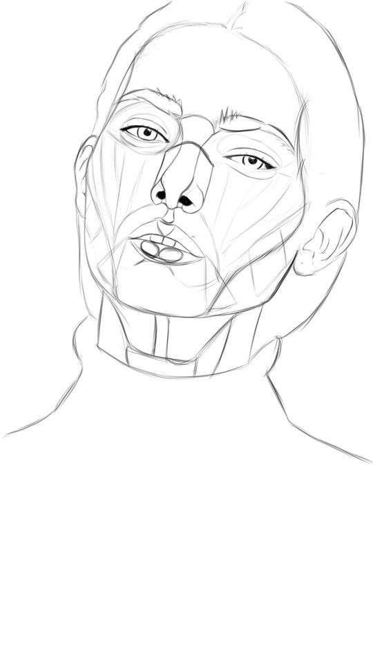
Oh, and the first one looks kinda like Jackie Chan ^^

Haha yeap! The compositional balance in the destroyer pictures are certainly lacking. The atmosphere depicts a calm foggy composure while the waves insist it going very fast. I haven't thought about that through! Thanks!

Guy looked like Jackie chan lol because the client showed me a reference image of a military man with messy medium length hair
 
Level 16
Joined
Jan 21, 2011
Messages
999
i was having Artblock for two days. When i started drawing, i almost forgot how to draw a face
fuck having to forget how to draw a face!, I'm never gonna let that happen again.
if there's anything i hate feeling most is feeling that you already knew how to do it and then forgetting how to do it, i mean fuck i just jumped on that hurdle! now that again!? fuck that man, FUCK THAT.

anyway, just recently started my own challenge to myself. I'm gonna draw portraits for 40 days.
and on the last day, i'm gonna compare my improvement to see how much i have improved.
source.gif
 

Attachments

  • 1.jpg
    1.jpg
    393.2 KB · Views: 97
Last edited:

deepstrasz

Map Reviewer
Level 68
Joined
Jun 4, 2009
Messages
18,706
Confusing thread name :p I thought @Idaero Ace posted his stuff here today. Goes to show that both threads start with the same sentence but end with different names :D.
Anyways, cool heterochromia iridum. You can use this kind of stuff to create rainbow-esque (asymmetrically coloured) creatures.
 
Level 15
Joined
Dec 21, 2013
Messages
910
Mastah! Anyway, there should be only 1 master, but currently there are Master Goblin and Master Kurt.
I think I need call you the Hentai Kurt again lol. I'll call you Master Kurt once you beat Master Goblin in art contest, and then I'll call Mr. Goblin to Hentai Goblin (lol this sounded more hentai). But, I will stick with the Mastah Kurt!!

@deepstrasz lol the idea, because Kurt is my Mastah! The Mastah Hentai Senpai Kurt
 
Level 16
Joined
Jan 21, 2011
Messages
999
My whoozy just-woken up brain was very confused, at first i thought someone changed my name, then i thought someone hacked into my account then i thought hiveworkshop's been a bit glitchy
after some coffee, i realized @Idaero Ace just changed his avatar XD nice prank, really got me there!

I'll call you Master Kurt once you beat Master Goblin in art contest, and then I'll call Mr. Goblin to Hentai Goblin (lol this sounded more hentai).
I've learned my lessons and i've gotten better ;) i've learned more neat secret shadow techniques that i'll be using in the next contest. Until then, i'll just be posting some human drawings to increase my drawing proficiency.
 
Level 28
Joined
Nov 12, 2007
Messages
2,340
Cool starships, you could've made the thumbnailing a bit bigger though. They look like shards of something atm. Looking forward to see the results!

never show your printer you're in a hurry, those damned things can smell fear

Oh yes, those evil things surely do. Although I feel they're much better "tamed" if we compare with the ones from early 2000's.
 
Level 16
Joined
Jan 21, 2011
Messages
999
Cool starships, you could've made the thumbnailing a bit bigger though. They look like shards of something atm. Looking forward to see the results!

yes well, that's the point of thumbnailing so you could focus more on the shapes than the details, any more bigger and they'd require more attention than required. i sort of think they're bigger than necessary. Made them like, 10-20 seconds just randomly scribbling until some shapes comeout and i refine them. After that i choose probably 1 or 3 from them and that's where i render them :) helps with artblock you know? :D

 
Level 15
Joined
Dec 21, 2013
Messages
910
Sometimes I confused between your thread and Edgy's thread. Thats strange o.o

Uh oh I believe this one hasnt pointed out yet! But becauae you already said that so I wont tell you :p
 
Level 16
Joined
Jan 21, 2011
Messages
999
it's really funny because the more you make it more realistic the more people will notice all the small details.
WLOP is one good example of how not to do that but still make it awesome.

Moon and Night

is one of his many examples. You could say the girl's nosebridge is wrong or the lips are too small, but essentially, it's the readability of the art the artist makes them on the appropriate size and thus disregarding the finer details in favor for better composition
 
Level 15
Joined
Dec 21, 2013
Messages
910
Err.. that glasses still the same for me. You know glasses should be in front of eyes, and will looks flat from side view, unless its something like the one used for sport thingy (this is what I wanted to say since yesterday)

edit: lol just remembered that there is that kind of glasses, lol, sorry
 
Level 16
Joined
Jan 21, 2011
Messages
999
Err.. that glasses still the same for me. You know glasses should be in front of eyes, and will looks flat from side view, unless its something like the one used for sport thingy (this is what I wanted to say since yesterday)

edit: lol just remembered that there is that kind of glasses, lol, sorry

making glass is hard lol haven't practiced that yet. But at the same time he's not really wearing a glass, those are the kind people wear for nothing but style lol.
also yeap, gonna take your advice and adjust the glasses a little bit. I do want to show the eyes though, and he's not really in a side-side view.
ScreenShot_20161209233345.png

I'm gonna make more adjustments to his face since he does really look like he's in a direct side view. Maybe put the glasses directly at the front like you said.
But yeah, someone pointed that his face are too far forward so i'm gonna make another adjustment. Hopefully this time it's correct.
 
Last edited:
Level 16
Joined
Jan 21, 2011
Messages
999
So i did what you said @Idaero Ace , it does make it better! you were the first to point that out of many people, so i thought it didn't needed to be changed. Also because i'm lazy and i've already merged all my layers, so painting on it again is sort of a drag. You're right! and it does make it better!
so i hope this is my final revision! :D
 

Attachments

  • 707.2.jpg
    707.2.jpg
    1.8 MB · Views: 106
Level 16
Joined
Jan 21, 2011
Messages
999
I just saw Liu Kang, Jet Li, San Goku and Jackie Chan merged!!
Nice digi painting btw, the gaze is really good XP
lol thanks, was trying to emulate oil painting or acrylic, but i think i blended the colors too much in the face so the paint textures were all gone :/

quick shot of what i'm working on. Friend says i can't draw anime :/ i'm gonna try to prove her wrong :p also don't mind the long legs, i like long legs XD
 

Attachments

  • falling.jpg
    falling.jpg
    149 KB · Views: 157
Level 16
Joined
Jan 21, 2011
Messages
999
I think Imma sort of will agree with Idaero Ace, that you're really a pervert XD
Well anyway, can you tell me its workflow,
It seems you're finished with the sketch, then flat colors, then depth would be next right?
how come?!?! :O i thought this was romantic ._. like they're falling literally in love or floating on some clouds or underwater :/

well for this one i simply did
-sketch
-flat colors
then i'm about to do some depth.

in some cases, sketch > depth > flat colors when you needed to focus greatly on depth like landscape or background drawings with which, it would be advisable to start with grayscale first ^_^
 
Level 16
Joined
Jan 21, 2011
Messages
999
Still a WIP, still waiting for the masters for some C&C on facebook.
critiques i've gotten so far:
  • upper half is too boring, thunderclouds advised
  • Army is too uniformed/linear/repetitive. Advised to add some Variations
  • I have you surrounded.jpg <- yeap, thumbnail seems too washed out
 

Attachments

  • 15591071_1352378724781707_5067214098420688354_o.jpg
    15591071_1352378724781707_5067214098420688354_o.jpg
    769.4 KB · Views: 151
Last edited:
Status
Not open for further replies.
Top