• 🏆 Texturing Contest #33 is OPEN! Contestants must re-texture a SD unit model found in-game (Warcraft 3 Classic), recreating the unit into a peaceful NPC version. 🔗Click here to enter!
  • It's time for the first HD Modeling Contest of 2024. Join the theme discussion for Hive's HD Modeling Contest #6! Click here to post your idea!

My icons

Status
Not open for further replies.
Level 13
Joined
Jan 21, 2012
Messages
1,982
Hey guys! In this thread I will be posting my icons , I hope I receive some fedback here!

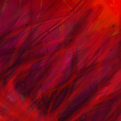
Ok so I will call this Burning Grass
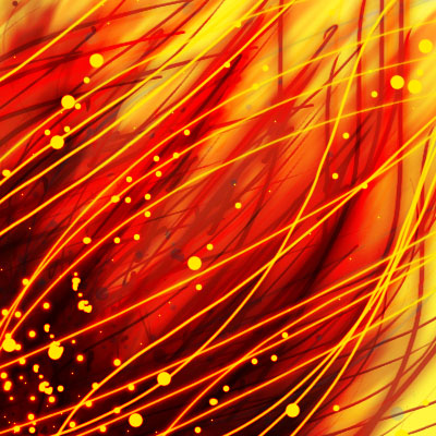
214358-albums6123-picture65637.jpg

Damn%20shit1.jpg

 
Last edited:
I personally don't believe that this is actual freehand content, as I have seen previous work of you.

Our Icon Submission Rules state that filter work (and similar) is not considered freehand work.

Now, a hint on the way:
Always make sure that you check / test your recent project in a 64x64 image - to see if it actually works as an icon.
Are the details you want to show actually visible?
Does it look coherent? Do the colours work together?
Can the concept be seen right away, or does it take several glances to understand it?

Also, I think you have watched CR's video tutorial, where he showed people how to play around with colours.
Experiment even more with them, on gradients, not just with a single spot etc.
 
Level 13
Joined
Jan 21, 2012
Messages
1,982
Thanks for the review! So for the first question witch is

Is this free hand ?

30% free hand , I used a brush pack so its actually just placement but I did use free hand to continue the lines.

And yes I do check out for 64x64 but this was just testing and it was not ment for the icon section :) I just want to get fedback of what I do and I'm really thankful :)
 
Level 3
Joined
Feb 10, 2013
Messages
40
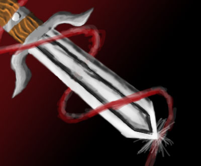
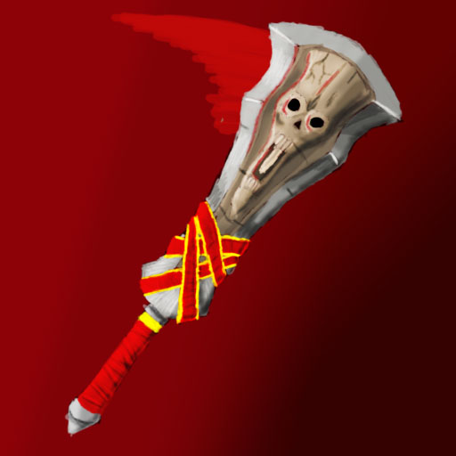
I feel the sword icon could use more eye candy ; maybe adding some more "flashy" background or improving the little red twirl around it ?

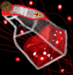
I like the Hellfire one though :) As for the bottle, I feel the background is kinda iffy ; I feel it's neither empty nor flashy ... Gravitating towards one or the other should give a better result :)

Kepp up the good work !
 
Level 19
Joined
Jun 29, 2009
Messages
6,760
After realizing you wasn't trying to cheat (At first I was like, what, who took my son and replaced him with a cheating bastard skull?), I must admit that I'm proud of you. Just because it isn't my way of doing art, of course that doesn't mean it isn't art. Good job, sonny :)
 
Status
Not open for further replies.
Top