Chaosy
Tutorial Reviewer
- Joined
- Jun 9, 2011
- Messages
- 13,295


Map Development Thread GuideBy ChaosyIntroductionGreetings, this tutorial is supposed to show you a few tricks with BB codes to make your map presentation look awesome. This can be applied for your map development thread, which can later be copied to the map section if/when you release the map. This wont improve the map itself but it will make more people check out your map, and it seems like a more serious project overall. This is not a template, it is a guide. If you want an already finished template go here: https://www.hiveworkshop.com/forums/miscellaneous-tutorials-456/map-description-templates-171659/ ContentTo start with, your thread needs to be informative. If you make a thread that says "Guys I made a ORPG, play and have fun! *link to map*". It will not be taken seriously most of the time, not to mention people want to know what they are downloading. The following sections are included in most map threads.
I usually include way more than this, but I consider it good enough if it's done properly. ColorsColors are a wonderful way to give a certain feel to your thread. For example if you have a campaign about a human general, having a blue color to the text seems pretty logical. However there are bad colors, and good colors. Try to read this Try to read this The light blue color is just about 10x easier to read according to wikipedia and other scientific research. (not really) It is usually a good idea to use a mix of colors that are similar. If use an orange color for an orc based map you could do something like:
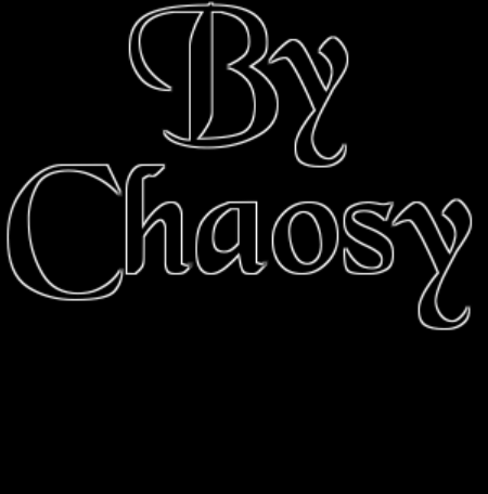
TitleThe title which is usually the name of your map in big letter at the top of the thread, which is the first thing a user will see. Thus, it is important to make it look good. Plain text is boring, we are going to use an image instead. And since not all of us are gifted artists (curse you, talented ones!), we will take a shortcut. Go to either www.cooltext.com , www.flamingtext.com or any other similar website to create your title image. While some think the animated ones are really good, they are not. Try to keep it simple. As such I took the following image. 
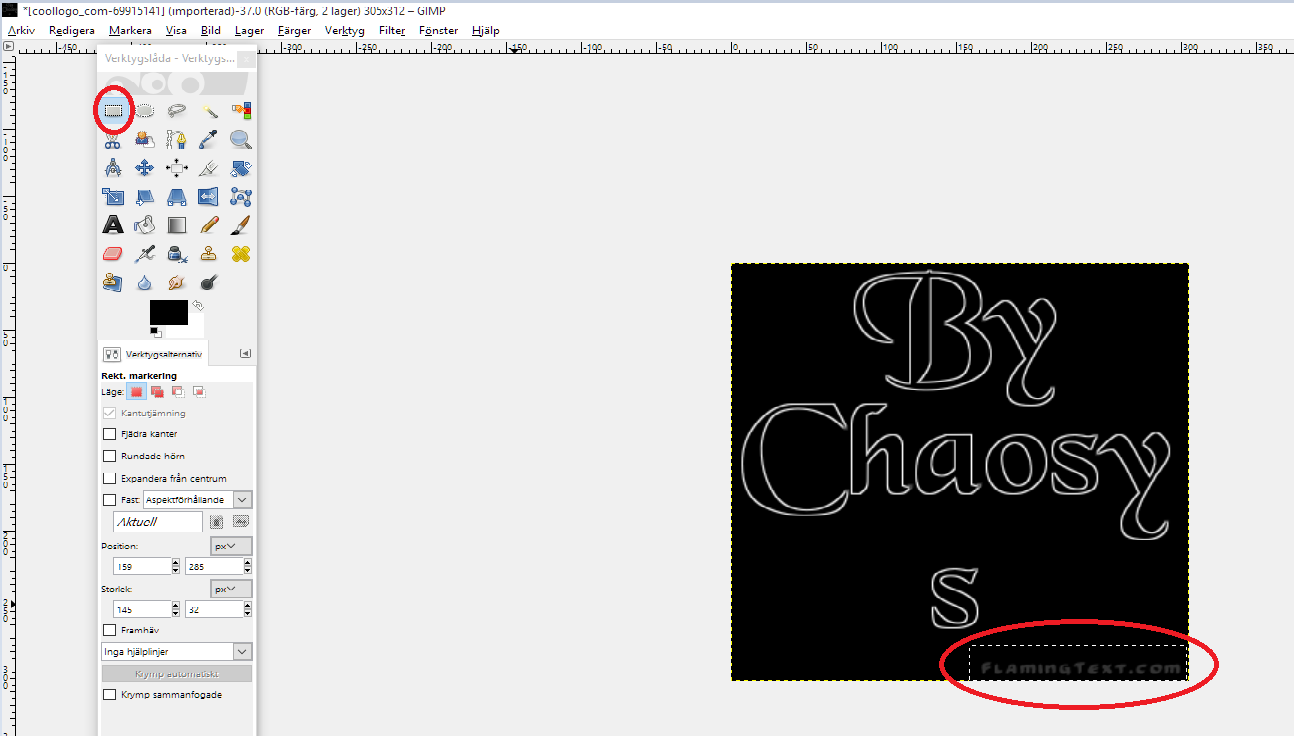
Do note that some filthy websites put their logos on the image which force you to remove that with a (free) photo editing tool such as Gimp. To make this easier, I just wrote an extra row which means the little logo is isolated and easier to remove. Select a region with the rectangle selection tool and press delete.
ScreenshotsMost people can do this. However few can make it look good. We are going use the
|


Attachments
Last edited by a moderator:


