• 🏆 Texturing Contest #33 is OPEN! Contestants must re-texture a SD unit model found in-game (Warcraft 3 Classic), recreating the unit into a peaceful NPC version. 🔗Click here to enter!
  • It's time for the first HD Modeling Contest of 2024. Join the theme discussion for Hive's HD Modeling Contest #6! Click here to post your idea!

I'd name it moose. but. ergh.

Status
Not open for further replies.
Level 28
Joined
Aug 7, 2011
Messages
1,638
Hmm.. ok... I uploaded these stuff here, cuz Hivers give good feedback.. and I really need it xD I want to know.. what I should improve, as in Lightning, Shape, Pose, Positioning, Atmosphere, Detail quality (very very sucky), etc.

209078-albums6010-picture64099.png


one of my first paintings btw. It took me a lot of time. And it didn't turn out that well :D


209078-albums6010-picture67377.png


The shape here is very fucked up I know. But hmm. If you can tell me what to improve (I won't do it of course, I'm too lazy xD, I just want to note this and.. know it from now) in the atmosphere here, I'd appreciate it :]


209078-albums6010-picture69716.png


The hand before the wrist looks very.. unattached to the palm. The. hand, what's it called :/? I tried several ways but it just looks. weird.


209078-albums6010-picture69718.png


209078-albums6010-picture69719.png


I mean, damn. Heads are really hard to draw o_O


209078-albums6010-picture71001.png


209078-albums6010-picture72377.png


209078-albums6010-picture74486.png


209078-albums6010-picture74645.png
209078-albums6010-picture74646.png


209078-albums6010-picture74725.png


209078-albums6010-picture75535.png


file.php
file.php


209078-albums6010-picture75884.png


21430abc8b1f828e5c57b437ceeebff7_75830.png


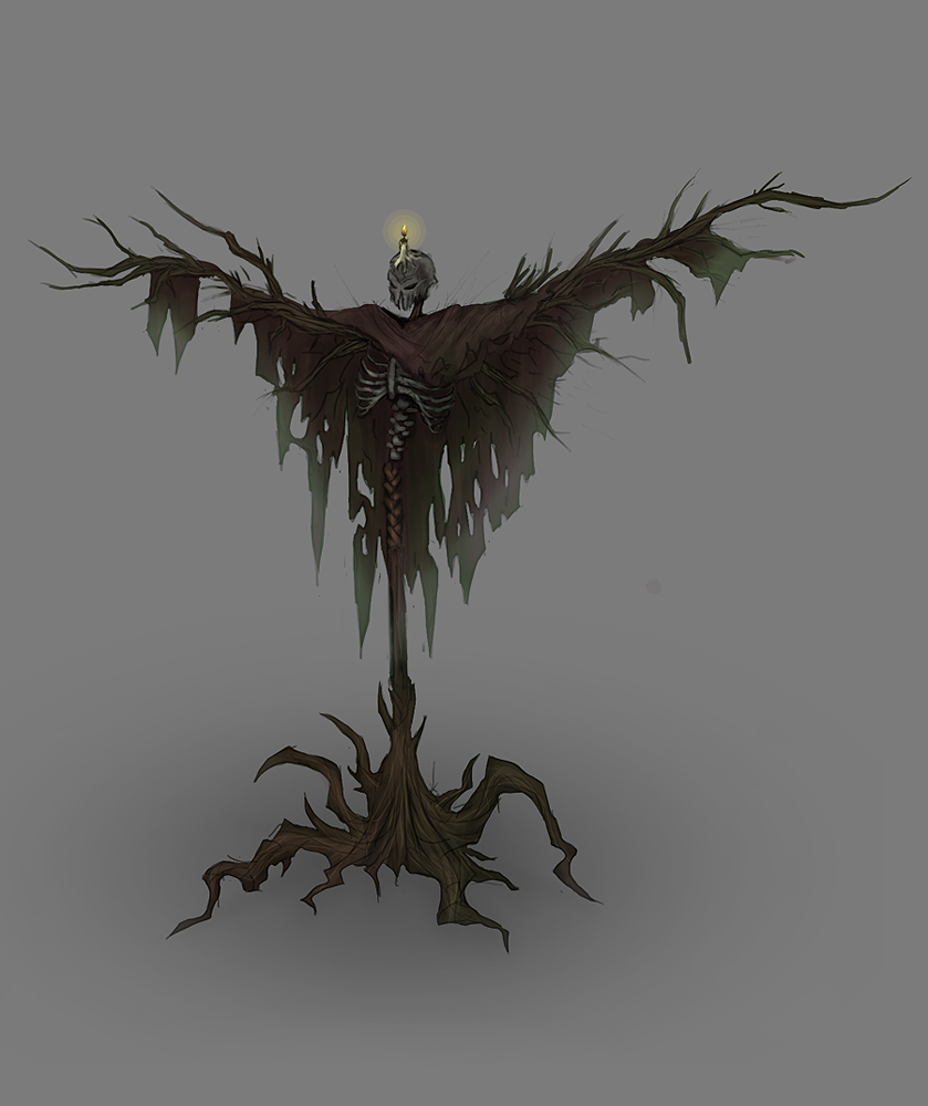
Edit: I just noticed this looks awful from Laptop Brightness. Hmm, my Comp's screen is really dark, even when set to maximum brightness -.-


209078-albums6010-picture77526.png


Aaand I just noticed it's damn dark from my comp, since I painted it on the laptop :/ Brightness issues again. I should really find a way to fix those :X It fucks up everything.


209078-albums6010-picture77681.png


209078-albums6010-picture79672.png


209078-albums6010-picture79673.png


209078-albums6010-picture79671.png


209078-albums6010-picture79674.png


file.php


209078-albums6010-picture83182.png


On some monitors most of my paintings might appear really really dark. It's because the Internet and the Windows 7 Image Previewer add more contrast and reduce light. I've been looking for a way to fix this Darkness Issue from long ago, so far I got nothing except using Irfan View, which previews better than the Win 7 Image previewer. If anyone knows how to fix this, please tell me, I'll be really grateful ^^
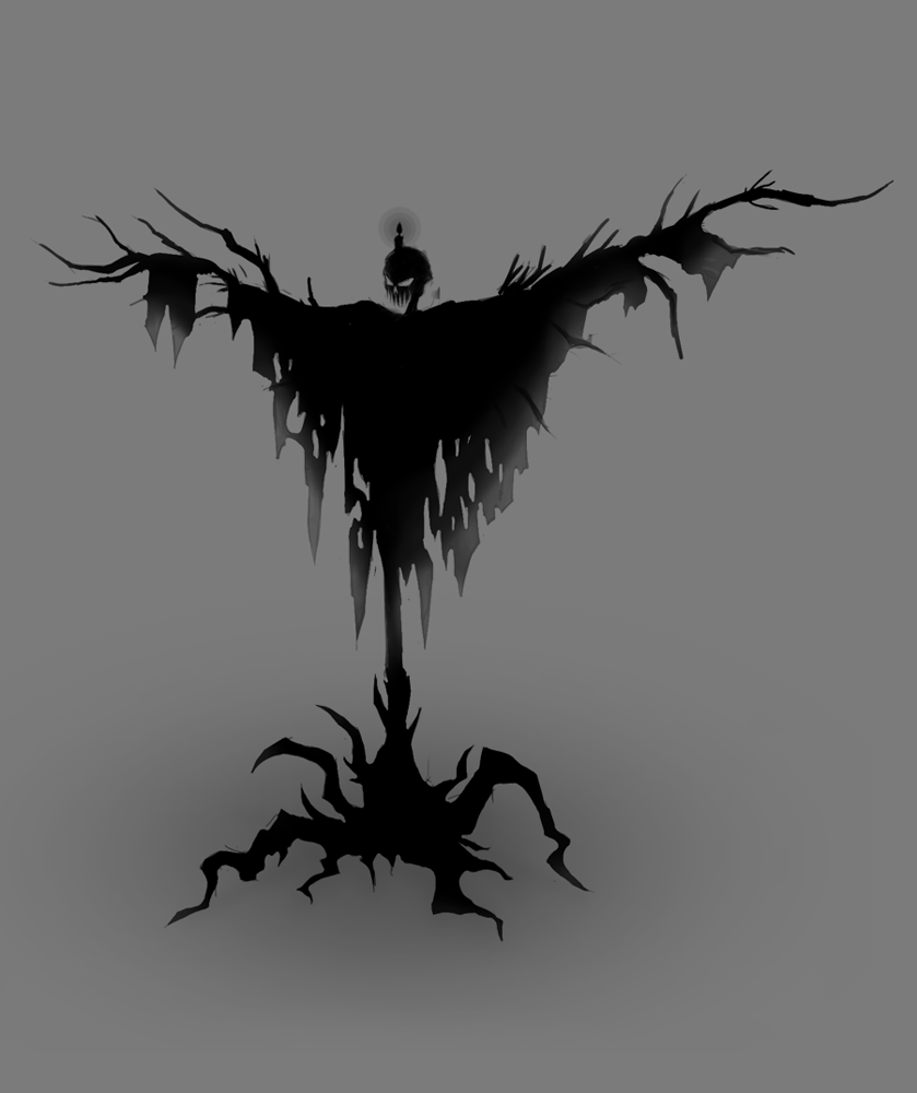


209078-albums6010-picture64097.png
 
Last edited:
Level 28
Joined
Aug 7, 2011
Messages
1,638
Heh. Thanks Hell Master :D


--> About how I "achieve it".. hmm. Well, firstly I start from the head as a simple circle. Some people prefer starting from the legs, because it will give you a good position, but I prefer from above because that way I can make the figure in a better pose. After the head I choose the angle for the torso. And, since, in most drawings the torso is upright I only have to choose the angle for it, nothing else. Then comes a very important part - the hands, with them you can represent Power, Weakness or any type of Feeling to your character. If the hands are going upward they represent Power. Another way is to back the head a bit (even if it is a bit unrealistic) from the torso and make the torso go a bit forward. Then come the legs which are extremely hard to draw (at least for me, mostly the feet). With the legs you have to make your drawing stable. Pro artists say that if you descend a vertical line from the head it must fall between the two feet --> that way the figure is stable. I have noticed though, that this isn't always correct ;D like, if you have a person standing like a... a flamingo, this rule won't apply and you can still make him be balanced and stable.

--> Another important thing you must do is to study anatomy - a really hard thing btw. However, there are ways to ease your work, for example, my bro has many books about anatomy and I use them to look at figures - proportions, gender of figure, etc. It helps a lot to show you a standing figure. Stuff like that - http://t3.gstatic.com/images?q=tbn:ANd9GcT2HWu4ir6SkyB_K89XIC2-drl6gDfvrozvOMp0giSO6-lOE0pekw

but there are only a few books which can show you how the body changes when it's moving.. The knee, for example, move your knee! See? Even with the slightest movement it changes so much!


--> If you want to become a real pro artist, you will need to do one (or more, even better) of things like: Take lessons from a good art teacher (or ask your art teacher in school when you are unsure about something), Buy a book about art (it's really hard to become good with ONLY this though. Because it only shows ways and techniques and does not teach stuff. (I started with Matt Dickson's book about fantasy creatures and such (it also has human figures and all that) and now Bames), or observe Nature, the best and most time taking way :/ All artists in the past are so pro because they didn't do shit all day, just drew humans and nature :cgrin:


--> Here is a very important tutorial about visual library (your fantasy level and all this, a thing you will need if you want to draw as a Game Artist and such. not just a street artist, because, sadly, that's where most Really Good Non-Fantasy Artists end up ;( drawing amazing paintings for no money.. + it's not really interesting to draw the same thing every time - human faces, humans, nature, human faces, humans, nature, human faces, humans, nature. It becomes a bit boring)

Here's the tutorial:
http://www.youtube.com/watch?v=dnflBERf2zM watch it if you have time. it's really good


As Feng Zhu says here, art is not a talent, everyone can do it. What is art actually? Copying the stuff from your mind and/or from what you see in front of you. Everyone can copy right?

 
Level 10
Joined
Dec 17, 2011
Messages
347
You got da good stuff man!
But let me tell you some crits:

1. The armours and metal in general should get a much darker overall value, becouse metals doesnt have really a value, its just reflects light and when it dont reflect it to the camera its pretty dark.

2. Also you should use darker values on some places. You may add like 96% black value to places like between two armor plates in the armpit etc. I know, there is the contour but meh.. :D

3. Lack of color in some places. For example i'd used much more intensive colors for the flag, and that....stuff on the head of black knight.

4. Highlights seems not related to the light sources sometimes. Try to brainstorm harder where the lights hit...

5. This is just optional but colored lights are useful, they makes the dudes much cooler most of the times!

The moose be with you!
 
Level 28
Joined
Aug 7, 2011
Messages
1,638
Thanks Justice :D that's good advice.
1. Yes now I see it, I can darken the non-lighted areas, it would really look cooler (for example on my last 2 pics)
2. Absolutely correct! Thanks for that one, it would be really useful. I never really thought of that hehe.
3. I wanted it to be grayscalish here :D To give it a more dead feeling and not so intense.
4. I don't understand light.. I just can't :\ I've tried brainstorming it (make light sources, use lines to see where it falls etc.) didn't work... I just can't ;___; I am trying to learn it though, but without any advice of how it works from anywhere it's hard.. I mean, no Art Teachers explained it well to me, no Videos in the Internet about light (at least not the ones I am looking for)... I don't know.
5. Colored lights are good, maybe not even optional :D they are Essential. It's just that, I can't really get a good color.. After I finish a painting I am like "wut but the light/glow effects aren't waht I wanted them to be.. not intense enough!" or while I pick the colors I can't really find one which could work. Or brushes, the blurry "glow" brush isn't blurry enough for me, and I can't figure out how other artist make light blurry, intense and lightish when I look at videos of how they draw. I've watched many tutorials, I've done as they do it but the end result is nothing like what they have :/ Hmm...

Enough complaining :cgrin: I should start drawing moar ^^ More drawing = More skill, everybody knows that..


MAY THE MOOSE BE WITH YOU TOO JUSTICE !!
 
Level 10
Joined
Dec 17, 2011
Messages
347
First post updated ^

I added a gray version, fixed the highlights.. I think xD How is it now Justice :?
There's a lot more detail that needs to be put but I'd rather make some more paintings than master this one :cgrin:

Woow, datz got pretty nice! :goblin_yeah:
Im glad i could help something.

I know exactly what you feel. Becouse it takes me f*cking long time, and i mean **********ing long time to detail a painting, and often i get bored and just just lead off another piece before i can complete something... :goblin_cry:

Keep up good wrk!
Btw i going to upload my.... things here to the Hive soon. :)
 
Level 28
Joined
Nov 12, 2007
Messages
2,340
No, don't say that lol

You can paint, it just didn't look as neat and professional as it does now! I mean, if you can keep with the quality you achieved with your last one and build a portifolio, you could easily be hired for some illustration job, as now the employer would feel he is dealing with a professional guy :p
 
Level 28
Joined
Aug 7, 2011
Messages
1,638
Wooow D: I'm far from getting hired hehe xD but thanks for even .. thinking of that :)

I haven't even finished school yet ;D wuwz.
I just can't paint, I have no idea how Lightening works, what colors to use, and I am too impatient to put detail :/ There must be some technique, some main painting technique people use when painting digitally, but I just can't find it >.< And from tutorials you don't really learn those stuff, they are quite useless for me. Not that I'm "too good for them" or anything like that, it's just that they don't tell much stuff there, they just paint and.. say some words in between. Even the best painting tutorials are a bit useless, like FSD Feng Zhu's, Sycra's tutorials :X The best I could find I mean.

Anyways, I won't bother you with these boring stuffz :cgrin:

Comments like yours though, make me want to draw :D So.. thanks man! Really.

Of course, bad feedback is also very appreciated because I need to know my minuses >.> only a side viewer can see them fully. So, when you think something sucks, say it.
 
Level 28
Joined
Aug 7, 2011
Messages
1,638
Coming soon!

http://www.hiveworkshop.com/forums/pastebin_data/pjtd76/Vampire.jpg

First I gotta figure out how to fix the hands and some other figure problems and then I guess I will finish it :cgrin: It was supposed to be a Dracula for Halloween but since i can't draw human faces I made that beastly face and then.. after trying some Dracula Costumes on it I decided they don't fit, so in the end I went for Van Helsing Dracula wow ;D muscle guy
 
Level 4
Joined
Sep 10, 2013
Messages
85
The "Shadish guy in a half robe or whatever" could use a lot of shadows, since it appears he is somewhere enclosed. The brazier is another main element, whereas it is a source of light. It would be a lot interesting if the subject was lit with fire-light as it kind-of emphasises a darker atmosphere. . The "half-robe" would do well if it was connected to a larger part of the shade instead of looking displaced and present below the chest only. Also, the arm bones of the subject are quite thin and unnoticeable from the angle he is in.

The "Skeleton-Ghost guy" is a bit too small and the background a bit too big. Is he floating up above the horizon, or is he amidst a bluish smoke? The lightning could use a lot more light since lightning produces a lot of light. Also, apply the rule of thirds.

The "druid dude"'s arms are too short for his stature, and he is better off with a dagger than a cutlass. The gems and the herbs are a nice touch also.

Is the Priest's head is made of light?

The Headless Pyromancer could use blood in his decapitated neck since he is rather fit to be 'living' in undeath for a very long time.

The black night could use a lot of contrast, in terms of shadows and colour. He is too pale, unless the atmosphere you intended for him is somewhere dusty or bathing with light. The latter which needs proper shadows. Also, the tuft of hair on the armet of the Black Knight is quite fabulous. Haha.

In my opinion, the first warrior is better off with only a sword than with both a sword and a spear, that or with the spear tied to his back.

And the second warrior is better with an ornate, gemmed iron belt than a loin cloth.

The Blade Runner's right arm lacks size, in terms of perspective. Also, he is quite nice. I like the spider-ish touch to his design.

The swamp could use a lot of phosphorescence, like an eerie green glow or whatever.

The Scarecrow is nice. I think it would be better if it was structured like a tree with a skeleton only from the spine up, without arms, tied to the tree. And with many candles on its shoulder instead of it forehead.

EDIT:
Okay, so I didn't read the other comments... Anyway, notes for you :)
 
Level 28
Joined
Aug 7, 2011
Messages
1,638
Wow! Thanks for the feedback, it's really good. I agree with everything you said except maybe some stuff like the spear and sword, I don't really see what's wrong with that :D he's on guard duty or something, not in a fight, where he wouldn't be able to use them both at once. And aa.. the headless pyromancer doesn't have a head because I just can't draw it :D Not because I wanted him to be.. headless.

But really, stuff like the short arms of the druid and such, I hadn't really noticed them. Sure, they are old paintings of mine, which means that they are suckier but still.. I didn't really know what's wrong with them, I just knew it is. You just pointed out the reasons why they suck. And I also noticed that the first warrior's legs are too fat. Even if he's wearing plate.

I didn't get what you meant about the second warrior though, about that gemmed iron belt.. you want him to have a gemmed iron belt rather than a cloth? But he doesn't have a cloth.. Hmm.. I mean, he has a belt with a gem :D


Thanks a lot for spending time here to help me out though :)

(The Swamp btw was meant to have an eerie glow but then I reduced it >.< cuz it didn't look so cool. I just can't make light stuff. I suck at this. At painting as whole, I guess.)
 
Level 4
Joined
Sep 10, 2013
Messages
85
The sword and spear was just my opinion. Having both does seem to make him look badass but anyway, it's just my opinion.

Okay, so he wasn't actually headless. How about adding a centurion helmet? It'd be nice, I think.

I reread my comment, and I realised that I forgot to say "bigger ornate, gemmed, iron belt". By cloth I meant the thing draped in between his legs.

You're welcome, I was trained to do this. I draw and paint too, and I do agree with your statement that only other people can see the flaws of your works. So yeah, basically we need to say what sucks about each other. LOL, kidding :)
 
Level 28
Joined
Aug 7, 2011
Messages
1,638
"So yeah, basically we need to say what sucks about each other. LOL, kidding :)"

No, no, not at all. We really do have to say it :D Why kidding? As long as it is said in a friendly way, not just hate comments it's really useful for both sides.

And about the cloth.. a.. what about it :? You want it to be more.. clothish and not so plane? Well, truth is I can't make it look okay :D

Helmet to the pyromancer? Well, it's my solution to everything - hood, helmet, something else, just not the head. I really wanted to draw a head this time but when in the end it turned out so ugly I erased and just dumped the painting, I was too not-in-the-mood-for-drawing after that. And well, with time it just got old and, I think that now I can make a better one, so I doubt I'll come back to it. Just for the idea I guess.
 
Level 4
Joined
Sep 10, 2013
Messages
85
It's kind-of too much for me.

How are you doing with your paintings now, are you getting better? Because you said you weren't good at it.
 
Level 45
Joined
Jun 3, 2005
Messages
6,982
Level 28
Joined
Aug 7, 2011
Messages
1,638
Aaa, that's.. that's a good idea Kimberly. Actually I did have an idea of the background itself and the light would be the moon (not visible though) --> light coming from above so I'll just have to shade some areas which aren't hit by light from above afterwards. I just wanted to paint the overall value of a body and then focus on light.

But yeah, a rough terrain sounds like a nice idea. Just let me finish the body, only 1 hand left :cgrin:
 
Level 4
Joined
Sep 10, 2013
Messages
85
The deltoid part does seem kind-of big, so, make his rib area a bit larger, or his left arm a bit smaller. But if he is angled (making the right arm bigger), then add a little shadow to his left arm to suggest that indeed, he is angled.
 
Status
Not open for further replies.
Top