Moderator
M
Moderator
17:55, 20th Jun 2013
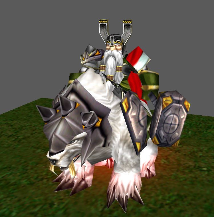
Deolrin: Personally, I think you've done enough to change the walk animation. It looks good enough to me as it is. However, in-game, the current walk animation looks too slow - I really think you should use the "Walk Fast" animation as the default("Walk") animation, and rename "Walk" to "Walk Alternate" - in that way, people will be able to set tag requirements to "Alternate" to use the slower walk animation, in case they need to. Another problem I noticed is how the rider holds his hammer - the edge of the handle is a bit too close to his hand, and he looks like he's about to drop his weapon. You should move it back a bit, or extend the handle. Additionally, the hand holding the weapon is a bit too stiff during "Walk" animations - I suggest you make it bobble up and down a bit. Finally, the spikes on the bear's helmet and the shoulderpads look unfitting, and honestly, pretty bad. I think it's because you tried to put so many details on them, and how lowpoly they are. I suggest you rewrap them to use the spike texture found on the bottom of the Mountain King texture - it is generic, gray, and looks great with just about anything.
Deolrin: Personally, I think you've done enough to change the walk animation. It looks good enough to me as it is. However, in-game, the current walk animation looks too slow - I really think you should use the "Walk Fast" animation as the default("Walk") animation, and rename "Walk" to "Walk Alternate" - in that way, people will be able to set tag requirements to "Alternate" to use the slower walk animation, in case they need to. Another problem I noticed is how the rider holds his hammer - the edge of the handle is a bit too close to his hand, and he looks like he's about to drop his weapon. You should move it back a bit, or extend the handle. Additionally, the hand holding the weapon is a bit too stiff during "Walk" animations - I suggest you make it bobble up and down a bit. Finally, the spikes on the bear's helmet and the shoulderpads look unfitting, and honestly, pretty bad. I think it's because you tried to put so many details on them, and how lowpoly they are. I suggest you rewrap them to use the spike texture found on the bottom of the Mountain King texture - it is generic, gray, and looks great with just about anything.


 Approved


