Moderator
M
Moderator
20:24, 8th June 2012
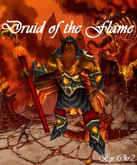
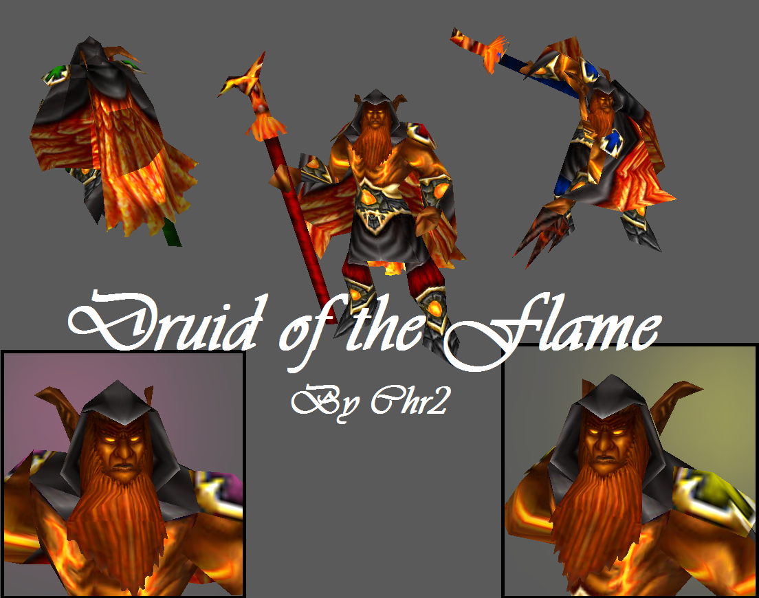
67chrome: Overall this looks pretty cool, I like the detail work on the face, overall color use, and various details and textures. The feathers in the cape are perhaps a little large, but nonetheless this seems like a solid resource for the Hive
ʞııɥs: No changes have been made for two weeks, moving to rejected (until updated).
ʞııɥs: It's better, but I still think the face could use some sharper lines. I also noticed the beard is looping, that is, the ends are meeting in the lower part rather than hanging straight down. Not sure if that was your intention, but it does look odd to me.
ʞııɥs: Face really lacks depth and is also quite blurry. It all seems to lack a bit of contrast, really. I love the design for the belt (thing), though.


 Approved


