- Joined
- Sep 30, 2008
- Messages
- 1,459


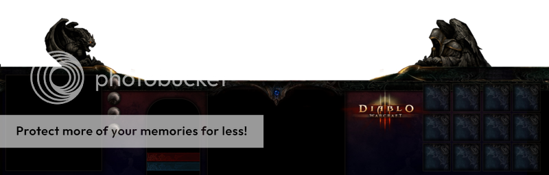
As part of my Diablo III project, ive decided to try out a custom interface for the map. Ive posted a screenshot below:
Updates:
All the texture work has been taken from the Diablo III fansite kit.
__________________________________________________________
Only problem is, I've got no idea how im going to take my .psd, chop it all up, and finally, import it into Warcraft III :S
Could I enlist the help of someone to do it for me? Full credit given on the hive page, and the in-game quest menu for whoever helps
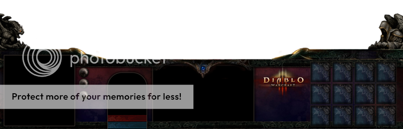
Last edited:
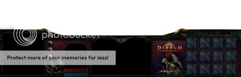
") with the exception of the logo
with the exception of the logo 


 You can only change the skin it uses
 ")


 haha im just kidding mybe it takes to much space.