Mr.Goblin
Art & Graphics Design Moderator
- Joined
- May 26, 2008
- Messages
- 4,446


Chronicles of the Second War


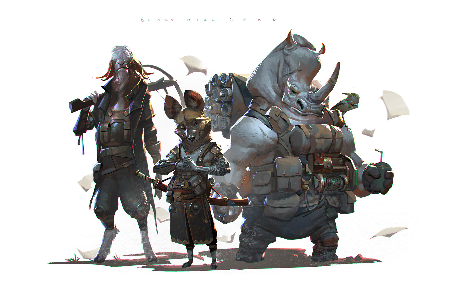
Image is courtesy of Rudy Swisswanto
Bounty Hunter
Contestants are to create a Bounty Hunter. A Cunning dangerous and prowling killer that is only in the game of killing for the huge bounty involved. Can be anything!: an alien chasing massive beast, an elf ranger hunting down gnolls, to a sci-fi jetpack flying clone! Just make sure we can perfectly understand they are in for the gold and the trill of the hunt.

- First Place: 50 reputation points and your entry on an award icon. Also the chance of getting a unique thematic rank icon done specifically regarding preference.
- Second Place: 35 reputation points and an award icon
- Third Place: 20 reputation points and an award icon

| Contestant | Entry |
| stein123 | Click |
| Hayate | Click |
| HappyCockroach | Click |
| Flyphor | Click |
| San | Click |
| morbent | Click |
| Gyrosphinx | Click |
| Murlocologist | Click |
| Exarch | Click |
| NightStalker | Click |
| Edge | Click |
| Traggey | Click |
| Peekay | Click |

- Mr.Goblin
- Heinvers
- Each judge will receive 5 reputation points.

Theme | Does the artist take advantage of the theme, or is the vision unfitting? | /10% |
Execution | Does the artist display the design in an effective manner, or is it hard to tell what is what? Are artistic techniques used effectively to make the character interesting, or does the style deteriorate the concept? Is the appearance of the design objectively pleasing, or is it of low quality? | /25% |
Concept | Does the design offer a new creative approach, or is it generic and cliché? Does it have character, or is it just another boring design? Does the design make sense and fit the description, or is it necessary to read the title to understand? | /40% |
Realism | Does the design balance, or are the proportions impractical? Is the anatomy or construction correct, does it allow the character to move as it should, or is functionality disregarded entirely? | /25% |
- 75 % of the winner shall be determined by the contest's appointed judge(s).
- 25 % of the winner shall be determined by the results of a public poll.

Edge45 (Heinvers)
Theme 7/10
Well interpreted and an approach that is admirable. Not the best, but not the worst either. Medium in execution, I'd say.
Execution 16/25
You've improved a lot in digital art. Of that there is no doubt, but you still go for those perfect shapes and forms, which quite frankly look dubious. The glares and light bouncing off of blades and effects are rather forced. You need to work on it.
Concept 35/40
Like-able idea and less of a mainstream approach. I'm just not so fond of the warcraft inspiration.
Realism 19/25
Lovely water splash effects, though they look steamy and a bit forced. The anatomy of the characters is questionable, especially of the gnoll. A problem that played a part here is the perspective that isn't respected at all times. It might be nitpicking but the field looks quite cleaned when put against the forest environment.
Total: 77/100
Edge45 (Mr.Goblin)
Theme 5/10Even though your murloc looks like a deadly killer, we have little to no clues that tells us he’s a bounty hunter. No pouch of gold, no ‘’wanted signs’’ attached to his belt, just some killer dual composition. I can’t give you much point because of that sadly.
Execution 16/25
Great lighting! Overall great shading and textures, Great sense of movement, nice use of colors!, nice composition! Also, nice sense of scale! You’ve outdone yourself in this one!
")
Although, in the future, I’d suggest you to pay attention to your tones and values when you draw characters in an environment. The Gnoll is lighter than the leaves in the background, which breaks the piece visually. On a technical standpoint, the elements who are further back should always be lighter and things that are closer should be darker.
Concept 15/40
I can’t give a lot of point here for a few reasons. First, like mentioned above in the theme, there’s no visual cues that grounds your character into the ‘’bounty hunter’’ narrative. Second, you had 100% freedom to make a kickass alien or a badass medieval rogue type of character, but you went for a murloc set in the warcraft universe. Third, the design of your character is quite simple, beside his cape and his weapon there’s no intricate trinkets, or armor pieces or potions or pouch of gold. Next time, trust yourself and do something different!
Realism 20/25
like said before, GREAT LIGHTING, overall great shading and texture work, I’d love to see more specular lights on the murloc (since he’s wet), also some proper reflecting orange light coming from the fireballs would have help ground it in the environment. The water also lacks specular lights, it’s really dark for a sunset piece. Dynamism works well, we do sense the Kobold got hit and the murloc is dashing away. Note= none of the characters are casting any clear shadows. So next time, for each source of light, think what it hits, where it reflects, and where the shadows should be casted.
Total: 56/100
----------------
Exarch (Heinvers)
Theme 9/10
Lovely approach on themes here. Might've been better if the character was more faded to score maximum.
Execution 22/25
The pencil mix with Photoshop coloring came out quite good. However, the environment and mid-ground parts are underwhelming.
Concept 36/40
Almost there but not quite on top yet. The first entry looks quite fancy but the second one is cliche.
I would say that the gore factor was unneeded in the first place.
Realism 18/25
Perspective and lighting my dear fellow. That's what brings it down.
Total: 85/100
----------------
Exarch (Mr.Goblin)
Theme 7/10
We sense he’s a killer on the hunt, great composition, intriguing character... although we’re missing a bit of information. There’s no pouch of gold or wanted signs, but the intricate pouches and armor pieces tells us he’s not kidding around.
Second piece= (no grades involved)---------------------
he’s definitely a killer or a bounty hunter, being offered gold to cancel the bidding.
Execution 16/25
it’s a really noisy piece. the character’s back shouldn’t receive any lights, the bonfire doesn’t emit any light either (I don’t see the environment being tinted or casting shadows due to it.) The background has the same tonality as the foreground, which shouldn’t be the case in such a detailed piece.
Composition is great and the perspective is great, nice idea.
Second piece = (no grades involved)---------------------
Interesting piece, although very noisy, your background and your characters shares the same tonality, making your drawing hard to read, which kills the composition. Beside, there’s hardly any casted shadows, the various lights also makes the composition hard to read.
Concept 30/40
Making the subject having his back facing us…. is not a smart move. Although, you did save yourself with a few neat aspects. By having him ready to strike, looking down at his victim is a great use of the environment to convey the character of the bounty hunter. Also, his armor design and small trinkets is a nice touch. But like said in the theme, we’re missing something.
Second piece (no grades involved)---------------------
I’ll be honest, a bloodelf/nightelf bounty hunter is quite a boring choice to go with when you had the possibility to draw anything. Although, his stance and stare does make him look like a trained assassin, which is great. The fact his face is hidden is nice too, but the lack of any other details (armor pieces, trinkets etc) is quite underwhelming.
Realism 18/25
Proportions seems to be working, nice work on the hands specially. The lighting is great, but the fact that casted shadows don’t come from the same angle is a bummer (the fact the character has his back lighted. Some trees doesn’t cast shadows, etc) beside the bonfire doesn’t cast any lights on his surrounding too.
Also, I would highly suggest you to check reference pictures for your future projects, get a sense of the shapes of tree trunks and branches, get a sense of how the light reacts on various objects etc. Would help you greatly!
Second piece (no grades involved)---------------------
There's a weird distortion happening in this piece, the fact that the arms closer to us seems way bigger than the other ones attracts the eye. Also the proportions of the man being killed is a little bit messy, he barely has any wrist or neck. (Great expression though!). The background also doesn’t seem to follow the same angles of your central perspective. The lighting also has huge issues. Either way, I’d again highly suggest you to check references for your next art projects.
Total: 71/100
---------------------
Flyphor(Heinvers)
Theme 6/10
I find this approach to be somewhat conflicting. It even borders on contest theme.
Execution 15/25
The effects are bearable if any. The 'goo' monster however is not so much. Textural work on it lack big time. You need to work out transparency, coloring, texture, effects, etc.
Concept 15/40
Not much to ponder on sadly. If it weren't for the contest's title, I'd even think that this was done for the previous contest. Might be the angle, lack of substance but it just didn't work out that well for you.
Realism 14/25
Character anatomy is alright but highly contrasts with the blob that is the 'goo' monster. Textural work once more, perspective, anatomy, lighting, shadows, gradients. Those are that factors that you have to take into account when trying to portray something in a realistic fashion. Next time perhaps.
Total: 59/100
---------------------
Flyphor(Mr.Goblin)
Theme 6/10
Well, we do know he’s a bounty hunter: by his strong stance and due to the ‘’wanted’’ sign, but that’s pretty much it. Armors, a weapon, gold pouch etc, would have helped you convey it more.
Execution 10/25
Nice composition, nice sense of scale, but I can’t say much more about your piece. The fact there’s no background, that there’s multiple source of light but with no real shadows being casted. etc. Can’t give you much here.
Concept 24/40
Hard to give you points when you’re character isn’t even facing us. And barely wears anything beside his tunic and his metal bracelets. Like said before the composition is nice though, his stance speaks power and love the contrasts between their silhouettes. White hair is also a nice touch to attract the eye and give flavor to the character.
Realism 14/25
The point of view is nice, proportions seems alright, the textures works too but I can’t give you much beside that. The fact there’s no casted shadows, different sources of light with no proper rhyme lights or casted shadows, this whole scene is quite messy when it comes to realistic rendering appropriate to your artstyle.
Total: 54/100
----------------
Gyrosphinx (Heinvers)
Theme 9/10
I like it. Might not be the best out there but it projects the theme in a simplistic way.
Execution 22/25
It could've used more texture in places like foreground and sky but it looks fine as it is.
Concept 34/40
I wouldn't give it higher score due to the hostage approach done here and the guns. Once again texture, more texture needed for higher score.
Realism 22/25
Perspective looks on spot, although the anatomy is somewhat passable. The hands, torso, face expressions and legs are a bit screwed over. Not bad however.
Total: 87/100
---------------------
Gyrosphinx (Mr.Goblin)
Theme: 9/10
That’s a sly looking Bounty hunter! Love the marks on his breastplate, I’m glad to see you’ve included the victim as well. He sure looks like a trained soldier. Good job! A Wanted poster or a pouch of gold would have gave you a full mark.
Execution: 14/25
It’s a sketchy lineart with no shading… can’t give you much sadly. Although, i like your composition, the stop sign creates nice parallel lines that frames the victim, also the gun and the stop signs creates visual lines who leads to the victim as well. Your lineart is also clear enough that it doesn’t affect the readability.
Concept: 32/40
Love the fact you went for a post-apocalyptic feel for your piece. You have a great balance of details and features. The sly smile and the cigar gives a lot of character to your subject as well. Overall you’ve managed to give us enough visual informations for us to understand he’s a trained and efficient soldier. The pirate eye patch is also pretty badass… but sad he can’t use his gun’s scope.
Realism: 12/25
Good job on the proportions, you’ve got some issues with your hands though. Perspective issues as well for the gun, the facial features, etc. Can’t give you a high mark either since it’s just a lineart with no shading and coloring.
Total: 67/100
----------------
HappyCockroach (Heinvers)
Theme 6/10
Might I say mighty spraytastic? Yes it is sprayed over the theme. Once again, even if looking unfinished, it reeks of the previous contest's theme. Yeah.
Execution 8/25
Should I say more and claw away at it at a faster rate? Indeed.
Concept 24/40
I shall think about this. I need to chew more on the sprayed bugs factor. I like it and I dislike it at the same time. Also, Is that a mace equipped barbarian? Questions upon piles of questions.
Realism 5/25
Perspective looks acceptable but dues to it being an unfinished piece and texture not visible yet, it gets a low point. Not sure how it made it to the poll. Perhaps more for me to saw at.
Total: 43/100
----------------
HappyCockroach (Mr.Goblin)
Theme 5/10
Love the idea of spinning the bounty hunter theme into an exterminator theme. But Since your entry is just a early WIP, can’t give you much.
Execution 8/25
Obviously it’s a sketch, but the composition was an interesting idea and the sense of scale would have made it a killer drawing at the end.
Concept 10/40
Well, like described in the theme, it’s just a sketch and I can’t give you much. Can’t judge you on his stance, his look, his clothing, his overall design. So I can only give you points for the exterminator idea.
Realism 5/25
Same thing for the concept-art aspect.
Total: 28/100
---------------------------
Hayate (Heinvers)
Theme 7/10
Quite unfitting for the theme. Might be the angle or the character. The bounty hunter doesn't have enough character. These puns...
Execution 17/25
You know, I've seen you do concept art before and THIS IS NOT IT! Lacks depth, transitional shadows, proper light, complimentary colors and all the shizzle coming along. Angle of choice isn't that flattering either. It's just an overall eye sore to look at. You might want to steer down from over the top PS effects since they tend to ruin your piece if used in insane manners.
Concept 34/40
I like the character's expression but the whole approach to the concept is lackluster.
Realism 10/25
Texture, texture and texture. Perspective, anatomy, light, colors, anatomy. All these in a blender and portrayed in a decent manner need to be done. Proportions are off due to these very factors.
Total: 68/100
----------------
Hayate: (Mr.Goblin)
Theme: 6/10
That looks like a deadly goblin! Nice drawing! Although i can't give you a high mark because you've decided to illustrate a character that fits into an already established and well known franchise: warcraft. Also, we can't really tell your character is a bounty hunter, by the lack of a gold pouch, a wanted poster, etc. He could be a goblin pirate as well as a goblin mercenary.
Execution: 19/25
Great composition, dynamic stance and stare! Love your background and lighting. You've really made some smart choices to "show of" your character design! Although, it is quite a sketchy drawing, because of that: it's a little hard to read. There's also a few perspective issues, mostly noticeable for the gun and the right arm. You have quite a lot of issues with your proportions (see in Realism) When it comes to shading, Overall it’s lovely and dramatic, but your rhyme lights are all over the place. In conclusion = more hard edge, smaller brush and details and pay attention to your proportions and light for next time!
Concept: 30/40
Like mentioned in the Theme, we can’t really tell he’s a Bounty Hunter. Beside from that, your choice of stance, his facial expression are a great way to show his character. The earrings, the dynamite belt, the tattoos are all great details too! He sure looks like a deadly killer! (Borderline satanic perhaps
 )
)Realism: 18/25
You have quite a few issues here, mostly when it comes to your proportions. I understand you tried to make the gun point towards us and due to the lense and angle, every part of his body facing us is closer and thus bigger, but oh boy it’s really hard to pull it of in an illustration and in your case I see the struggle is real. His Fingers looks to be as long as his forearms, the ears don’t seem to be attached on the head at the same place, same goes for his shoulders. Also, like mentioned before, your shading and lighting is intriguing and was a nice idea, but you also struggle a lot with your rhyme lights and volumes. But I really appreciate you went for it!
Next time use reference pictures.Total= 73/100
---------------------
morbent (Heinvers)
Theme 10/10
Excellent vision. Good thematic portrayal.
Execution 23/25
Mighty fine. Although it could've used slightly more texture and shades of color.
Concept 36/40
Star Lord anyone? That's some cliche approach there but passable so far. I also dislike the same design for both weapons. Yeah, not digging those much.
Realism 21/25
Aside from the decent anatomy and well chosen perspective, there's something off with the character's shoulders, boots length and guns perspective. Something's rotten in Denmark. The attire would be quite impractical to walk around.
Total: 90/100
---------------------
morbent (Mr.Goblin)
Theme 6/10
Sweet looking killer you’ve got there! Although I understand you went for the Boba fett approach, there’s nothing else that tells us he’s a bounty hunter. A pouch of gold, a wanted poster would have helped us. But for the rest, there’s no doubt he’s a badass killing machine.
Execution 22/25
Professional work right there! The stance, the point of view, the strong silhouette, the details, the lighting, the reflective elements etc. Very great job there mate! Although I would have love to see the metal part to be as reflective as the golden trims of the robe. Also his right arm seems strangely far away from his torso. All and all, there’s not much to add. Great job! Portfolio worthy with the tiny extra details I just mentioned.
Concept 36/40
Just like mentioned in the theme, we can’t really tell he’s a bounty hunter, but beside that, it’s a great character design! His stance, his robe, the mix of sci-fi elements with a robe that feels more like fantasy (Ya know, the Destiny video game vibe) is great and well balanced! Extra point for choosing orange for the lights and green for the robes. It gives that extra edge to your character, due to that, he stands from the mass. Also good balance between the detailed areas and the empty space. I like the fact you broke the symetrie here and there as well. + love the fact he’s masked, gives that mysterious edge.
Realism 22/25
Damn he’s tall. You gave him superhero proportions. Beside from the right arm issue as mentioned in the execution, it’s great! Watch out for the feet though. Some proper ref would have helped you, also he seems a little light on his feet and his balance seems off because of it. (we don’t feel his height)
Total: 87/100
----------------
PeeKay (Heinvers)
Theme 10/10
Spot on and just around the corner of clarity.
Execution 24/25
Truth to be said, I am a bit disappointed that you didn't go all out with it with the smooth textures started here. On the other hand, colors are almost vivid in terms of clarity and the perspective gives it a high note. Could've used more particles and effects like dust, breeze and whatnot.
Concept 38/40
It has the needed character but it misses that omph you usually give your pieces. The scene looks a bit bland. Might be due to the textures not fully developed but you might've not intended them to be.
Realism 23/25
Perspective is well done, colors are chosen well but the textures are just not quite there where I would've expected them to be. Light settings are done nicely and shades are right there. Good work.
Total: 95/100
---------------------
PeeKay(Mr.Goblin)
Theme 8/10
Man he looks like a killer hunter! Great stance, great setting, love the bear trap and the fact he’s clearly tracking a huge beast. I would have love to see a gold pouch or a wanted poster though. We clearly see the hunter aspect, but not the ‘’bounty aspect’’ sadly. Can’t give you full marks. Cool backstory though
Execution 23/25
Fantastic drawing! Great composition, nice stance, great atmosphere, nice colors, nice sense of depth, very professional work! Although, if you want a nice rhyme light on your character, you’ve got to add rhyme lights to the environment as well! Also, your character and the environment aren’t casting shadows. If you want a nice rhyme light, it’s part of the deal as well buddy! Details, I know… just want you to get better.
Concept 37/40
Love the costume! Nice trinkets, nice mask, dig it! Although, watch out with this type of stance: It gives character to your subject, but you’re hiding most of his chest, which is not really a good idea, especially for a concept-art piece. Providing a side piece was a great idea for that matter (next time, a clean lineart would work better than a simple sketch though).
Realism 23/25
Nice job with the proportions, great job with the lighting, although the rhyme lights issues and the casted shadows. Great shading overall and great atmosphere
Total: 91/100
----------------
San = (Heinvers)
Theme 7/10A bit on the lacking side of thing. We've seen payed contracts before so nothing new so far.
Execution 19/25
I feel like you rushed it just about THAT much. What gave it away is the lacking texture work, improperly placed shapes and shadows. Not your best.
Concept 28/40
Yeah, not really fond of it due to the cliche nature and lacking vision. Might I say lazy?
Yes, it is dear San.
Realism 15/25
Might be the weird pose, non-existent to low perspective, odd anatomy, scratched shaped. Call it whatever you want, this is not really doing the right thing for your piece.
Total: 69/100
---------------------
San = (Mr.Goblin)
Theme 10/10
Love it! a different approach to the bounty hunter with a touch of humour, nice idea! Perfect mark here!
Execution 17/25
Sketchy drawing with perhaps not the best scan/picture. Humoristic composition, simple but works well for the humor and the purpose of your piece. The lineart is clear, you have quite a few issues with the shading though: everything looks flat, the lack of volumes and highlights (and colors) hurst your otherwise nice drawing.
Concept 34/40
Great character, love the mix between a western look with a superhero flavor with the mask. Great design overall, nice balance and happy to see you’ve made a asymmetric character. Nice stance, love the hands and the wanted posters. He does look like a trained killer, so overall I’m quite pleased with your entry!
Realism 18/25
Hard to judge a lineart sketch, can’t judge you on the atmosphere or the lighting. etc. Proportions seems alright, a few struggle with the perspective here and there, mostly on the legs and the knees. The hands works well, but the use of reference would have helped you a lot on this piece. The lack of proper shading also hurts your volumes. So either way, next time I’d like to see you jump into shading and coloring and use references for your drawings
Total: 79/100
----------------
stein123 (Heinvers)
Theme 8/10
Somewhat similar to Gyro's piece but taking it a notch higher. I like it but it lacks some special momentum to it.
Execution 21/25
Usually you are very good with depth and lighting but here you didn't really give it all. Good expressive faces though.
Concept 36/40
It has that spark but the troll misses some forest vibe. I guess that tattooes could've helped there.
Realism 21/25
The angle, while not fond of it, makes for some interesting effect. Angle is alright, textures and depth need to be worked more upon and the troll's face anatomy is a bit weird. Especially the tusks and forehead.
Total: 86/100
---------------------
Stein (Mr.Goblin)
Theme: 10/10
ouuuh that's a bounty hunter alright! Imposing stance. Deadly stare, dead victims and a crushed "wanted" poster.<3
Execution: 17/25
Overall it's a really nice sketch. The lineart is clear, the textures works well! The shading is a little flat (due to the use of a lineart) but it does not affect the readability of your art, which is nice. Great strong stance and a clear silhouette. Great drawing overall! I would have loved to see it in colour. Also, watch out for your shading, we can't tell what's the source of light in your piece, your drawing is also missing any casted shadows.
Concept: 32/40
I can't give you full mark in this category because you've chosen to create a character based on an already existing franchise: warcraft. + let's not fool ourselves, there's actually a unit named : Troll head hunters in warcraft 3. But beside the choice of illustrating a troll.... great design! The shoulder pads are really cool! The scarf is nice. (Can really feel the Zul’jin art inspiration though), the belt is also cool. The axe on his back is nice as well! All and all good job!
Realism: 17/25
Proportions seems okay! The hands are well made. I feel there's a lack of "stiffness and heaviness" when it comes to his right arm and general stance though, it's a little minor, but we don't feel the weight of this massive head his lifting.
When it comes to the lighting, your shading and your volumes are hard to judge: since it's a black and white sketch. Even though it's well made, i can't give you too high. Specially for the shading issues mentioned in the execution.
Total 76/100
----------------
Traggey (heinvers)
Theme 9/10
The rainy setting does help with the idea. You take good care of the theme but something of a crowd in there could've helped more.
Execution 25/25
Pure juice. I like the vision's portrayal and overall character coupled with the scene's emotional depth.
Concept 38/40
As said previously, a crowd in there could've helped add more depth to it. Might be intended by you so it's sliding now. A bit nitpicking here, BUT the old 'hag' isn't that touched by the threat. Looks a bit odd to me.
Realism 24/25
Color palette looks about right, angle, perspective, shapes and anatomy all checked. I just think that the saturation is slightly off and adds too much film filter to it. Yeah, that. Aside from those points, well done.
Total: 96/100
---------------------
Traggey (Mr.Goblin)
Theme 10/10
YOU SIR DESERVE A COOKIE! You took the whole idea, spinned it on it’s head and made something truly different and creative with the theme. The wanted sign saved you though.
Execution 21/25
Nice atmosphere, love the two light sources and how to both reveal the characters in their entirety. Kudos, because it’s really tricky to do so. (know, I’ve tried and fail in the past XD) Proportions are off, but I’ll let it slide for a cartoony character. The composition works well.
Concept 35/40
Like mentioned above, great creative turn on the theme. You’ve chosen to go with a cartoony approach, so the simplistic design of your robots and old lady works well, the lack of an umbrella is annoying though. It would have helped with the silhouette of your character, it would have helped the composition and frame even more the faces. Overall love the bow tie and the raincoats, gives flavor to your robot.
Realism 19/25
Well, hard to judge. Can’t judge you on the proportions because you took a cartoony approach. You did great with the light, but your shadows are extremely dark. Being under the rain, you’re missing a lot of specular light on the coat and the robot, same goes for the background. You really want for a tricky scene, references would have helped you a lot.
Total: 85/100


 (still want to know when will be the next contest lol), on a peronal side, i was really looking forward to see more from Flyphor, i really dig a lot your style, hope to see more from you on the next contest, this one was really fun, great job to all!