• Listen to a special audio message from Bill Roper to the Hive Workshop community (Bill is a former Vice President of Blizzard Entertainment, Producer, Designer, Musician, Voice Actor) 🔗Click here to hear his message!
  • Read Evilhog's interview with Gregory Alper, the original composer of the music for WarCraft: Orcs & Humans 🔗Click here to read the full interview.

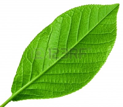
BTNHealingLeaf

This is my second icon fully made by me ,
I am a beginner in photoshop and I know that this is very simple, But I hope you may enjoy this :)

CHANGELOG

RENEW THE IMAGE ... :D

f9qusn.png


-RENEW the image, I'm trying to make a better leaf.

icons_17098_btn.jpg


Keywords:
Leaf, Earth, Heal, Rejuvenation, Herb, Herbal, Life, Plant, Nature, Tree, Green, Grass, Weed, Item, Ability, Natural.
Contents

BTNHealingLeaf (Icon)

Reviews
13:45, 21st Feb 2014 Sin'dorei300: Needs definition and shading\highlights. This is supposed to be a healing herb, not a common one. Needs some special effects\glow\somethin' to show this. Sin'dorei300: Make the background lighter or the leaf...

Moderator

M

Moderator

13:45, 21st Feb 2014
Sin'dorei300: Needs definition and shading\highlights.
This is supposed to be a healing herb, not a common one. Needs some special effects\glow\somethin' to show this.

Sin'dorei300: Make the background lighter or the leaf lighter, atm it's too dark.
It looks like a plastic leaf, take a look to a real one.

09:16, 22nd Mar 2014
Sin'dorei300: Again, the background is blending with the leaf too much, and the leaf looks like it's made out of plastic.


209577-albums5234-picture82171.jpg
194715-albums6441-picture73606.gif
Sin'dorei300
194715-albums6441-picture73606.gif

09:46, 15th Apr 2014
Sin'dorei300: It still looks like plastic...
 
This is 100% created by me, First I use light brush and light green , then I will shape the leaf the I add the details (like lines) . After this, I lower the light then I adjust some colors to make it darker, then I put filter to it (plastic wrap), then I used leaf brush to add the effects .

To prove this, I will show another sample .

1
4ihe3b.png

2
wtymvn.png

3
2ueliyx.png

4
x4fz1i.png

5
2pyyv5h.png

6
2ng7fx0.png


And thats it ! This is not actually look like to that icon but I will show how I made it . :) Please remove your doubts . I am a beginner only and my icon seems not perfectly done but I will improve my next icons .
 
Last edited:
Level 24
Joined
Jul 9, 2009
Messages
4,097
I like the glow you've made but it's hard to see since it's so dark that it melts into the background, I'd like it more if the glow was clearer.
 
Level 10
Joined
Sep 1, 2013
Messages
773
Edit: Whoops, sorry for that!
I don't like the background too much. Maybe you could improve it?
Otherwise it's nice.
 
Last edited:
Your tinypic photo is not enough to prove to me that it's your work.
Please provide more WiPs.

Look my comments, I already give a sample . . I am not a liar , just remove your doubts .

EDIT : I have a problem for now, my PC do not start because BSOD appear and I need a technician to fix the fucking problem but i don't have money to pay him . For now, I rent a computer so just wait until my PC will fix . .
 
Last edited:

Chaosy

Tutorial Reviewer
Level 40
Joined
Jun 9, 2011
Messages
13,219
I actually like this icon. The background is not boring and black it lifts the icon a little. I find the icon kinda cartoonish but fairly well made. I am having a hard to to choose between 3/5 and 4/5..

anyway, I suggest another effect to it. I was thinking about the wisp harvest tree effect if you know what I mean. I will wait to rate this in case you update.
 
Top