Moderator
M
Moderator
20:58, 28th Sep 2014
Sin'dorei300: Nice composition!
Sin'dorei300: Nice composition!
(4 ratings)
 Approved


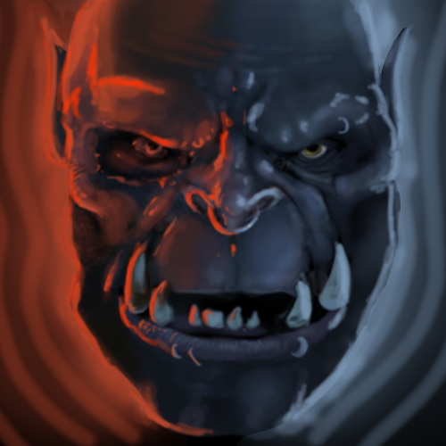
Read the description, there was mention about it.Garrosh is that you?

Goodlookin orc.
However for an icon, thicker highlights looks better.
(Viewer's perspective) The left face looks cut off.
I suggest to use a black outline for the fel orc. Additionally, more details so they are visible on the 64x64 icon.
I think some the icon is not that bad, but it really doesn't suit "Fury" description. There are no flames of anger, no bloodlust-like eyes, just an orc which looks like he's scheming some plans to destroy his enemies. In that case if would rename the icon on "Deception" or "Power of Y'shaarj" or "Dark Side".
This wasn't even worth to mention.
I think naming it such would just make it less usable. After all it's an icon.
Judge by looks, not some name of it, I'd say. Sure it is an opinion, ofcourse... But I don't really see a point to call it some "Power of Y'shaarj".
Though "Fury" doesn't always mean it has to be THE one fury we know from WoW spells.
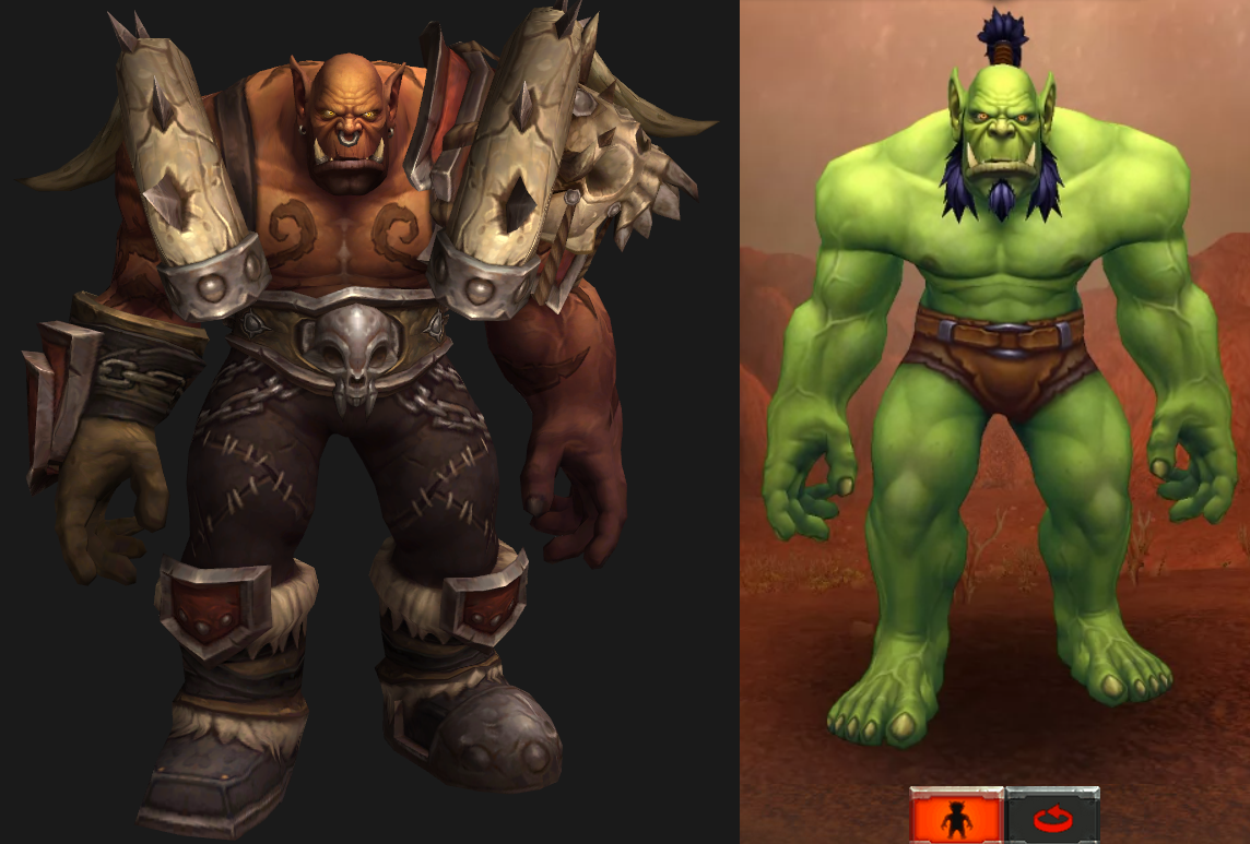
Well, you made an icon that looks exactly like Garrosh from WoW. In description you said that it was supposed to be a Garrosh, but then you changed it to "regular" orc, though i dont see the difference.
Im not a wow fanatic, im just pointing out that some other names could suit it better. Your quote "This wasn't even worth to mention." was really mannerless however and you should cool yourself down before a assaulting another poor reviewer trying to give you suggestions.

Updated!The big pic is really nice, but in the 64x64 icon many details aren't that visible.
Also the eyes could stand out moar.


