Moderator
M
Moderator
10:07, 21th Dec 2010
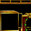
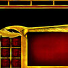
shiiK: There's a few glitches that needs to be fixed - the resource icons are overriding the border of the boxes, and although it doesn't look ugly, it breaks the uniformity and I don't think that suits this UI. The golden leaf over the inventory (with the text on) is cut off at the tip. You've got some nice design in the bottom of the unit information area, but unfortunately, it interferes with the unit information and obstructs game play.
The large blocks of yellow/golden metal are awfully boring for the most part. Try to add some more details in there. I'd also prefer if you worked some more on the Phoenix over the portrait.
10:03, 21th Feb 2010
67chrome: Overall this is well-done enough it should be approved. It would be nice if you worked a little more on this though, perhaps add some runes to the gold or thin the gold down and use it for designs instead of large blocks of material. The overall red and gold of this is a bit overpowering and eye-catching, which can be a good thing for important units, but not so much backgrounds like terrain and UIs. I'd recommend desaturated the red a bit, and perhaps add more of the pastel colors present in Silvermoon architecture rather than sticking to just red and gold. Adding pastel pinks and oranges to the UI could allow more elegant and elvish designs with the gold and red, and allow things such as your phoenix inventory cover to look more impressive/obvious.


 Approved


