
Moderator
M
Moderator
13:55, 30th Jan 2011
THE_END: I love the improvements, you did a nice job here.
THE_END: I love the improvements, you did a nice job here.
(3 ratings)
 Approved
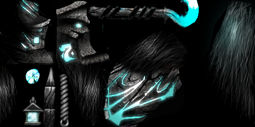
")


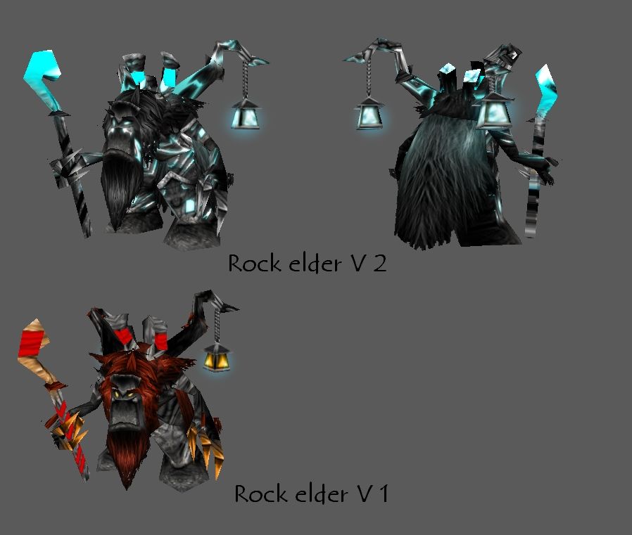
Ok, will do some crystals and "Shit" ^^
, you know the drill


Return back the other one, it is totaly better.
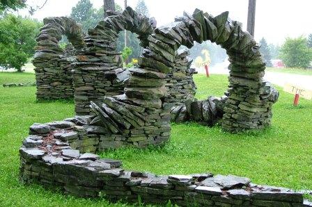
What moderator said monotone is a lot color in black, gray and white. But overall is nice. You need to use more color on it. Look more rock as example. Hope this help you.
Actually, that's not the point. the point was it didn't have enough details... It's ok now, but... whatever. I asked Debode, Dentothor, ShiiK and others about opinions... It looked great. Nothing else. No body said it looked too monotone. But whateva... I use a lot of these (...) ^^

*cough*
I didn't say it looks great. I just said it needed more details rather than more colours.
Right now, I think the beard, and all other hair, is a bit too boring. You could try to make it more dwarven looking (design-wise) and/or add some slight colouration to it. Some subtle green and blue shades of colour on the rocks would help as well.

V2 looks too much like a WoW-style Death Knight to me.
I kind of liked the red-brown "hair", like dried grass or straw, though the execution could have been better - it looked too furry, not like plant matter. Also, I don't think V2's hair makes any sense. What are they supposed to be made of, grey like that?
Maybe you could make them clumpy, like a bunch of individual bushes.
No offence, Keiji, but you're no skin moderator. :/


I like this, its very nice dude. Tell me, how did you get the glows? play with the contrast or something?


