- Joined
- Jun 5, 2008
- Messages
- 2,573
Really creative work guys.
I was hoping for a stone frame myself, i really think it would be a cool one.
I was hoping for a stone frame myself, i really think it would be a cool one.
If Pharaoh_'s extension counts towards all contestants, the deadline was today between 0:59 and 1:59.
Stone wouldn't have been very imaginative, though it depends on the concept.Really creative work guys.
I was hoping for a stone frame myself, i really think it would be a cool one.
Stone wouldn't have been very imaginative, though it depends on the concept.
Looks like I didn't get this done on time. Deadline was yesterday, no? Or is the timezones screwing with me?
Wanna still work on it?


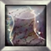
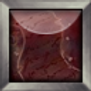
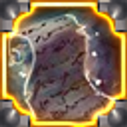
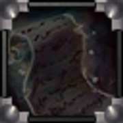
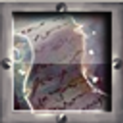

OK so here are my borders. I am continuing my future/metal based them
/ BTN / DISBTN / ATC / DISATC / PAS / DISPAS /


And here is a screen on when i started working on the icon but i got an error... But i was clever and made a Screenshot then cut out my border from it

Nice metallic things ^)
How did you create the borders exactly?Yeah i am thinking of making a UI but i am not 100% sure
I did not meant to offend you, I just asked out of curiosity, because I wanted to give you some advice on the creation of an UI.Everything in my icon's is freehand lol....
How did i create the borders ?? drawing them lolz... In the screen you can see your icon beneth it i took 1 of your borders and resize it to my liking just to see how "thick"i can make my bordersIF you look at the screenshot closly you can see some layers have little shading and almoust no light and the visible layer has shades and lights

My additional Preview of border, i will try a hard and draw as a mad, to finish my icons in time.. Tons of work..

If i am not wrong your big picture is very detailed but because of the resize the detais are not visible what size are the icons you draw before resize ??
But it is good for now
I can see the chain, but the rest is... not to be identified.My additional Preview of border, i will try a hard and draw as a mad, to finish my icons in time.. Tons of work..

I can see the chain, but the rest is... not to be identified.
Care to share a bigger pic of this?
Hm, BTN is awesome, but ATC does seem to create an unpleasant effect: the border itself busts in the icon so much, that it looks as if it's a part of it.





The leaves are really tiny and insignificant. You can hardly see them properly in the icon itself.Final submission. I've noticed the stones need harder shadings/lightning as I resized it. Also figured I've made too small details to be enough noticable. Unfortunately I am out of time. So this will be my final entry. (sorry about the double post, but wanted to notify you about me being done)
Have to say it didn't really turn out to what I wanted it to.
What's the canvas size you used?@Phar, <3
@Black, Yeah I agree, looks good in the big one, but falters in the proper sized one. Oh well.
I see. I used that size myself. It's true, you don't have that much to work with, the trick is to get as much done as possible, resize the image to the original size (64x64 in this case) and do some touch-ups there.I used 128x128 when working on it. Working on this small sizes never really been my thing, I don't really get the hang of it.
That's great to hear, because that's what contests are for: to push your boundaries and try out new things. You will improve automatically.Yeah, thanks for the tip. And sure it does not, I find it interesting to work in ways I don't usually do. So it has been a good experience even though I am not fully content with how it turned out
That is a good idea.Old one was better :/
You may want to create an ATC instead with this piece, by toying around with those little squares (like spreading them more around, as if they are shuttered and floating in air) and by changing the red color.

Blood Dark Icon's Prison


