
 Approved


- Joined
- Jul 22, 2015
- Messages
- 3,485


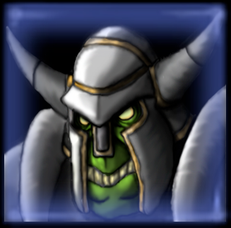
Oh no. It's going to be everywhere now.Thanks to Scias for the blue border of the second icon.
Anyway, the icon looks great in the big picture, but the icon looks rather plain when scaled down. I'd personally draw the attention more to the orc rather than his armor. The big picture does a great job on that, but at the scaled down version, the "green" of the orc is lost. It's still slightly blurry like the rest of your icons, but there is a noticeable difference in sharpness with this one, so keep it up.


")


