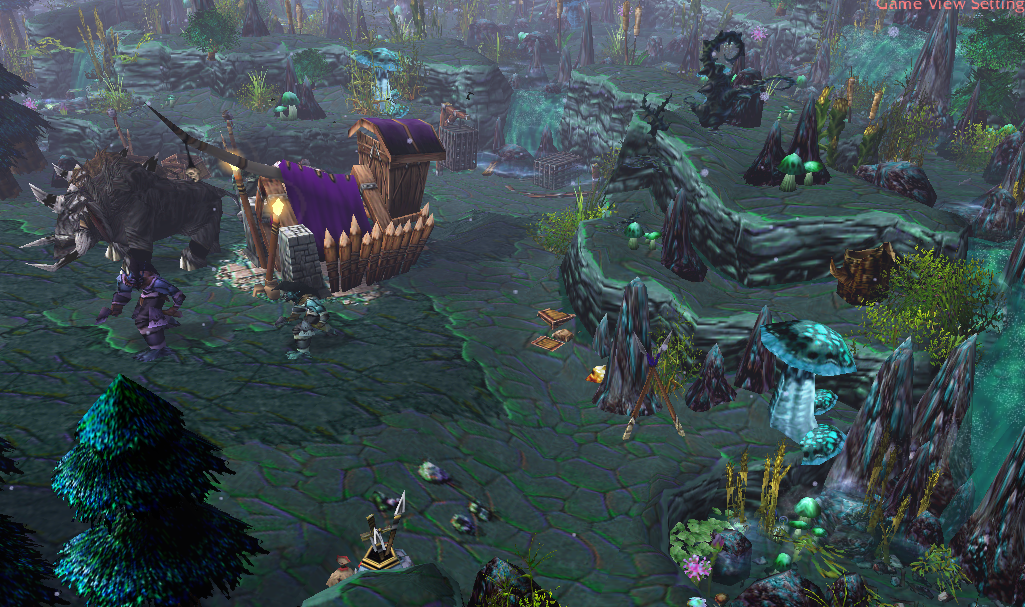
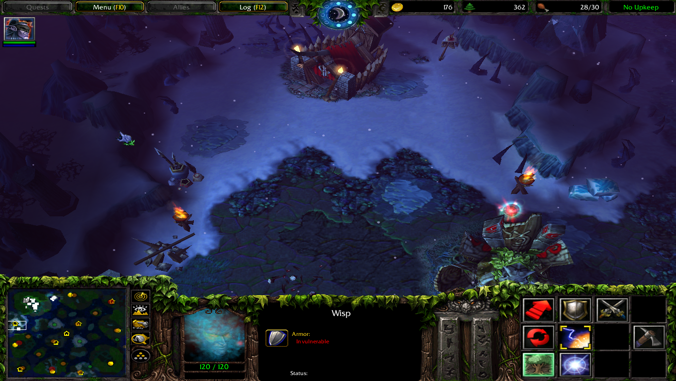
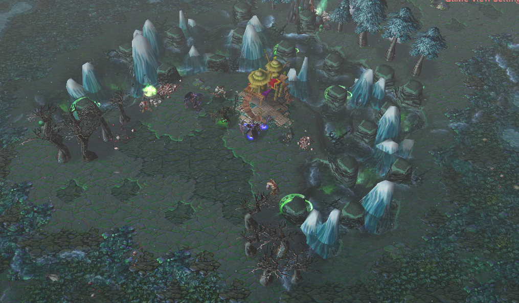
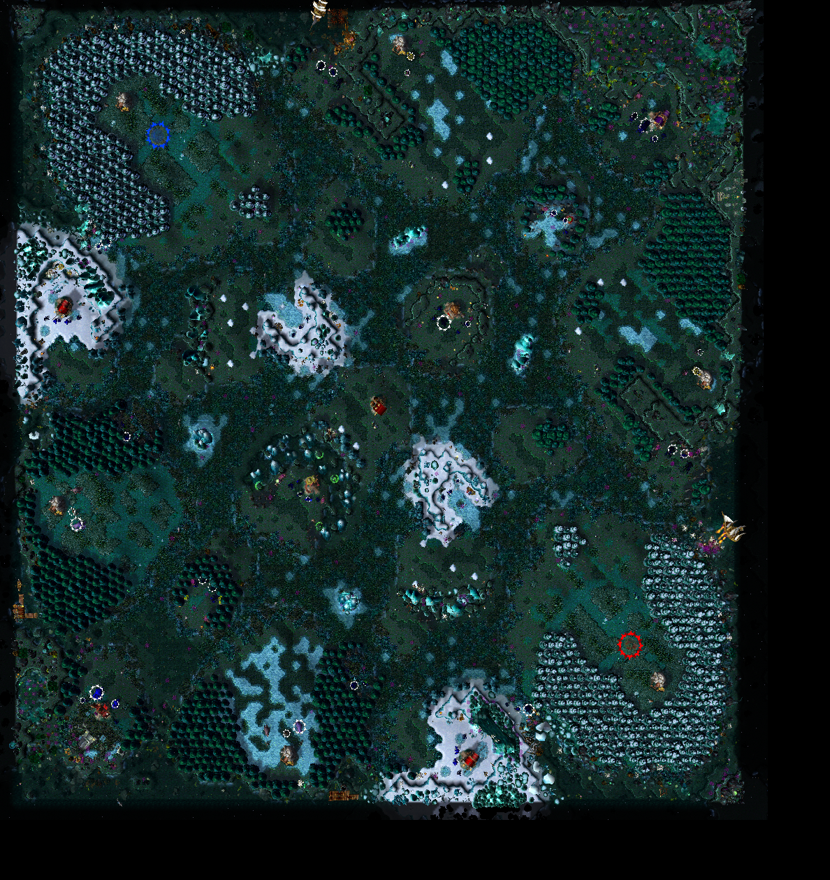
0-Lightning effects looks corny, i would just remove them.
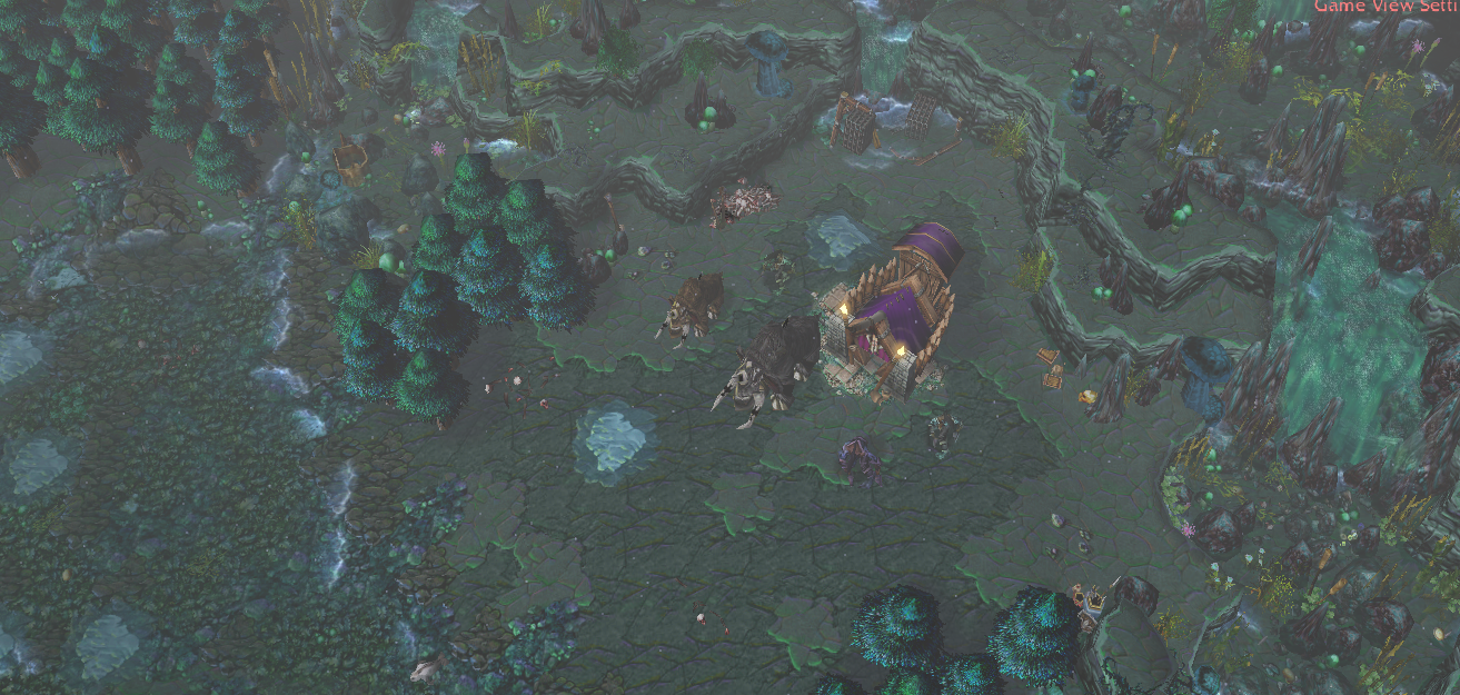
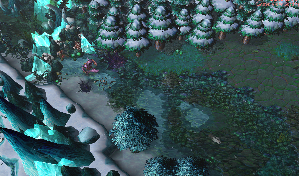
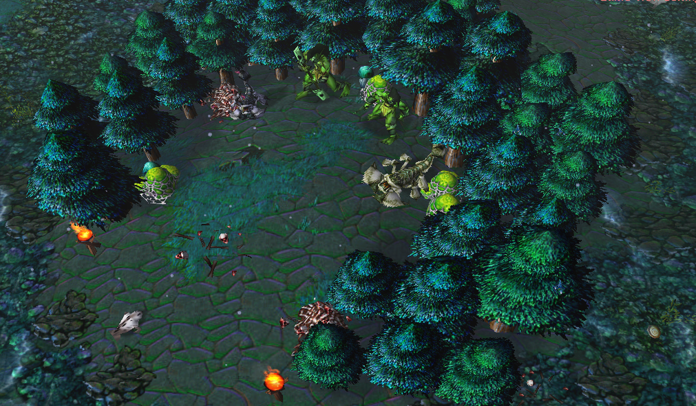
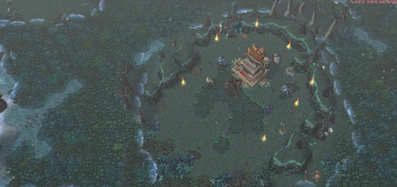
1-Too many doodads, it looks cluttered. "Less is more".
2-Too many doodads from too many tilesets, it looks a bit wierd to have ashenvale bushes with outland bushes.
3-Use less detailed textures. It might look fine in the editor, but you once you move 12 group units over the map sometimes you can't see your units or they don't stand out enough. It's pretty disruptive for gameplay. Player blue with night elf units or or units for example have natural camo.
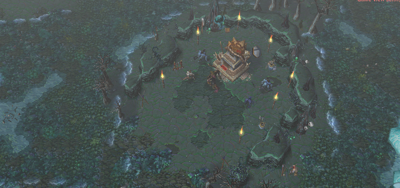
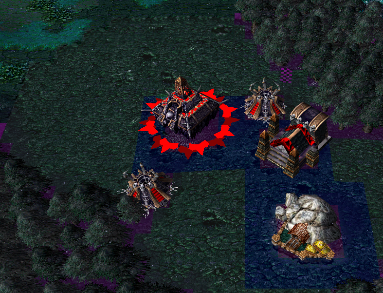
4-Merc camp archway looks cool.
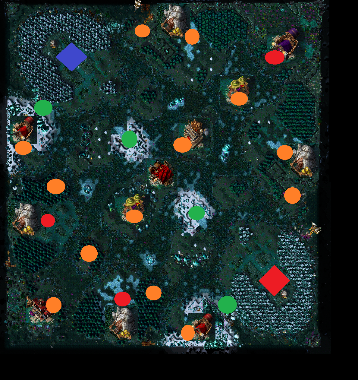
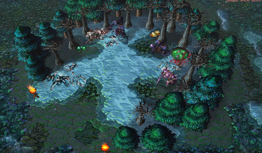
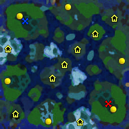
5-Narrow the map down thematically. I thought this map had to do with the dragon.
6-I like how eye of sargaras is used, that's a cool detail. Remove the other doodads and cliffs and put those at the center of attention.
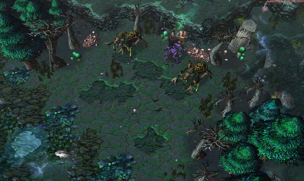
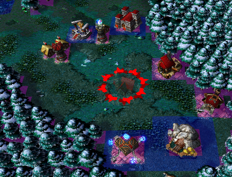
7-Make the center green camps wider. Players need to pull this camp, if they don't then they risk getting blocked inside the hole during creepjack. Ending games prematurely.
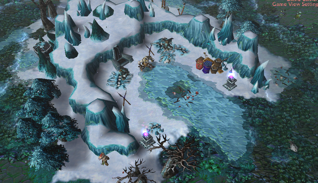
8-Don't put dragonspawns in the front of camps. They have evasion, so when you pull you might miss your attack. It's funny, but annoying. Put another creep in front that players can more easily pull.
9-For competitive play, pros generally frown upon non-conventional creeps such as dragonspawns. I got less points from Lawliet for using them in a 2v2 map contest. Just keep it in mind if you want to make your map for competetive play or make your map a fun party map. Generally creeps with luck factor such as Evasion and Curse might not be the best idea. I think they're acceptable in 3v3 or 4v4 though as those modes are generally more party/fun focused.
 Approved