i did, but my point is THE SHADES of blue. the icon is all the one shade of blue. surely you could change that to the advantage of the aesthetic appeal of it, as it looks quite undefined and blurry as a small image. making the glow around the hammer bigger could help too, and stronger lines on the timber too.


 Approved
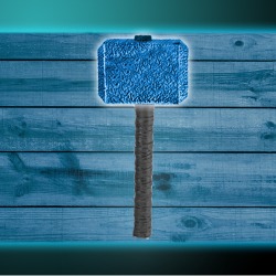


")