Follow along with the video below to see how to install our site as a web app on your home screen.
Note: This feature may not be available in some browsers.
Listen to a special audio message from Bill Roper to the Hive Workshop community (Bill is a former Vice President of Blizzard Entertainment, Producer, Designer, Musician, Voice Actor) 🔗Click here to hear his message!
i did, but my point is THE SHADES of blue. the icon is all the one shade of blue. surely you could change that to the advantage of the aesthetic appeal of it, as it looks quite undefined and blurry as a small image. making the glow around the hammer bigger could help too, and stronger lines on the timber too.
The wood seems far too realistic to be actually hand-drawn. I highly doubt the method you used to create this icon - I'm leaning towards thinking that you copied and pasted.
Freehand manes you have to draw. Real life photos is as bad as copy\pasting, as far as I know. I recommend you to look at the 2D art tutorial section - those tutorials are very often recommended:
thats a hammer? i thought it was a street sign @_@
and ya needs freehand. its simple shapes should be hard to draw. especially the hammer since its so far away.
This site uses cookies to help personalise content, tailor your experience and to keep you logged in if you register.
By continuing to use this site, you are consenting to our use of cookies.


 Approved
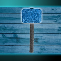


")