
 Approved


- Joined
- Aug 20, 2011
- Messages
- 4,141


I think you can do better than that.
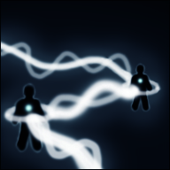
Looks too sketchy in the actual state.
There is a lot of unused space, it lacks shading and color variation.
Those figures are almost invisible in the small icon.
The effect seems too randomly drawn.
I suggest you to re-work the effect, with more accurate shapes and perspective.
Make the figures stand out more, try to zoom it in a bit or use a suitable background, add some colors to kill the monotony.
Try to put some more effort in your icons. All of your icons need better definition and shading(highlights & shadows).
I recommend you to read a few tutorials(2D Art Tutorials):
How to Make an Icon
General Icon Process Tutorial
Basic Icons Tutorial
NFWar's Tutorials
Basic Icon Guide