- Joined
- Nov 8, 2007
- Messages
- 2,263
The following tutorial will take you step by step to create an icon.
You can read through the following guide if you need help on shading and texture rendering (how to make things look like they have a certain texture). In reality, the only way to really learn is to learn things yourself but the following will definitely help you.
The following can be useful for all kinds of illustration, not just icons. However, it is vital that icons are done correctly. Only given a limited space of 64x64 minus what the border takes away, every space on the icon has to count into fulfilling the purpose of an icon:
To effectively represent an object or an action in a clear and defined way
What that basically means is that your icon must sufficiently represent what it is supposed to represent. There can be no ambiguity about it. If it is a 3 dimensional object, it must look 3D. If it is an 2D pictorial representation of an object, it must look 2D. If it is a woven basket, it must look like a woven basket. It must not look like something other than what it should look like.
You do need photoshop for this tutorial although doesnt really matter which version. I happen to use CS4. If you happen to use GIMP or any similar programs, the specifics of this tutorials might not apply to you but the basic principles do.
Step 1.
Choose what you are going to draw. In this case, I am choosing to draw something simple, a club. I chose a club because this will allow me to show you how to render both metal and wood which I presume are the most widely used materials drawn.
Step 2.
Now choose what canvas size you are going to draw on. People often choose the most arbitrary numbers of canvas size, 1000x1000, 2000x2000 or even 1500x1200. Bigger the better seems to be the thought process here. And it really isn't.
You have to look at what your final product is going to be. it is a 64x64 sized icon. So the really logical step will be to choose a 64x64 size canvas. If you feel that it is way too small to draw on, then you can use 128x128. But 256x256 is really pushing it. Bigger the canvas, the more details you are going to lose when you resize to 64x64 size.
Of course, you may draw really roughly and use the blurring of the resize to compensate the roughness. This works here and there and this would really be personal preferences.
Once again, I just prefer using small images to begin with.
Step 3
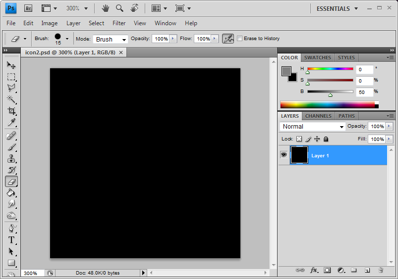
If you see here, I have chosen a 128x128 canvas. This is the background and as you can see, it is flat black. The icon will have mostly black background so I have chosen black.
Step 4
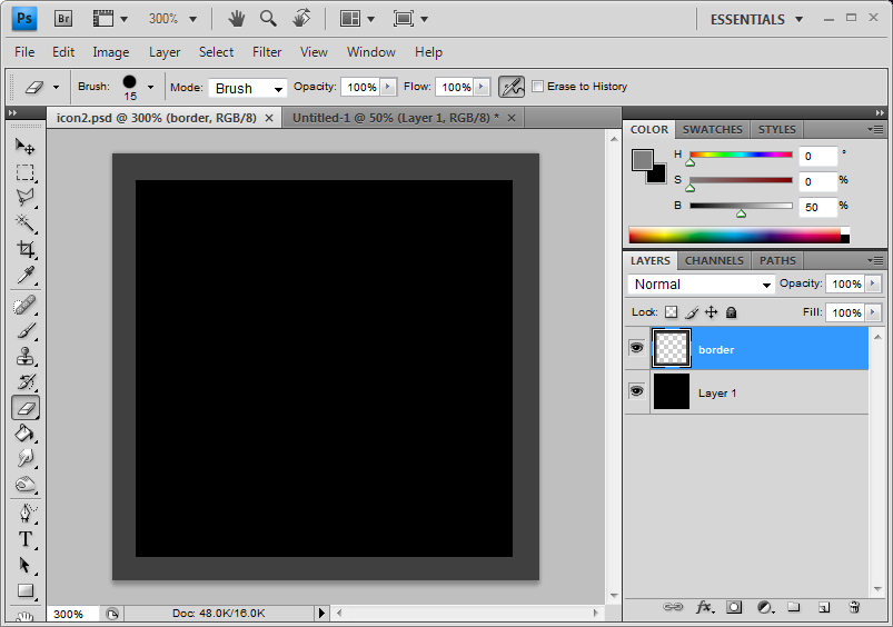
The second thing we do is to set up the borders. The icon you create will be cropped off all around the edges and right from the beginning, you have to understand this and compensate for it. Here, I just covered up the edges with dark grey. This way, I will not waste time fixing things that are going to be cropped off.
Step 5
First thing first, we are going to grey out the basic shape of the object we are going to draw. It is very important that you chose the grey of 0 saturation and 50 brightness. Hue doesnt really matter since saturation is 0.
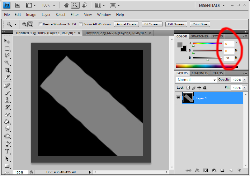
As you can see, I've set it as 0, 0 and 50.
If you cant see this type of slider, just open up the options as shown here and chose the HSB slider. HSB stands for hue, saturation, brightness
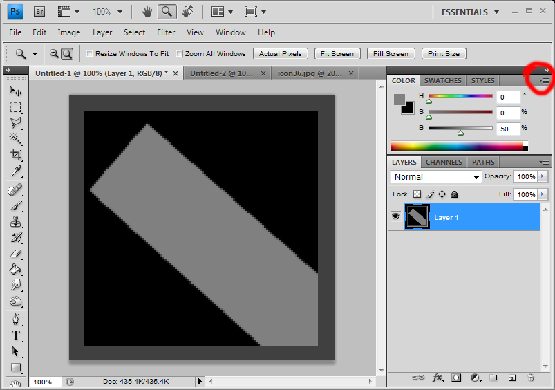
You can chose all kinds of other sliders but I find the HSB sliders to be the most useful
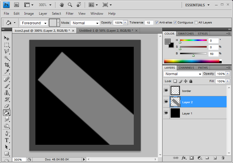
Now, you create a new layer and you block out the approximate shape you want.
Step 6
Now the shape above is of a cylinder shape, taken directly from the side which is incredibly boring. It also limits the way you can express the shape of the object in regards to its mass and depth.
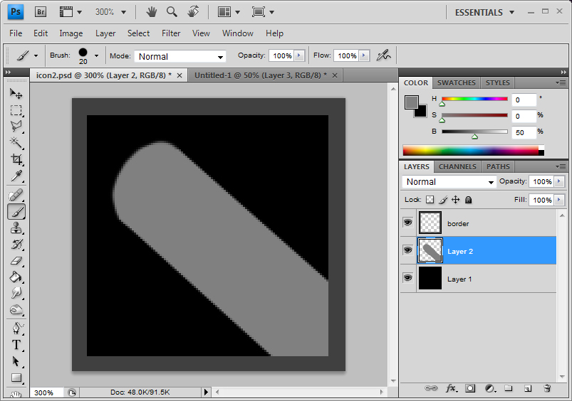
So I simply slant it a little so one end would look rounder. This is still a little boring
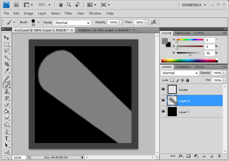
Here, I put a slight foreshortening effect by making the end of the cylinder look smaller than the front. Foreshortening creates a better sense of depth and it enhances the illusion that the object you are drawing is 3 dimensional and possesses mass.
Step 7
Next I create a new layer on top of this grey shape and change the filter type to Overlay
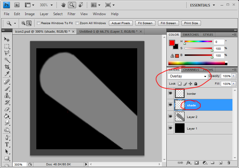
Having set this as overlay is very very important.
Step 8
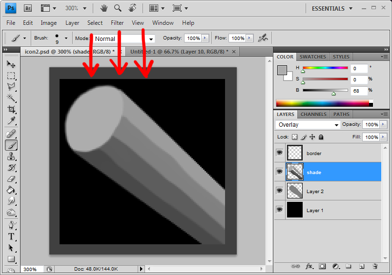
Now pick various scales of grey and roughly block out the dark area and the light areas. As you can see the light is set as coming from more or less directly above. The good thing with setting this layer as overlay is that you do not have to be careful as to not go over the original grey shape. You will never get messy outlines like this. And if you want to refine the grey shape by erasing some parts of it, the overlay layer does so automatically. It is best that you experiment a little bit more with overlay.
Step 9
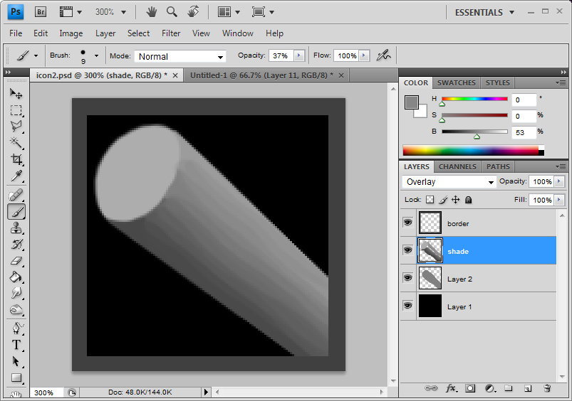
Using the colour picker (while in brush mode, press Alt and select the colour), you can very quickly smooth gradient to the shading to give an impression of a more rounded object. Of course, since my object is wood, shading here does not need to be absolutely evenly graded. In fact, slight uneven-ness gives a natural look.
Step 10

Now, to increase the sense of depth, Even though the lighting may or may not act this way, we make the parts that are closer to the view a little darker. This is simply to give the object an even more illusion of depth.
Step 11.a
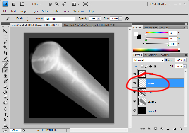
Just experimenting here. Created a new normal layer and gave it a slight highlight to make the surface metallic. Just shows how a simple highlight will change the material of the object.
Step 11.b
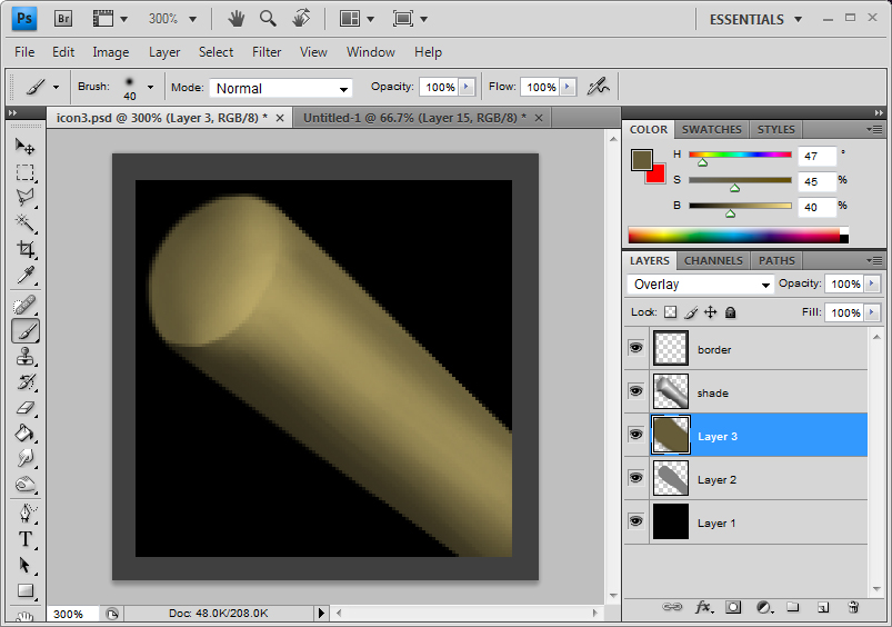
Continuing from step 10, I put a simple brown block, on a new layer between the grey block layer and the overlay shading layer as the colour for my wood.
Step 12

Create another layer above this base colour layer. This will be the wood grain detail layer.
Step 13

First the rings of the wood. These can be simple lines drawn with lighter brown. In my case, I have put a very very fait gradient to it, add a slightest complexity. Of course the resize will make this effort rather redundant but its good wood rendering practice anyways.
Step 14

Now the grooves on the side. How tightly you put these grooves is of personal preferences. Of course, a really refined and smooth wooden surface will not have obvious grooves and barks will have their own distinct patterned grooves.
Step 15
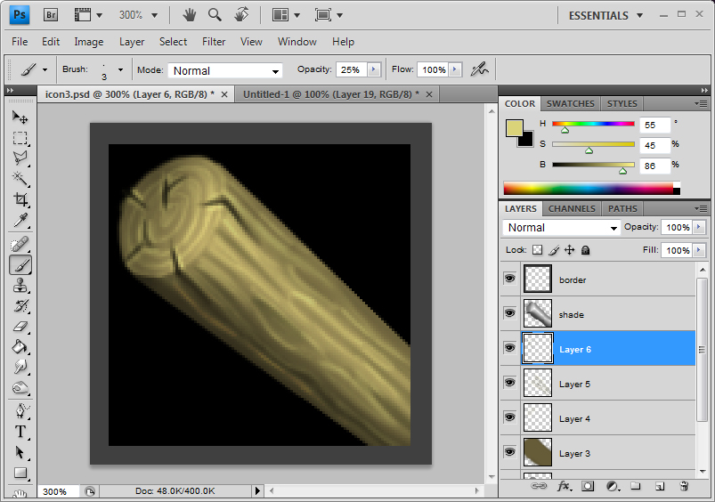
Wood crafted objects tend to dry out over time and as they dry out, the wood will split here and there. Especially round the parts that have been cut. Expensive treated wood will have measures taken so this does not happen. However, the object I am drawing is a rough cheap club and it does not have that kind of special treatment. Draw in some chips and cracks. Cracks on the side will generally follow the grooves you have drawn before and the cracks on the cross sections will follow the shape of the wood ring.
Step 16

What i do here is give bit more highlights to the object, defining the details a bit more, making sure they are clear and they stand out. I just used a thin light brown brush.
After that, the wood is more or less done until the later stages.
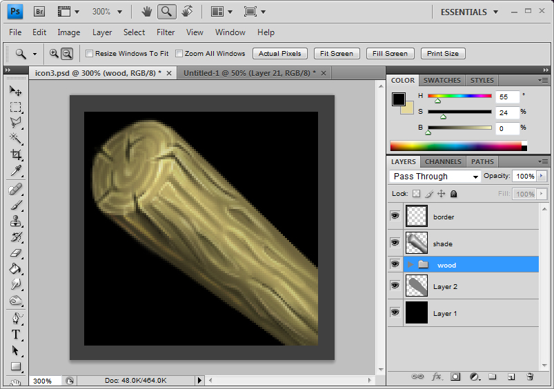
I put all the wood related detail layers in a folder.
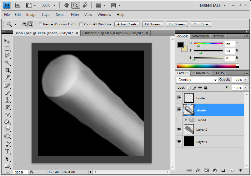
This way, I can turn the visibility of this folder on and off and return to my grey scale image which is useful for the next few phases of the drawing.
Step 17
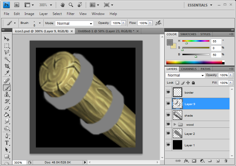
Turn the visibility of the folder back on. What we are doing here is putting bands of metal on the ends of the wooden pole. This prevents the wooden pole from splitting in half completely. In the old days, they also used to do this with string, ropes and animal intestines. Of course, what we have here is a club and metal bands will be more beneficial than ropes. Block out the vague shapes of the metal bands with 0, 0, 50 grey again.
Step 18
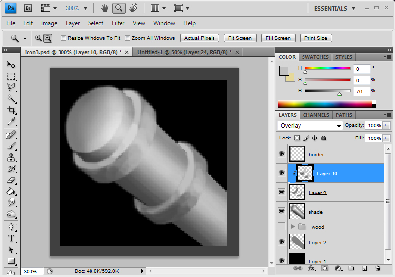
Same process again. Create a new layer on top of this grey shape layer and set the filter mode as Overlay again. This time however, right click the newly create layer and select "Create Clipping Mask". Turn the visibility of the wood detail folder off and use the color picker to quickly shade the metal bands.
Step 19

Same thing again as before. Create a new layer below the shading layer. In here, I decided to give the faintest of bluish grey. Doesn't really matter, once again. I usually prefer my metal slightly blue. If you are going for more rust prone metal, brown would work too, possibly.
Step 20
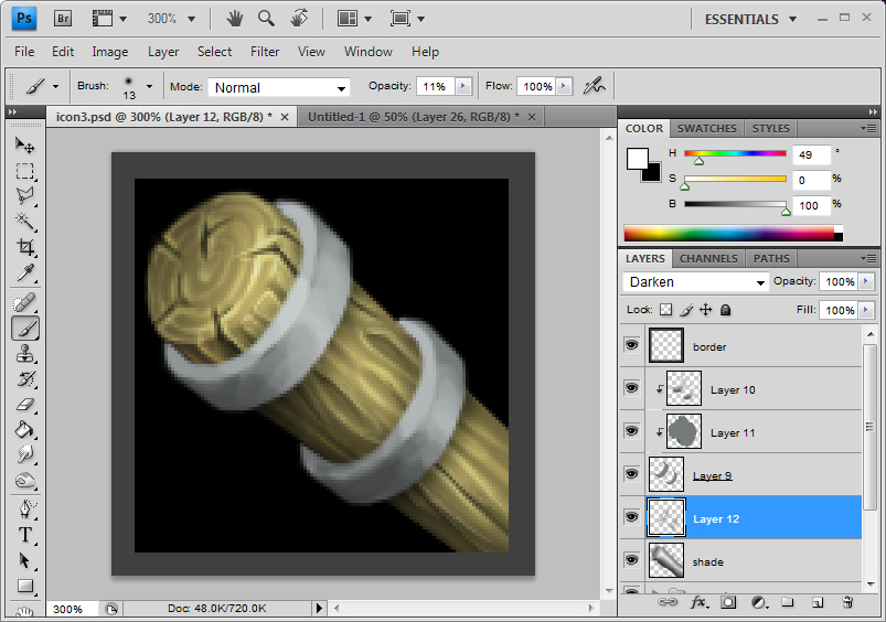
Under the grey shape layer, I decided to brush in some faint shadows the metal bands will cast. Could be set as overlay or darken and could be just set as normal. It's simply personal preferences. I set it as darken.
Step 21

Here I've decided to show some reflective highlights. Of course, this one is incorrect.
The top band and the bottom band are both similarly shaped and both have the same light source. Therefore, the highlights of the top band should align with the bottom band. It isn't doing that.
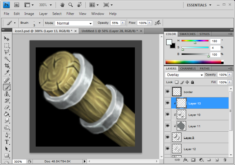
Here it is, fixed.
Step 22
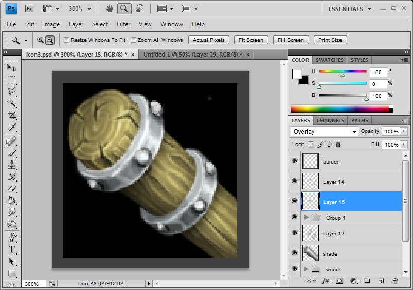
Using simple black and white, on a new layer, draw some rivets on top of the band. Nothing complex.
Step 23
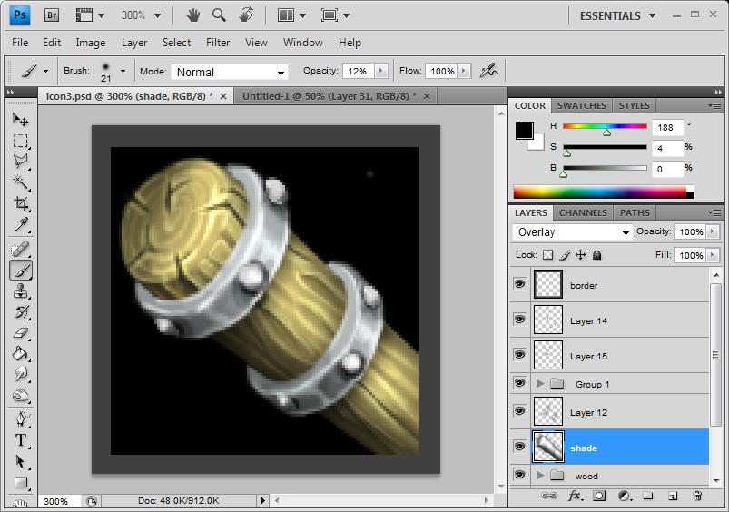
Just brightening up some of the parts as I see fit, just to enhance the 3D aspect of it.
Step 24
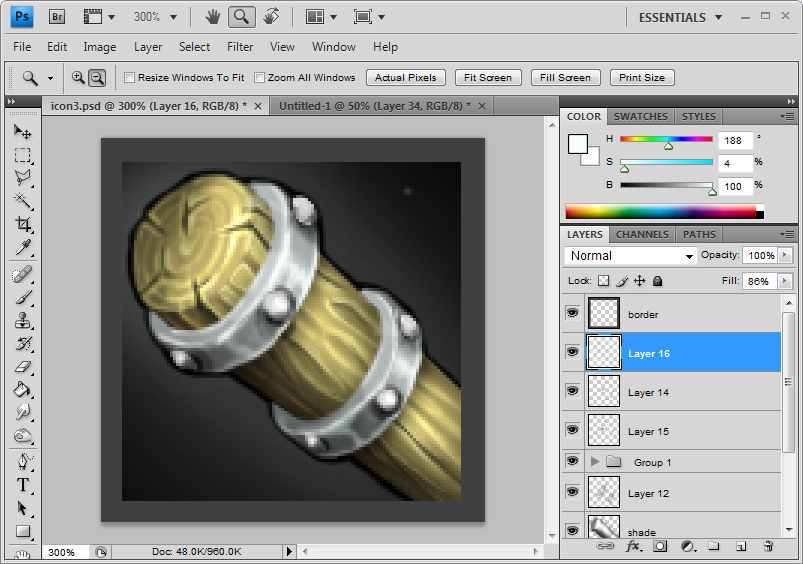
After that has been done, to finish off, you put a glow to the background. Contrary to what some people believe, having a glow does not turn the icon into a spell icon. What having a simple smoothly gradient-ed glow does is to break up the completely flat black of the background. A solid flat black background will weaken the visual strength of shadings in the object. Having this glow also means that some of the dark parts around the edges of the object does not completely disappear in to the black.
Step 25
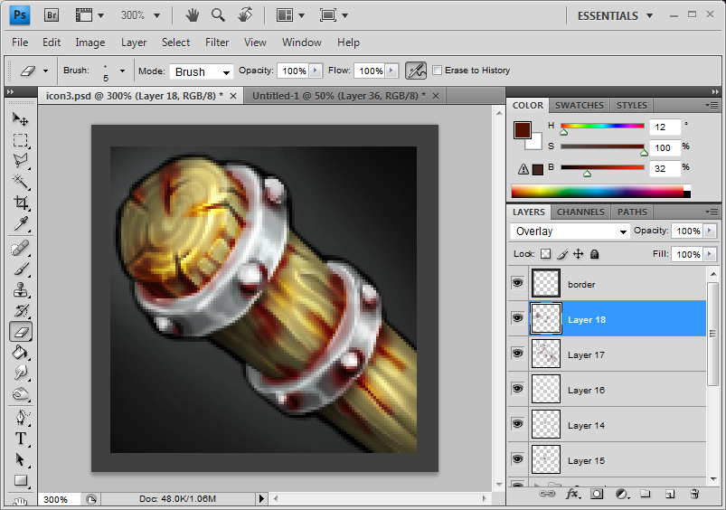
As an extra touch, I decided to make the club a bit bloody. By using soft dark red brushes, you can achieve an effect as if the blood has stained the wood. Use this to stain the cracks and corners, especially where the metal meets the wood. Don't forget a little red on the metal themselves to represent the way they will reflect the red of the blood a bit.
Step 26
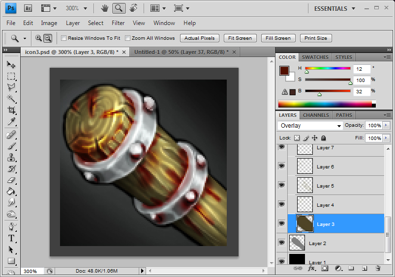
Here, instead of red blood stains, I put more blend of more brownish blood stains. It is subtle but it adds details.
Step 27
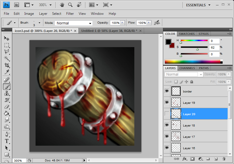
Here is some dripping blood.
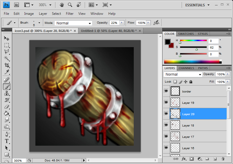
Then the shadow that the blood casts. It is a very small thing but it makes a difference.
Step 28
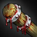
And here is the final image without the borders.
At this point, you MUST save this file, not flattened down, as a different file under different name. You are making a backup file. When working with computers, always make a backup file.
Step 29

Now what you do is resize it to a 64x64 sized icon. Button manager will do this automatically but we don't want to do it automatically.
Now, as you can see, the resize didnt totally kill the details. It is pretty acceptable. You can see the grains of the wood, the blood, the metal and the glow. Pretty clear.
Step 30

Last thing you might want to tweak is the Sharpen filter. Make sure your 64x64 image is flattened down. And then go to the Filter option and the top and choose one of the sharpen options. Your image should look a bit harsher and more rigid right now.
Press on your keyboard Ctrl + Shift + F and a sharpen slider will pop up. Simple tweak the slider to get the image that you want.
After this, you can manually sharpen some more stuff up. It is personal preference.
Now save this file up as jpeg and name it the object name. I named my image "Beatstick"
Naming your jpeg file properly will make things easier for you.
Step 31
Open up Button Manager. You can get button manager from here. In button manager, open up your jpeg file. Select the border you want. You will be able to see what the icon looks like in the preview. And simple save the image. Button manager will automatically name the blp. file with the BTN prefix as well as creating a DISBTN version, in your folder.
That would be it.
Don't forget, NEVER delete your un-merged original files as you will need them to improve upon stuff when you get a feedback.
Step 1.
Choose what you are going to draw. In this case, I am choosing to draw something simple, a club. I chose a club because this will allow me to show you how to render both metal and wood which I presume are the most widely used materials drawn.
Step 2.
Now choose what canvas size you are going to draw on. People often choose the most arbitrary numbers of canvas size, 1000x1000, 2000x2000 or even 1500x1200. Bigger the better seems to be the thought process here. And it really isn't.
You have to look at what your final product is going to be. it is a 64x64 sized icon. So the really logical step will be to choose a 64x64 size canvas. If you feel that it is way too small to draw on, then you can use 128x128. But 256x256 is really pushing it. Bigger the canvas, the more details you are going to lose when you resize to 64x64 size.
Of course, you may draw really roughly and use the blurring of the resize to compensate the roughness. This works here and there and this would really be personal preferences.
Once again, I just prefer using small images to begin with.
Step 3

If you see here, I have chosen a 128x128 canvas. This is the background and as you can see, it is flat black. The icon will have mostly black background so I have chosen black.
Step 4

The second thing we do is to set up the borders. The icon you create will be cropped off all around the edges and right from the beginning, you have to understand this and compensate for it. Here, I just covered up the edges with dark grey. This way, I will not waste time fixing things that are going to be cropped off.
Step 5
First thing first, we are going to grey out the basic shape of the object we are going to draw. It is very important that you chose the grey of 0 saturation and 50 brightness. Hue doesnt really matter since saturation is 0.

As you can see, I've set it as 0, 0 and 50.
If you cant see this type of slider, just open up the options as shown here and chose the HSB slider. HSB stands for hue, saturation, brightness

You can chose all kinds of other sliders but I find the HSB sliders to be the most useful

Now, you create a new layer and you block out the approximate shape you want.
Step 6
Now the shape above is of a cylinder shape, taken directly from the side which is incredibly boring. It also limits the way you can express the shape of the object in regards to its mass and depth.

So I simply slant it a little so one end would look rounder. This is still a little boring

Here, I put a slight foreshortening effect by making the end of the cylinder look smaller than the front. Foreshortening creates a better sense of depth and it enhances the illusion that the object you are drawing is 3 dimensional and possesses mass.
Step 7
Next I create a new layer on top of this grey shape and change the filter type to Overlay

Having set this as overlay is very very important.
Step 8

Now pick various scales of grey and roughly block out the dark area and the light areas. As you can see the light is set as coming from more or less directly above. The good thing with setting this layer as overlay is that you do not have to be careful as to not go over the original grey shape. You will never get messy outlines like this. And if you want to refine the grey shape by erasing some parts of it, the overlay layer does so automatically. It is best that you experiment a little bit more with overlay.
Step 9

Using the colour picker (while in brush mode, press Alt and select the colour), you can very quickly smooth gradient to the shading to give an impression of a more rounded object. Of course, since my object is wood, shading here does not need to be absolutely evenly graded. In fact, slight uneven-ness gives a natural look.
Step 10

Now, to increase the sense of depth, Even though the lighting may or may not act this way, we make the parts that are closer to the view a little darker. This is simply to give the object an even more illusion of depth.
Step 11.a

Just experimenting here. Created a new normal layer and gave it a slight highlight to make the surface metallic. Just shows how a simple highlight will change the material of the object.
Step 11.b

Continuing from step 10, I put a simple brown block, on a new layer between the grey block layer and the overlay shading layer as the colour for my wood.
Step 12

Create another layer above this base colour layer. This will be the wood grain detail layer.
Step 13

First the rings of the wood. These can be simple lines drawn with lighter brown. In my case, I have put a very very fait gradient to it, add a slightest complexity. Of course the resize will make this effort rather redundant but its good wood rendering practice anyways.
Step 14

Now the grooves on the side. How tightly you put these grooves is of personal preferences. Of course, a really refined and smooth wooden surface will not have obvious grooves and barks will have their own distinct patterned grooves.
Step 15

Wood crafted objects tend to dry out over time and as they dry out, the wood will split here and there. Especially round the parts that have been cut. Expensive treated wood will have measures taken so this does not happen. However, the object I am drawing is a rough cheap club and it does not have that kind of special treatment. Draw in some chips and cracks. Cracks on the side will generally follow the grooves you have drawn before and the cracks on the cross sections will follow the shape of the wood ring.
Step 16

What i do here is give bit more highlights to the object, defining the details a bit more, making sure they are clear and they stand out. I just used a thin light brown brush.
After that, the wood is more or less done until the later stages.

I put all the wood related detail layers in a folder.

This way, I can turn the visibility of this folder on and off and return to my grey scale image which is useful for the next few phases of the drawing.
Step 17

Turn the visibility of the folder back on. What we are doing here is putting bands of metal on the ends of the wooden pole. This prevents the wooden pole from splitting in half completely. In the old days, they also used to do this with string, ropes and animal intestines. Of course, what we have here is a club and metal bands will be more beneficial than ropes. Block out the vague shapes of the metal bands with 0, 0, 50 grey again.
Step 18

Same process again. Create a new layer on top of this grey shape layer and set the filter mode as Overlay again. This time however, right click the newly create layer and select "Create Clipping Mask". Turn the visibility of the wood detail folder off and use the color picker to quickly shade the metal bands.
Step 19

Same thing again as before. Create a new layer below the shading layer. In here, I decided to give the faintest of bluish grey. Doesn't really matter, once again. I usually prefer my metal slightly blue. If you are going for more rust prone metal, brown would work too, possibly.
Step 20

Under the grey shape layer, I decided to brush in some faint shadows the metal bands will cast. Could be set as overlay or darken and could be just set as normal. It's simply personal preferences. I set it as darken.
Step 21

Here I've decided to show some reflective highlights. Of course, this one is incorrect.
The top band and the bottom band are both similarly shaped and both have the same light source. Therefore, the highlights of the top band should align with the bottom band. It isn't doing that.

Here it is, fixed.
Step 22

Using simple black and white, on a new layer, draw some rivets on top of the band. Nothing complex.
Step 23

Just brightening up some of the parts as I see fit, just to enhance the 3D aspect of it.
Step 24

After that has been done, to finish off, you put a glow to the background. Contrary to what some people believe, having a glow does not turn the icon into a spell icon. What having a simple smoothly gradient-ed glow does is to break up the completely flat black of the background. A solid flat black background will weaken the visual strength of shadings in the object. Having this glow also means that some of the dark parts around the edges of the object does not completely disappear in to the black.
Step 25

As an extra touch, I decided to make the club a bit bloody. By using soft dark red brushes, you can achieve an effect as if the blood has stained the wood. Use this to stain the cracks and corners, especially where the metal meets the wood. Don't forget a little red on the metal themselves to represent the way they will reflect the red of the blood a bit.
Step 26

Here, instead of red blood stains, I put more blend of more brownish blood stains. It is subtle but it adds details.
Step 27

Here is some dripping blood.

Then the shadow that the blood casts. It is a very small thing but it makes a difference.
Step 28

And here is the final image without the borders.
At this point, you MUST save this file, not flattened down, as a different file under different name. You are making a backup file. When working with computers, always make a backup file.
Step 29

Now what you do is resize it to a 64x64 sized icon. Button manager will do this automatically but we don't want to do it automatically.
Now, as you can see, the resize didnt totally kill the details. It is pretty acceptable. You can see the grains of the wood, the blood, the metal and the glow. Pretty clear.
Step 30

Last thing you might want to tweak is the Sharpen filter. Make sure your 64x64 image is flattened down. And then go to the Filter option and the top and choose one of the sharpen options. Your image should look a bit harsher and more rigid right now.
Press on your keyboard Ctrl + Shift + F and a sharpen slider will pop up. Simple tweak the slider to get the image that you want.
After this, you can manually sharpen some more stuff up. It is personal preference.
Now save this file up as jpeg and name it the object name. I named my image "Beatstick"
Naming your jpeg file properly will make things easier for you.
Step 31
Open up Button Manager. You can get button manager from here. In button manager, open up your jpeg file. Select the border you want. You will be able to see what the icon looks like in the preview. And simple save the image. Button manager will automatically name the blp. file with the BTN prefix as well as creating a DISBTN version, in your folder.
That would be it.
Don't forget, NEVER delete your un-merged original files as you will need them to improve upon stuff when you get a feedback.
You can read through the following guide if you need help on shading and texture rendering (how to make things look like they have a certain texture). In reality, the only way to really learn is to learn things yourself but the following will definitely help you.
The following can be useful for all kinds of illustration, not just icons. However, it is vital that icons are done correctly. Only given a limited space of 64x64 minus what the border takes away, every space on the icon has to count into fulfilling the purpose of an icon:
To effectively represent an object or an action in a clear and defined way
What that basically means is that your icon must sufficiently represent what it is supposed to represent. There can be no ambiguity about it. If it is a 3 dimensional object, it must look 3D. If it is an 2D pictorial representation of an object, it must look 2D. If it is a woven basket, it must look like a woven basket. It must not look like something other than what it should look like.
Basic Icon Technique : Shading
As I said before, it is vital that your 3D objects look 3D, and the best way to represent 3D aspects of an object is to use shading.
Firstly, everyone's favorite subject...
...a sword. People seem to love swords and it seems like everyone's first icon happens to be a sword. It allows a lot of creativity, while giving variety of shapes to practice shading and coloring.
I work in 64x64. It takes away the whole quality loss problems that come with resizing. Working in bigger size has its advantages and working in small size has its own. It's really up to you on how you do it.
1. Flat

I've seen quite a few people do this. This is not what a sword should be. Swords are not made out of a thin, flat sheet metal. They have a variety of thicknesses; the thick main part to add weight and the very thin, sharp edge to cut with. The above is not a sword.
2. Cylinder
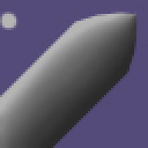
I've seen few people do this. The problem here is that when a sword is shaded like this, it makes it look really fat or even completely cylindrical. This type of shading is shown by a very bright topside and a very dark bottom side. The top gets a very good deal of the light, while the bottom, which is on the complete opposite side, gets very little light and is therefore very dark. Don't do this for your swords. Do this kind of shading for round maces, pipes, canes/quarterstaves, bullets, and gun barrels. Anything round can take this kind of shading.
3. Ellipse/pointed ellipse


This is a mixture between "the flat" and "the cylinder". It is neither too flat nor too fat. This would be a good shape to form a sword with. The white lights up at the top, but not as much as the top of the cylinder because it is slanted, and therefore takes less direct light. The bottom is not a complete black because that too is slanted and is able to get more light than the bottom of a cylinder.
4. Two sided


Moving on to more angular shapes. This is a typical two-sided object. This is defined by two distinct tones of shading. This kind of shading would be used for crude weapons where the edges are basically beaten into shape this way, and then beaten in the shape the other way, and then repeated on both sides.
The above two, the ellipse and the two-sided are a very good starting point to draw a sword. So, can I use any of the two to draw my sword? No. It would depend entirely up to what kind of feeling you want to convey out of your sword and what kind of "attitude" it has. The ellipse has very smooth shading. This gradual tone tells the brain that this is a smooth and curved object. Therefore, it will be much more suited for being turned into a sort of an elven sword. Elves are graceful and elegant, their movements are swift and flowing, and so should their weapons be. The smooth shadings, such as on the ellipse shape, are suited for that. The two-side, however, has a very sharp, abrupt change of shading. This is conveyed by the brain as something pointed or sharp and solid. It is more suited to the likes of an axe or a cheap foot man sword; hard and crude.
5. Three Sided


This is similar to the two sided. They both have relatively sharp shading. The sole difference, however, is the opportunities this kind of shape provides. It allows for more variety of shading, different reflective surfaces and different shadings. This kind of variety adds richness to your image, making it a whole lot more nice to look at. Also, having 3 sides means that you can assign the top side as the top sharp edge and the bottom side as the bottom sharp edge. This gives you new opportunities try and decorate your sword with various bits and pieces like runes, jewels, skulls etc. Why can't we just do that for the two-sided? Because in real life swords, the sharp edges are ground on a whetstone to give that sharp edge. Now let's say you put an expensive ruby on the grinding edge. Either you will lose a very expensive ruby or you won't get your sword sharpened at all. 3+ sides is the way to go if you want extensive decorations.
6. Complex (2-sided + 3-sided)

Honestly speaking, you wont really use the example shape shown in the 3 sided. The sharp edge thins out and nobody would want to spend time while sharpening, making sure that the 3 sides are visible to the very tip of the sword. This combination of 2-sided and 3-sided is the more realistic method of creating a sword. It has all the advantages of a 3-sided one.
7. Complex(2-sided + 3-sided + ellipse)


This is a one that is a tad bit harder than the rest. This kind of sword has what is called a "groove", or a fuller. This effectively lightens the blade by taking a whole lot of metal away, while retaining its main shape and strength. This basically is the 2-sided + 3-sided, where the middle section has been swapped out with inverted ellipse shading. The harder the shading is on the groove section, the deeper your groove is represented.
As you get better, you might want to try slightly more complex shapes:

That just consisted of the 2,3-sided, with a groove, but I changed my basic shape at the start. Two other things I did was I dramatized my shading as well as adding a surface-texture effect of a metal surface by using a slight white. More on those two later.
As I said before, it is vital that your 3D objects look 3D, and the best way to represent 3D aspects of an object is to use shading.
Firstly, everyone's favorite subject...
...a sword. People seem to love swords and it seems like everyone's first icon happens to be a sword. It allows a lot of creativity, while giving variety of shapes to practice shading and coloring.
I work in 64x64. It takes away the whole quality loss problems that come with resizing. Working in bigger size has its advantages and working in small size has its own. It's really up to you on how you do it.
1. Flat


I've seen quite a few people do this. This is not what a sword should be. Swords are not made out of a thin, flat sheet metal. They have a variety of thicknesses; the thick main part to add weight and the very thin, sharp edge to cut with. The above is not a sword.
2. Cylinder


I've seen few people do this. The problem here is that when a sword is shaded like this, it makes it look really fat or even completely cylindrical. This type of shading is shown by a very bright topside and a very dark bottom side. The top gets a very good deal of the light, while the bottom, which is on the complete opposite side, gets very little light and is therefore very dark. Don't do this for your swords. Do this kind of shading for round maces, pipes, canes/quarterstaves, bullets, and gun barrels. Anything round can take this kind of shading.
3. Ellipse/pointed ellipse


This is a mixture between "the flat" and "the cylinder". It is neither too flat nor too fat. This would be a good shape to form a sword with. The white lights up at the top, but not as much as the top of the cylinder because it is slanted, and therefore takes less direct light. The bottom is not a complete black because that too is slanted and is able to get more light than the bottom of a cylinder.
4. Two sided


Moving on to more angular shapes. This is a typical two-sided object. This is defined by two distinct tones of shading. This kind of shading would be used for crude weapons where the edges are basically beaten into shape this way, and then beaten in the shape the other way, and then repeated on both sides.
The above two, the ellipse and the two-sided are a very good starting point to draw a sword. So, can I use any of the two to draw my sword? No. It would depend entirely up to what kind of feeling you want to convey out of your sword and what kind of "attitude" it has. The ellipse has very smooth shading. This gradual tone tells the brain that this is a smooth and curved object. Therefore, it will be much more suited for being turned into a sort of an elven sword. Elves are graceful and elegant, their movements are swift and flowing, and so should their weapons be. The smooth shadings, such as on the ellipse shape, are suited for that. The two-side, however, has a very sharp, abrupt change of shading. This is conveyed by the brain as something pointed or sharp and solid. It is more suited to the likes of an axe or a cheap foot man sword; hard and crude.
5. Three Sided


This is similar to the two sided. They both have relatively sharp shading. The sole difference, however, is the opportunities this kind of shape provides. It allows for more variety of shading, different reflective surfaces and different shadings. This kind of variety adds richness to your image, making it a whole lot more nice to look at. Also, having 3 sides means that you can assign the top side as the top sharp edge and the bottom side as the bottom sharp edge. This gives you new opportunities try and decorate your sword with various bits and pieces like runes, jewels, skulls etc. Why can't we just do that for the two-sided? Because in real life swords, the sharp edges are ground on a whetstone to give that sharp edge. Now let's say you put an expensive ruby on the grinding edge. Either you will lose a very expensive ruby or you won't get your sword sharpened at all. 3+ sides is the way to go if you want extensive decorations.
6. Complex (2-sided + 3-sided)

Honestly speaking, you wont really use the example shape shown in the 3 sided. The sharp edge thins out and nobody would want to spend time while sharpening, making sure that the 3 sides are visible to the very tip of the sword. This combination of 2-sided and 3-sided is the more realistic method of creating a sword. It has all the advantages of a 3-sided one.
7. Complex(2-sided + 3-sided + ellipse)


This is a one that is a tad bit harder than the rest. This kind of sword has what is called a "groove", or a fuller. This effectively lightens the blade by taking a whole lot of metal away, while retaining its main shape and strength. This basically is the 2-sided + 3-sided, where the middle section has been swapped out with inverted ellipse shading. The harder the shading is on the groove section, the deeper your groove is represented.
As you get better, you might want to try slightly more complex shapes:

That just consisted of the 2,3-sided, with a groove, but I changed my basic shape at the start. Two other things I did was I dramatized my shading as well as adding a surface-texture effect of a metal surface by using a slight white. More on those two later.
Basic Icon Technique : Texture
On top of tone/shading, texture is the next most important basis that you MUST get right. What your object is identified as depends on entirely what kind of texture it has.
I am going to go through, step by step, on doing some of the most common texture that people use and seem to get wrong. That is wood.
In this guide, we are going to go through both natural wood(with bark) and processed wood(without bark) and we are going to learn how to do texture bark and wood grains.
1. Bark
Doing the bark right is very important when drawing a living tree.
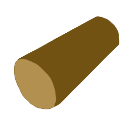
Lets start twith the basic form. Here, I got a simple cylindrical shape and gave it a more wood-like colour
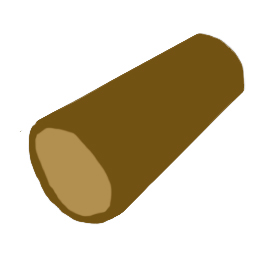
Now a bark is not a simple flat covering. It has a thickness and we must show it.

Now the basic tone/shading. See how here my shading isn't extreme like the cylinder shading I showed in the shading tut. It goes light to dark without going near complete black. That is because i want to give it a subtly softer look because barked wood is organic therefore more soft. If it was a hardened processed wood with its bark stripped off, it would have a more extreme shading. If needs arise, you can always put more shading at thee end.

Now put in the grooves of the bark. It's not wise to put grooves that go all the way through the trunk from beginning to end. That tends to ruin the natural look you want to achieve. Instead, have a few short ones and few long ones that fade out before reaching the end of the trunk.

Now this is something called a knot. The happen when a branch grows out of the main trunk but happens to be broken off and then healed, creating this distinct round pattern. Erase some of those grooves you have drawn before, draw the swirl of the knot and then redraw the grooves so they flow past the knot. Now take note that this knot can be an old one which would then be very close to the colour of the bark, or it could be a cross section of a sprouting branch which has just been cut which would then be a very light colour. If it is a recent cut, you would want to texture it like a cross section of a tree trunk which I will show in the next section. This example shown here is an old cut.
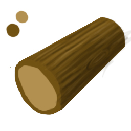
Now simply put in lighter highlights following the grooves as well as the knot. Make sure they fade as the grooves fade

Finally to show that the grooves are actually 3D, not just bunch of lines, I put little groove cross sections on the end of the trunk. Make sure they head towards the center of the trunk.
2. Cross section grains
These are the rings you see when you cut a tree

First, light circles

Then dark circles that follow the shape of the light circle

Thicker but softer brush to represent bigger light bands. These overlap with the previous light band to give a stronger light band.

Same thing with the darker band
Now your tree trunk cross section is about done. However, the following one extra detail can be added

These cracks occur in tree trunks when they have been cut and left for a while or due to the growth of the tree. It normally happens when cut wood is dried out so the fibres in the wood shrinks and expands, ripping little gaps. These almost always radiate from the centre of the trunk. The radiate as well as splitting between bands of the tree.

Finally hightlight the edges of the cracks for emphasis.
On top of tone/shading, texture is the next most important basis that you MUST get right. What your object is identified as depends on entirely what kind of texture it has.
I am going to go through, step by step, on doing some of the most common texture that people use and seem to get wrong. That is wood.
In this guide, we are going to go through both natural wood(with bark) and processed wood(without bark) and we are going to learn how to do texture bark and wood grains.
1. Bark
Doing the bark right is very important when drawing a living tree.

Lets start twith the basic form. Here, I got a simple cylindrical shape and gave it a more wood-like colour

Now a bark is not a simple flat covering. It has a thickness and we must show it.

Now the basic tone/shading. See how here my shading isn't extreme like the cylinder shading I showed in the shading tut. It goes light to dark without going near complete black. That is because i want to give it a subtly softer look because barked wood is organic therefore more soft. If it was a hardened processed wood with its bark stripped off, it would have a more extreme shading. If needs arise, you can always put more shading at thee end.

Now put in the grooves of the bark. It's not wise to put grooves that go all the way through the trunk from beginning to end. That tends to ruin the natural look you want to achieve. Instead, have a few short ones and few long ones that fade out before reaching the end of the trunk.

Now this is something called a knot. The happen when a branch grows out of the main trunk but happens to be broken off and then healed, creating this distinct round pattern. Erase some of those grooves you have drawn before, draw the swirl of the knot and then redraw the grooves so they flow past the knot. Now take note that this knot can be an old one which would then be very close to the colour of the bark, or it could be a cross section of a sprouting branch which has just been cut which would then be a very light colour. If it is a recent cut, you would want to texture it like a cross section of a tree trunk which I will show in the next section. This example shown here is an old cut.

Now simply put in lighter highlights following the grooves as well as the knot. Make sure they fade as the grooves fade

Finally to show that the grooves are actually 3D, not just bunch of lines, I put little groove cross sections on the end of the trunk. Make sure they head towards the center of the trunk.
2. Cross section grains
These are the rings you see when you cut a tree

First, light circles

Then dark circles that follow the shape of the light circle

Thicker but softer brush to represent bigger light bands. These overlap with the previous light band to give a stronger light band.

Same thing with the darker band
Now your tree trunk cross section is about done. However, the following one extra detail can be added

These cracks occur in tree trunks when they have been cut and left for a while or due to the growth of the tree. It normally happens when cut wood is dried out so the fibres in the wood shrinks and expands, ripping little gaps. These almost always radiate from the centre of the trunk. The radiate as well as splitting between bands of the tree.

Finally hightlight the edges of the cracks for emphasis.
Last edited:


