- Joined
- Mar 26, 2011
- Messages
- 1,280
Basic Icons Tutorial
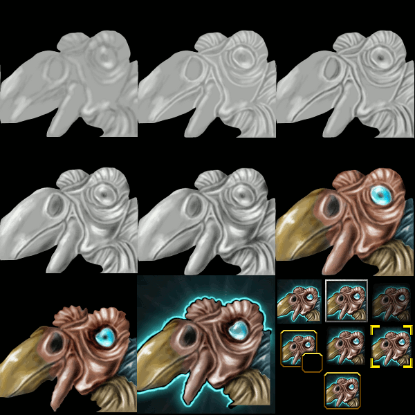
Example of basic icons that can be made with only a little practice.

Excuse me, these images in GIF format lacks quality.

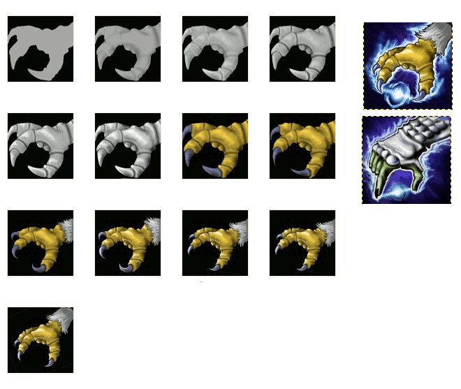

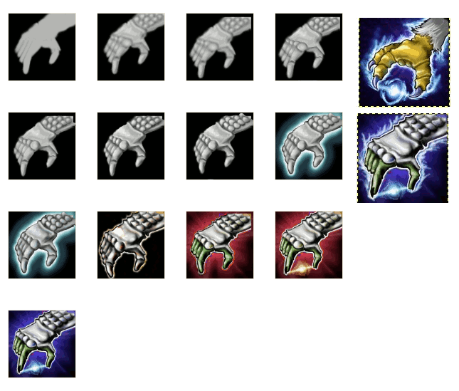


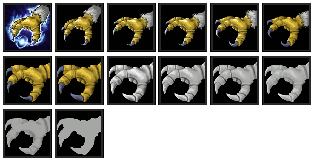
First Example: Wildkin's hand casting a spell, step by step.

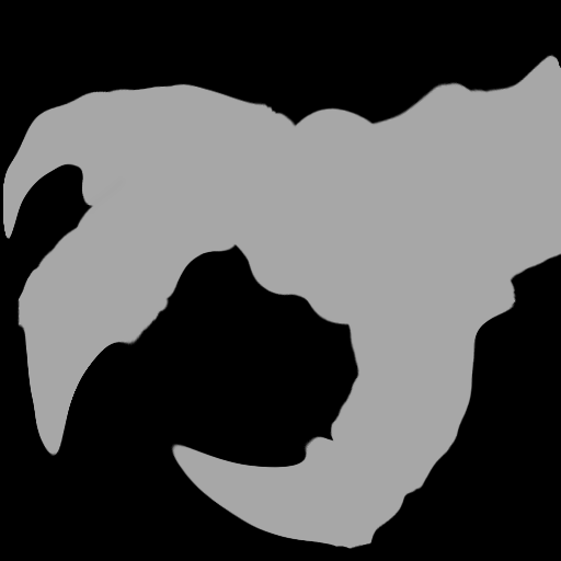
The shape can be easily carved, using the drag tool.
Do lighter shadows only for pre-setting the drawing, if possible use a reference image.
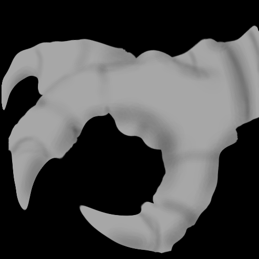
Now you should lighten your drawing following the actual behavior of light.
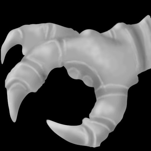
Make dark lines in the central part of the shadows.
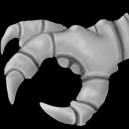
Among the lighter areas, create some areas clearer still, almost absolute white.
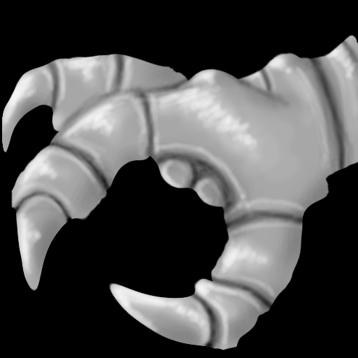
Shadows largest in the region opposite the illuminated region.
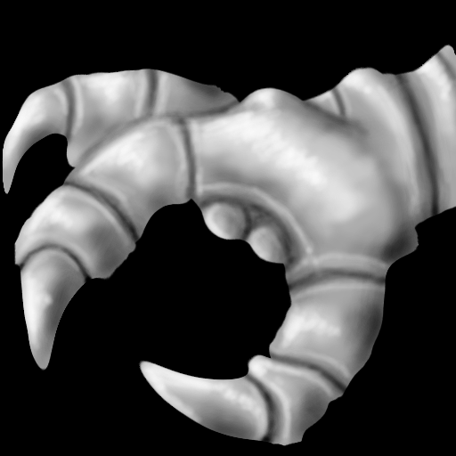
Coloring is important before the last stages, because the color will be compressed when shadows are also compressed.
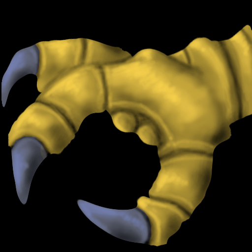
Thus the shadow and color, when compressed, will blend better.
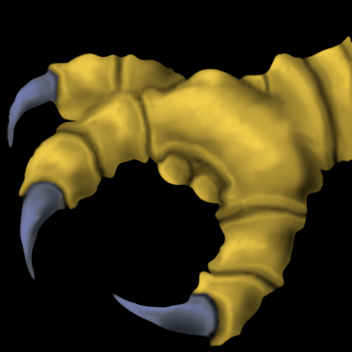
In this case the details that were added are the feathers.
Is important resize the drawing to suit the future icon.
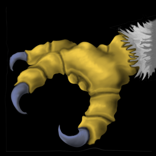
The strongest highlights. To really seem illuminated when resized.
And reshaping to suit the actual anatomy.

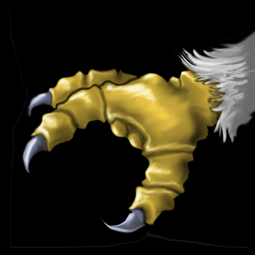
Choose the best angle for the icon, which makes the behavior of light to be more natural.
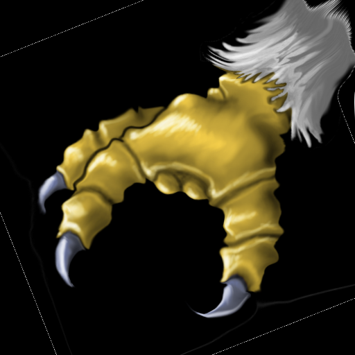
The only drawback in this part, is to be careful not to color the drawing to blend in with the background color.
Same colors in the drawing and background can mingle and reduce the definition of the icon.
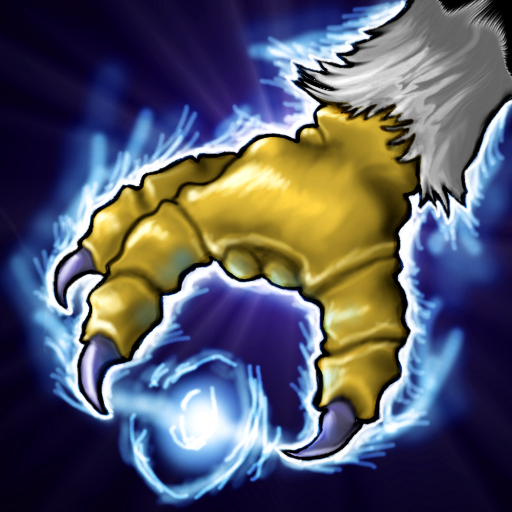
Thanks for reading,
I hope it helps future icon-makers.
And keeping alive the HWS.
And keeping alive the HWS.
Last edited by a moderator:


