Xenostalker's Gallery

Status
Not open for further replies.
Level 9
Joined
Dec 17, 2008
Messages
312
Hello everyone;

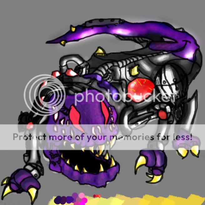
I began concept art (or that style of drawing) with GIMP. Now, moving on to Photoshop CS3, I have been practicing to harness my full potential. I'm still practicing, but I have a portfolio of my complete gallery at this link : http://xenostalker.daportfolio.com/

Free for comments/suggestions/ideas/and what not!

==========

==========


• None, Yet
 

Attachments

  • BlackKnightRework1 PICTUREjpg.jpg
    BlackKnightRework1 PICTUREjpg.jpg
    139.9 KB · Views: 186
  • SkyllRage24.jpg
    SkyllRage24.jpg
    155.7 KB · Views: 175
  • BannerT1-2.jpg
    BannerT1-2.jpg
    43.3 KB · Views: 116
  • BannerReduxPicture.jpg
    BannerReduxPicture.jpg
    52.9 KB · Views: 149
  • KnightRender1FINAL.jpg
    KnightRender1FINAL.jpg
    436.1 KB · Views: 144
  • ShadyBanner 2.jpg
    ShadyBanner 2.jpg
    41.6 KB · Views: 119
  • Lick_Gredduxrendered1.jpg
    Lick_Gredduxrendered1.jpg
    507.4 KB · Views: 166
  • Skeletor2.jpg
    Skeletor2.jpg
    181.6 KB · Views: 113
  • TatteredWorld copy.jpg
    TatteredWorld copy.jpg
    345.7 KB · Views: 148
  • Gapfield copy.jpg
    Gapfield copy.jpg
    831.2 KB · Views: 166
  • LoadingScreenLOARPG FINAL.jpg
    LoadingScreenLOARPG FINAL.jpg
    285.5 KB · Views: 161
Last edited:
Level 9
Joined
Dec 17, 2008
Messages
312
I'm not sure how I feel about these. Don't get me wrong, they look great, yet there's so much potential left in them. They all seem half finished.

I could understand that. Though, I don't get that feeling after drawing them, after looking back they could use a few touch-ups. What specifically are they lacking? Anything major?
 
Level 7
Joined
Aug 27, 2008
Messages
378
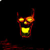
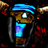
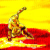
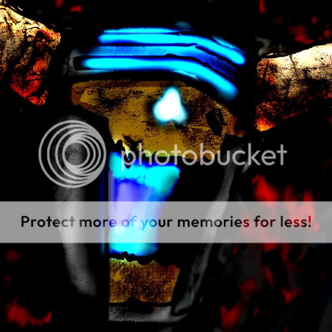
The first one looks alright, But the second one looks a little plain. It's almost completely yellow in his eyes, and especially his mouth. Try making it blend from red to yellow rather than just one straight to the other. Everything else looks alright though, just the eyes and moth.
 
Level 13
Joined
Jan 19, 2008
Messages
793
Well what I'm seeing is that you do some really nice detail work on some parts, then leave other areas incredibly plain. I believe you should try and detail the piece as a whole. (This goes for a lot of them on your site as well.)
 
Level 9
Joined
Dec 17, 2008
Messages
312
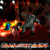
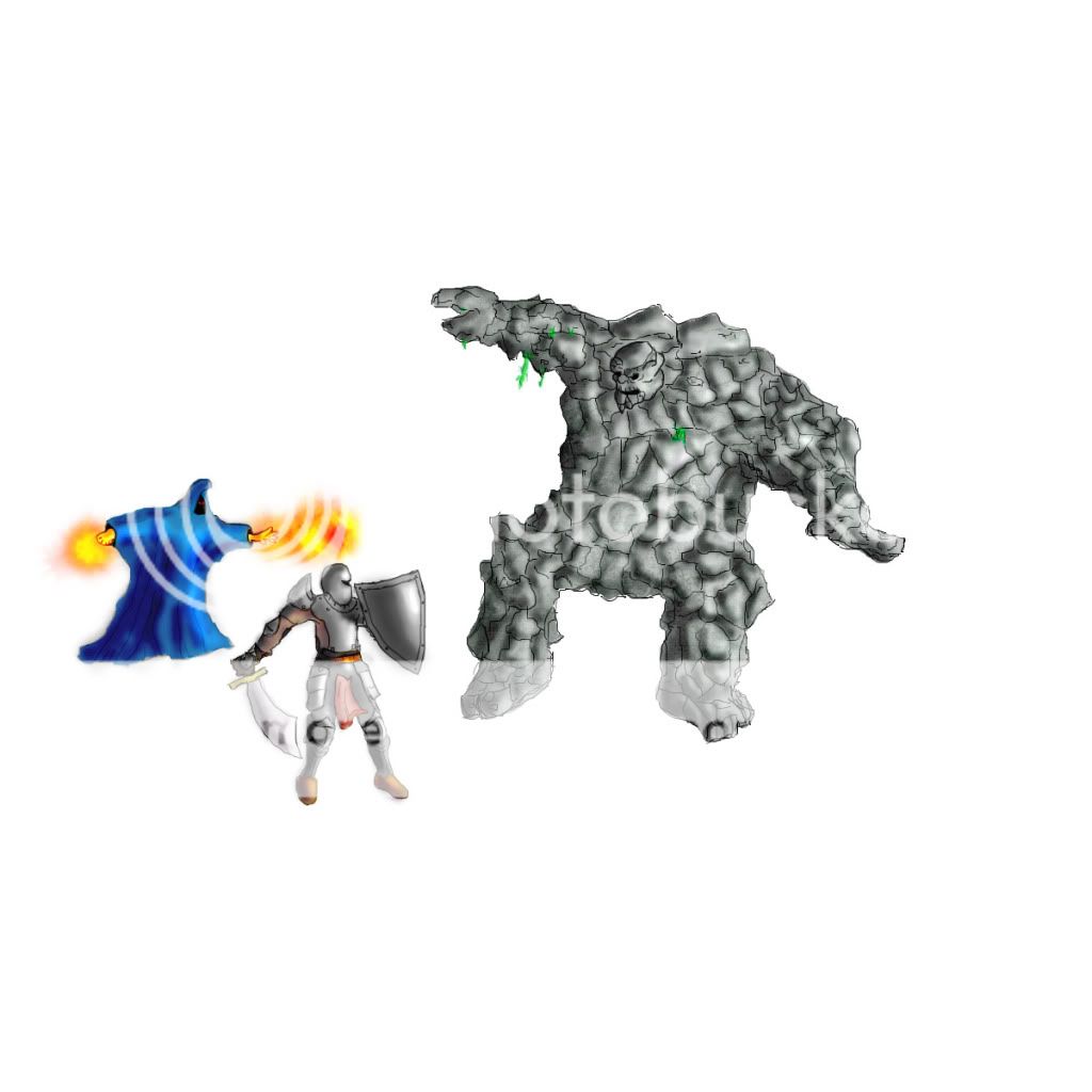
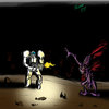
LoadingScreenLOARPGcopy.jpg


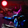
A new image I started for a friend's ORPG loading screen.

Before criticism:
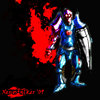
• Knight will be a bit more detailed once the entire base image is setup, same for wizard
• Mtn Giant will have more plant/rock/crack-like details (time-consuming right now, just want to get the basic picture done)
• Putting a cleric-like hero and a stealth-like hero in the image, feel free to suggest their pose/actions

Other than that... feel free to tell me it sucks etc etc.
 
Level 9
Joined
Dec 17, 2008
Messages
312
That sort of ever so slightly suggests that you didn't have them in the composition. Which for most people is an entirely logical conclusion.

How are you helping here, exactly?

I posted my WIP for constructive criticism. You just continually accuse me of not having a composition - without suggesting that I make one or giving any tips for future art.

, yeaaah.

This wasn't really a needed comment either. : |
 
Level 13
Joined
Jan 19, 2008
Messages
793
I was going to suggest what you said you already had planned.

(Also the Mage's hands could use a re-do, the right hand looks nothing like a hand, the other just needs more work to give it a more realistic look for a hand.)

As for the position of a stealth hero, I'd say on the far right side, maybe behind the mountain giant, in mid-leap about to strike, or possibly throw in some way of having him wind walked? For the cleric hero, he could fill up the space in the bottom center area and have him charging up a spell or show the Knight slightly injured, and some holy light or healing wave hitting the Knight.
 
Level 9
Joined
Dec 17, 2008
Messages
312
I was going to suggest what you said you already had planned.

(Also the Mage's hands could use a re-do, the right hand looks nothing like a hand, the other just needs more work to give it a more realistic look for a hand.)

As for the position of a stealth hero, I'd say on the far right side, maybe behind the mountain giant, in mid-leap about to strike, or possibly throw in some way of having him wind walked? For the cleric hero, he could fill up the space in the bottom center area and have him charging up a spell or show the Knight slightly injured, and some holy light or healing wave hitting the Knight.

Thanks for the tips.

I will try to make them hands look like hands. :pal:
 
Level 9
Joined
Dec 17, 2008
Messages
312
Stop using burn tool and make the outlines more black.

I don't use the burn tool, so I don't know quite what you mean. I do find alot of this stuff hard while working with only the mouse, for I hope to get a GFX tablet soon. But I will take into consideration the darker lines, for I can see how the depth would be affected by stronger contrast between shape and color.

Thx for the critique :D
 
Level 9
Joined
Dec 17, 2008
Messages
312
I got an Intuos4 medium for Christmas so I've been practicing with it for a few days.

I've taken all your harsh criticism and stopped using any special tools (except for some lighting tricks here and there).

If anyone knows where to get a free colorwheel plugin for PS CS3 please tell me :D
 

Attachments

  • robotcraft.jpg
    robotcraft.jpg
    474.9 KB · Views: 145
  • marinealone.jpg
    marinealone.jpg
    231.9 KB · Views: 73
  • marine encounter copy.jpg
    marine encounter copy.jpg
    349 KB · Views: 59
  • terrandefend2 copy.jpg
    terrandefend2 copy.jpg
    574.8 KB · Views: 71
  • 2ndtablet dragon copy.jpg
    2ndtablet dragon copy.jpg
    285 KB · Views: 63
  • robotpractice.jpg
    robotpractice.jpg
    157.5 KB · Views: 67
  • SKELETOR2jpg.jpg
    SKELETOR2jpg.jpg
    210.1 KB · Views: 127
  • fingerhealp.jpg
    fingerhealp.jpg
    445.1 KB · Views: 96
  • practicesoldier.jpg
    practicesoldier.jpg
    236.4 KB · Views: 75
  • 1sttabletdrawing.jpg
    1sttabletdrawing.jpg
    305.6 KB · Views: 65
Last edited:
Level 9
Joined
Jan 17, 2009
Messages
372
I got an Intuos4 medium for Christmas so I've been practicing with it for a few days.

I've taken all your harsh criticism and stopped using any special tools (except for some lighting tricks here and there).

If anyone know where to get a free colorwheel plugin for PS CS3 please tell me :D

they look really nice execpt for a few, with some of your paintings the proportions arent right, and also make sure your highlights match the light source's color or else it looks wierd. overall very good
My favorite is the skeleton warrior
 
Last edited:
Status
Not open for further replies.
Top