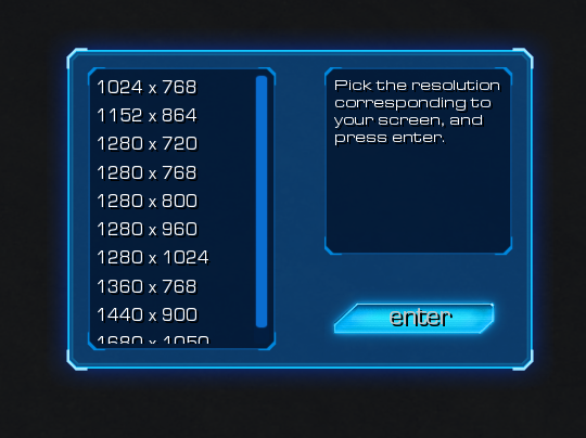
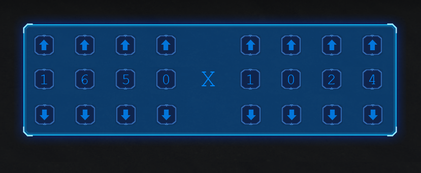
A basic evaluation of both leads to the conclusion number 1 is the way to go unless you revise your number 2 design.
Number 1 is easy to use as you basically need to make 2 click with maybe a scrole down. You need no idea as to what your current resolution is and additionally you can not make mistakes as they are all valid resolutions. People who might not be sure will get reminded and on top of that with the right functionality ingame people could try multiple times until it fits their screen if they have no idea of their resolution.
Number 2 on the other hand is needlessly complicated, error prone and user unfriendly. To select my resolution from the displayed one I would need 10+ clicks. Additionally it is error prone as you need to know exactly what resolution you are which 90+% of players will not. For example I am 1680*1050 as I know that, but if I did not I might choose the default displayed there which is wrong for me cause it is simlar but wrong. If I have no clue I might enter something stupid like 9999 x 9999 with no idea of what is wrong so it is not very user robust. Also one I have choosen my resolution, then what? There is no implicit button or action I must do to confirm the resolution.
It takes no genious to see that UI 1 is much better layed out and easy to use. Infact I do not believe you even thought about UI 2 when you made it due to how bad it is.
Changes that I advise making to the UI 2 is removal of the stupid number of buttons allowing customization of the resolution in all aspects and replacing them with a single up and down arrow for each part (2 ups and 2 downs in total). When they are pressed it increases the resolution for that component to the next standard size from a list which would cover the ability to enter made up or nonsense resolutions as well as greatly reduce the number of button clicks needed. Then the addition of a confirmation button to the bottom right so as to follow standards (usually bottom right in all program windows) so the user does not even need to think about how to use it.
With these changes, design 2 would be more use friendly as a primary way of inputting resolution and so be compariable to design 1. However design 2 with its current form and the addition of an implicit confirm button would be fine as a secondary more precise method of entering resolutions for future proofing the map as in 5 years time we may be using stupid resolutions like 2779*1337 for all we currently know so the degree of customization would be a good thing however the customization is too complex for a primary or only way of entering resolution.


 - I know there is a UI thread, but since no one has posted there for a long time i thought that would be necro posting...


