• Listen to a special audio message from Bill Roper to the Hive Workshop community (Bill is a former Vice President of Blizzard Entertainment, Producer, Designer, Musician, Voice Actor) 🔗Click here to hear his message!
  • Read Evilhog's interview with Gregory Alper, the original composer of the music for WarCraft: Orcs & Humans 🔗Click here to read the full interview.

Satanic-Paladin

This bundle is marked as useful / simple. Simplicity is bliss, low effort and/or may contain minor bugs.
  • Like
Reactions: deepstrasz
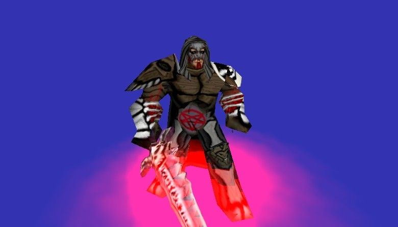
Hello again. This is my third skin here at this site. Its completely Free Hand (except for his mouth and lower facial area) and I took a little more time on this skin than the others (also note that the book is alpha-ed out). And, as a note on the Pentagram, (I just want to say this before anyone else does) YES I did just put a pentagram on his belt because I ran out of ideas. And unless someone can tell me something else to put there, I think it will stay that way.
*Skin Info* He is supposed to be another version of a Death Knight, but has more Satanic qualities, versus the very Human like Death Knight in Warcraft III.
Please leave comments and helpful reviews.
Contents

Satanic-Paladin (Texture)

Reviews
THE_END: No good shading on this whatsoever Good concept, but badly executed

Moderator

M

Moderator

THE_END: No good shading on this whatsoever
Good concept, but badly executed
 
Level 3
Joined
Oct 9, 2004
Messages
50
Well, nothing wrong in particular with the pentagram except for it's simpleness. How about making it look like it's more... I dunno... not spray painted on? *shrugs*

I dunno. Not bad though. Good skin.
 
Level 3
Joined
Oct 9, 2004
Messages
50
What I ment was, it looked like some graffiti tagger came through during a drive by, and spray painted his crotch with a pentagram.

Nothing wrong with the idea. Hell, it fits. He is a satanic paladin after all. It's just the execution.
 
Level 9
Joined
May 10, 2004
Messages
608
Since it's almost completely freehand you can't say anything bad about it
oh god, such ignorance, it burns my flesh.


It looks like you did a template for a skin (a good one i might add as well)
sure you also did a lil basic shading, but the level of shading is the same all over. You need to make the materials look like that which the are supposed to be.

Like the metal should have small but sharp highlights, while the bones have a low level of specularity (brown bones?)
 
Level 13
Joined
Jul 28, 2004
Messages
1,340
a lot of freehanding with some tracing, that's a good initiative, but the freehanding is somewhat poor, try to have a smaller brush with a lower opacity when you're working; it will take more time but it will look better. on his skull&armor i see thick and black contours everywhere. contours are something drawers should stop using when they reach grade 8: you must not try to put in evidence something by wrapping it with big black contours, but instead you should try to make it as realistic as possible, making contours useless. the freehanding is poor, and you obviously need more patience when working, along with some knowledge of shading&lightning.

oh and the things around his eyes are really horrible, i dont know what you used to do them, but please, refrain from doing such an horror again until you find a better method..
 
Level 5
Joined
Oct 21, 2004
Messages
137
Alright, I'll take some of your advice, but as to the contours, they are there for a reason. Warcraft III is a very cartoony game. Alot of the units (in-game) have a very cartoony feel to them. So, I wanted this skin to fit in well with the rest of Warcraft III, and added the contours. Also, as to the shading, there is a bit of shading on his legs, chest and skull (on his sholder), but his arms and face are indeed laking. And as to the "things" around his eyes, they're just cracks in his face armour, and the way I made them was just with an air-brush with 20% opacity.
 
Top