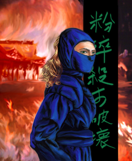
there is still that curved X on this chest, you should remove it.
and
WTF, WHY DID YOU SUBMITTED 3 NINJAS SKINS WHEN YOU CAN EDIT YOUR OLD ONE?
didnt you noticed that add/UPDATE resources button? making a new one and not editing the old one is veryyy lame!
This one is the best, why are you trying to act smart over it? there is little amount of folds, but there is more i guess. make the folsd bigger, bolder and more visible.
try adding some metal ornements like a belt or what now here and here, the pants looks like, sadly, only recolored.
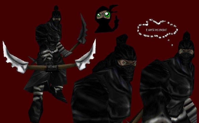
The ninja in the screenshot is rather useless, we only care about the skin, not how much you can draw comic ninjas in mspaint. mspaint is a great program btw it learns you how to mix colors.
that brown line to the right of his eyes is wtf, what is it doing here, there is no such line on the human, is this the hairline, or his ear? this line is misplaced and unrelated to the face here, scroll it way down or put something else here.
about the face, you should use more of a texture and give fold-like colors, it must be a mask you put over the face, they do have major lightning, add some, there is barely none.
the chest still needs major tweaking, remove that "X" on his chest, it makes it looks like the dress wraped on him like soap or a dress that is 2,5x too small for the person.
their outfit doesnt not wrap on them, not even for males, they give them some loose clothes to allow fluid movements, not to make them feel tight in their shirts.
your skin is way too tightly drawn, add way more folds, that's what you're missing.
 Approved


