• Listen to a special audio message from Bill Roper to the Hive Workshop community (Bill is a former Vice President of Blizzard Entertainment, Producer, Designer, Musician, Voice Actor) 🔗Click here to hear his message!
  • Read Evilhog's interview with Gregory Alper, the original composer of the music for WarCraft: Orcs & Humans 🔗Click here to read the full interview.

NightElfCursor.blp

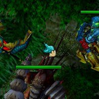
Browsing through the Resource Section, i noticed that only one thing is missing for a Naga Race - the Cursor. Well, here is one now, based on the Night Elf Cursor and replaces it.

To overwrite Another Cursor, the Paths are:
UI\Cursor\HumanCursor.blp
UI\Cursor\OrcCursor.blp
UI\Cursor\UndeadCursor.blp

And at last, credits to Misha for his Naga Warlord who can be seen on the Screenshot.

Update:
Changed Shape, reworked Skin.

Keywords:
Naga, Cursor, Race, Interface, UI, click
Contents

Naga Cursor (Texture)

Reviews
11:10, 31st Jul 2010 67chrome: This is certainly useful, but I would like to see significant improvements before approving this. The changes done to the original night elf cursor are not enough, and considering you get to copy the same image...

Moderator

M

Moderator

11:10, 31st Jul 2010
67chrome: This is certainly useful, but I would like to see significant improvements before approving this. The changes done to the original night elf cursor are not enough, and considering you get to copy the same image multiple times across this skin it's not like your freehand work will go wasted, largely the opposite. The amount of room you need to work on towards the 75% freehand requirement is not much bigger than an emote icon, and I'm sure you can handle that ;)
As for the generic side-scrolling and targeting elements of the cursor that are the same among all cursors leave those how they are, for the purposes of this skin I can ignore them towards the freehand content.

Also, the skin itself is not showing up on this page next to the screenshot, re-uploading the skin should fix the issue (or just updating it should work as well).

17:37, 4th Sept 2010
67chrome: I suppose this is decent enough for approval.
 
Level 14
Joined
Jun 16, 2009
Messages
247
ahh. quite good:thumbs_up:. but there are some issues:
+
*The hand color with scales and a shell approves that the hand is a true Naga race.

-
*The hand scales are way too tiny.
*Lacks a little shading though it's a good one.

-----
2.5 for the concept (due to, there are no available Naga hand cursor), and
1.0 for the freehand
3.5/5 total for me.
 
Level 38
Joined
Jan 10, 2009
Messages
854
OT: What i wonder about: 75% Freehand - on the model or on the skin?

I've usually interpreted it as on the model, as it tends to offer a more straight-forward look at the content. For models such as doodads that take tiny sections of the skin it certainly makes more sense, and most skins in WC3 have a significant amount of unused space which varies in size from skin to skin, so I like keeping things more simple by just looking at the model. Changing 75% of what is viewed in all practical applications is more important to me than what appears on the actual unwrap.

In my own skins I find some areas significantly more important, and try to change at least 75% of what shows up on the portrait model as well, though with the history of approved skins and skin moderation on this site I'll just try to encourage artists to work more on the portrait, the entire in-game model is the only thing that should be judged for the overall freehand content percentage.

I hope that answers your question :)
 
all thanks for credits but.. the hand doesn't really fit much, it could use some more uniqueness.. maaybe to look even more like a naga hand.. maybe.. some swim-thingies between fingers?

and that shell's a bad choice..
After checking anything that google delivered on naga pictures (wich is in fact, not much.), i would say that there are no swim-thingies between fingers, at least not for the females and with about 75% chance not for the males, too. They would be nearly invisible in the cursor, too.
Replace the shell with the fins (Or whatever you call them, the one in the back of the naga myrmidons/royal guards).
The problem is that there must be some kind of end of the hand. The fins (which would be parallel to the arm) would not do that, the shell does. And its color fits to the UI XD.
I hope that answers your question :)
Yeah. In fact, i never expected that much information.
67chrome said:
The amount of room you need to work on towards the 75% freehand requirement is not much bigger than an emote icon, and I'm sure you can handle that ;)
But on the emote, there is no need to shade and to make it look realistic
85590d1279181672-emoticon-contest-2-creeps-rolleyesanim.gif


I'll try to update it tomorrow.

OK, Updated it. Changed the Shape and reworked the Skin. The Shell is the same, i had neither the creativity nor the patience to change it too. Cant say which Version i liked better.
 
Last edited:
Top