• Listen to a special audio message from Bill Roper to the Hive Workshop community (Bill is a former Vice President of Blizzard Entertainment, Producer, Designer, Musician, Voice Actor) 🔗Click here to hear his message!
  • Read Evilhog's interview with Gregory Alper, the original composer of the music for WarCraft: Orcs & Humans 🔗Click here to read the full interview.
  • The Hive's 22nd Icon Contest: Creep Abilities is now concluded, time to vote for your favourite set of icons! Click here to vote!
  • ✅ The POLL for Hive's Texturing Contest #34 is OPEN! Vote for the TOP 3 SKINS! 🔗Click here to cast your vote!
  • ✅ The POLL for Hive's Techtree Contest #20 is OPEN! Vote for the TOP 3 FACTIONS! 🔗Click here to cast your vote!

Keeper of the world

Status
Not open for further replies.
Level 7
Joined
Apr 8, 2006
Messages
104
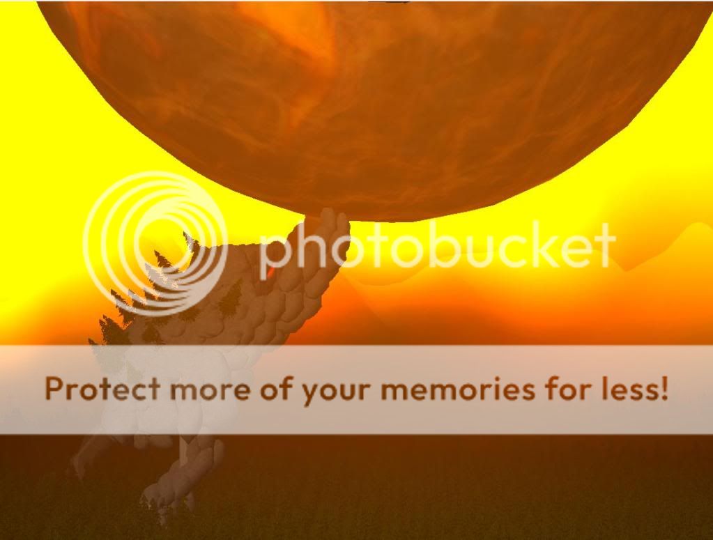
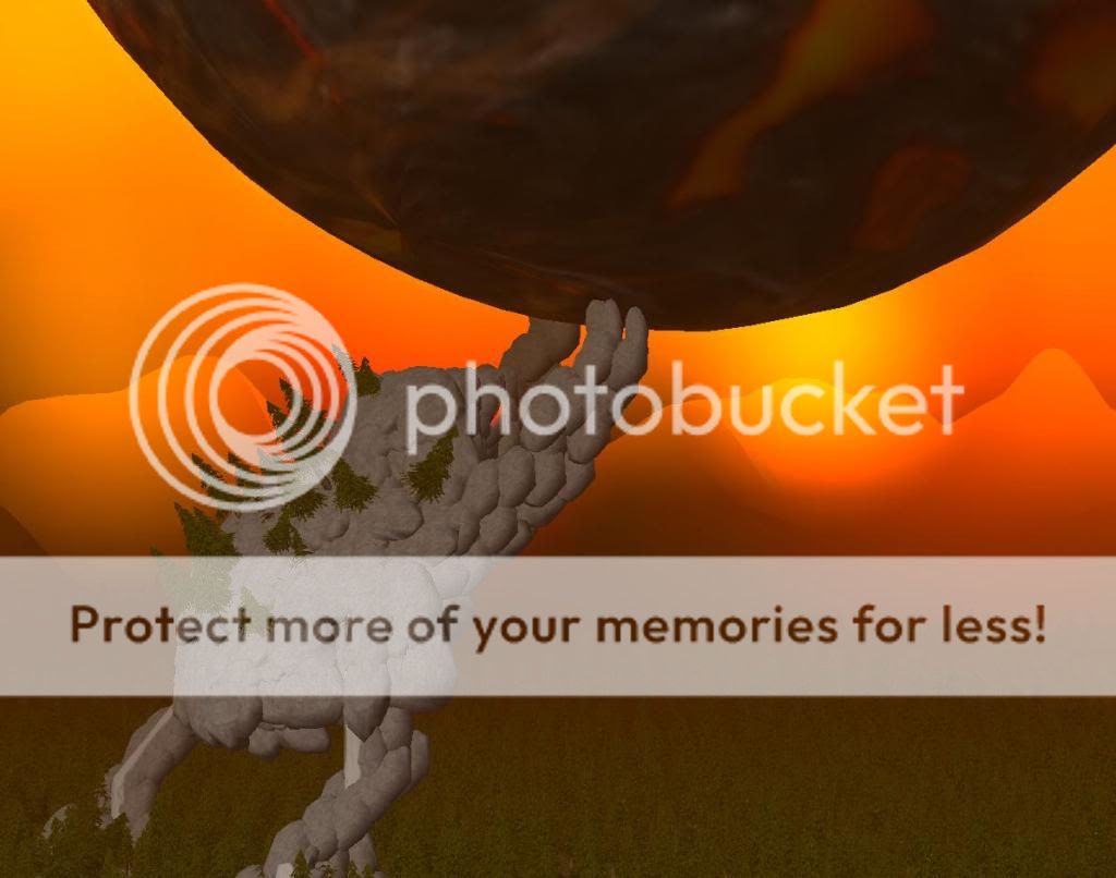
The end of the world stopped by a giant stone guardian. Inspired by Majora's mask.
Note : The guardian's hands are in this hudge meteore.
Old ver
zrre.jpg

New ver :
4545.jpg
 
Move his right leg more forward, if he would really stand like this, he would fall forward ^^

Looks okay though, a better stone texture, or overall a better model would do really well.
And maybe just don't spam trees as "background", and make everything smaller, so you have maybe, one land (small ofc, you would need to set the doodads really small, and it also needs a lot of time) but this way it would look way cooler.
 
Looks good but I cant figure out if it's a mis-shaped hand or a creature.
 
I'm loving the looks of that mole thing keeping the planet thing from crashing into the forest... thing. Ahem! Anyways, yeah you should work on the mole, I suggest you dont alter the looks of the guardian thi.. Eh, right, too much and rather just replace the stones with some better looking ones, namely the felsen rocks. Other than that, you could also make the forest on it's back look a little more realistic, and possibly have a waterfall comming down its back or something. Thing.
 
Idea is nice and the picture is well made also, (i speciallly like the lightning), but there are some things what you should do, to make it look better.

* Atm the forest in backround look too spam and also the trees look, like they are placed in line, what isnt logical in forest. So some variation in forest wouldnt be bad.

* Some changes on the stoneguardian wouldnt hurt IMO, cause he looks atm little bit too weard in someway. I dont see the reason for name"guardian".

Overall good work, keep it going.
 
Status
Not open for further replies.
Back
Top