Hmm, it looks rather fine Zwonne.
But there are some stuff that you should look in to, one of them being
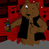
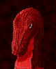
complementary colors. Remember, the shading on red is usually green and not just a darker shade of red or black. Also, adding complementary colors usually gives the drawing more depth. Try doodling around with them on spheres and etc. It will take some time to grasp it (I'm still not sure that I fully grasp it) but it's important to look in to it and get an understanding of it!
")
And just like you said, you need more color variation. Right now everything is red, including the background. His belly could be yellow, just to "pop it out". The background should also be changed, a red background could work if it was more “alive”; a volcanic landscape or something, but these shades of red are very annoying as they melt with the dragon.
Example:
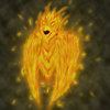
The Destroyer of Worlds by *PepperWolf
The background is actually rather simple; it's just shades of brown (and yellow/orange/red… BROWN xD), but it's enough to make Sargeras pop out as much as he does, despite that the land around them more or less burns. But if you're not going for a background, try something else than these red clouds. And one more thing on colors, never work with 100% black or white in a colorful drawing. Most of the time it destroys more than it helps.
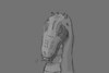
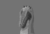
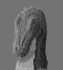
The skull - right now it looks very odd (the proportions are off).
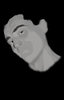
If you look at it now, the left part has a very "pulled/dragged" look. Like someone took the left side of his face and dragged it out (it looks very flat). I've attached an image with what I mean, and trying to show you how to fix it (it's not 100% correct, but I hope you'll see what I mean).
And last, the eye. Right now you have a really "human-esque" eye, which is very odd. Reptile eyes are very different from humans, so it looks very odd right now. Just Google around a bit, you'll see the difference. They have these "valleys" around the eye and there's a much "sharper" look to them. Of course, I don’t know if your design choice was to give it human eyes or not, but if you’re keeping them, you’ve to implement them better, somehow.
In general, don’t be afraid to play around with colors, just go mad with them!
And BTW, saving your images as .PNG gives them a better quality than .JPG
Hope it helps, somehow ^^
Attached Image (Huge):
http://www.hiveworkshop.com/forums/members/141575-albums3291-picture58905.png
Edit
And yes, I JUST realized that he looks like a ripoff of an Argonian.. Damn my subconcience!!
Doesn't matter, we all get inspiration from something and it's very, very hard to be completely original, if not impossible
Just don't worry about stuff like that, just do the stuff you enjoy doing!
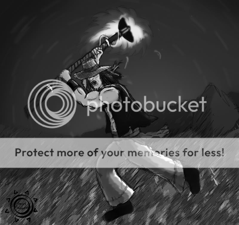
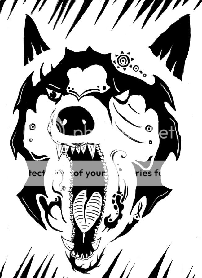
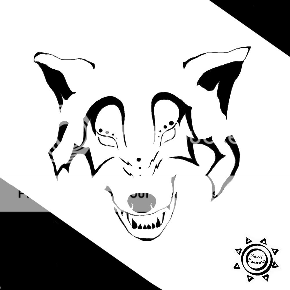
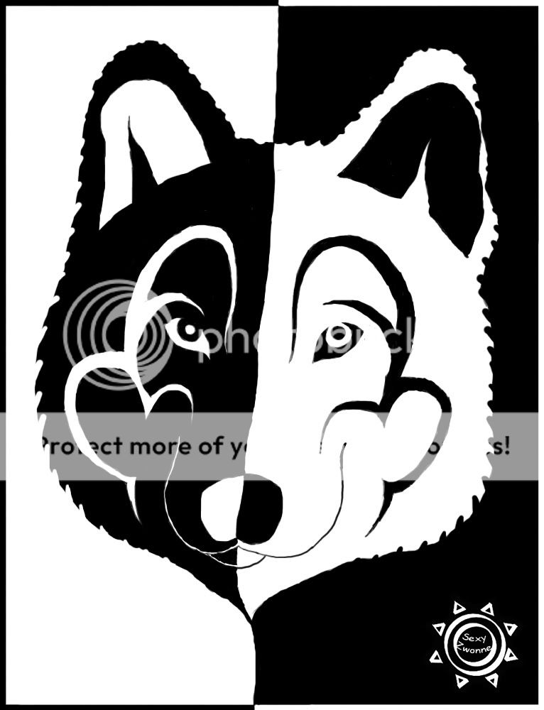
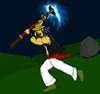


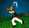


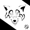
 I don't have any tests tomorrow, so I took some time to make this for a friend of mine.. Whataya say?
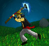


 GL HF!
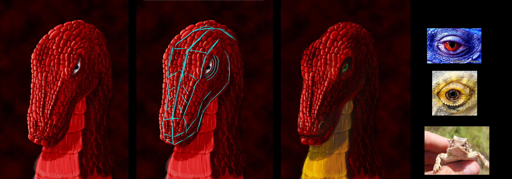