• Listen to a special audio message from Bill Roper to the Hive Workshop community (Bill is a former Vice President of Blizzard Entertainment, Producer, Designer, Musician, Voice Actor) 🔗Click here to hear his message!
  • Read Evilhog's interview with Gregory Alper, the original composer of the music for WarCraft: Orcs & Humans 🔗Click here to read the full interview.

Icon Criticism

Status
Not open for further replies.
Level 8
Joined
Jun 1, 2008
Messages
341
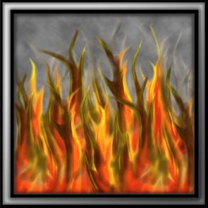
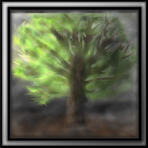
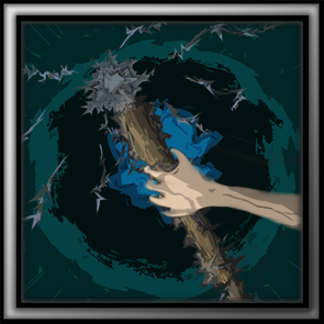
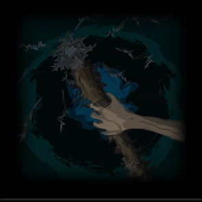
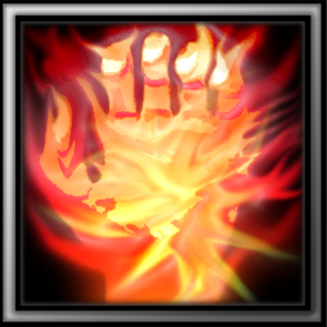
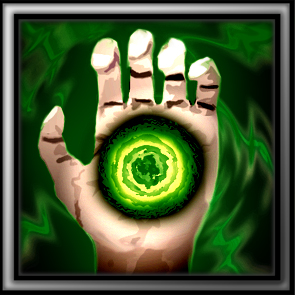
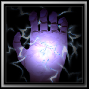
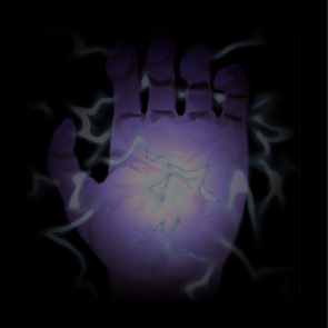
Hey.. I'm new to making icons so i figure before i try to submit those i've made i'd ask the hive what you think?

All the Icons I've made are no less than 85% Freehand and one is 100% (yet not quite as good as the rest (guess which one for yourself).

Please criticize harshly as I really want to know whats wrong and how to improve. Also if you think that i obviously have no chance at making good icons please DO say so.

Thanks for all comments.

By the way In this thread I am 'Requesting' your opinions.

Icon Showcase

55840d1243712866-icon-criticism-btnflameshield.jpg
55841d1243712866-icon-criticism-disbtnflameshield.jpg

149931-albums1689-picture12829.jpg
149931-albums1689-picture12830.jpg

149931-albums1689-picture12823.jpg
149931-albums1689-picture12824.jpg

149931-albums1689-picture12831.jpg
149931-albums1689-picture12832.jpg

149931-albums1689-picture12827.jpg
149931-albums1689-picture12828.jpg

149931-albums1689-picture12817.jpg
149931-albums1689-picture12818.jpg

149931-albums1689-picture12819.jpg
149931-albums1689-picture12820.jpg

149931-albums1689-picture12821.jpg
149931-albums1689-picture12822.jpg

149931-albums1689-picture12827.jpg
149931-albums1689-picture12828.jpg


Feel Free to Use these Icons and also feel free to +rep me xD
 
Last edited:
Level 9
Joined
Apr 28, 2009
Messages
538
it's nice that you want to help others by sharing icons, but i must say: I won't use icons like this in my map. I really wouldn`t.

And i don`t know who would.
 
Level 15
Joined
Mar 8, 2009
Messages
1,651
a bit too detailed, many of these detailes (like flames in the first icons) will become just a blur. also they need a bit more contrast and saturation to look warcraft-ish
 
Level 8
Joined
Jun 1, 2008
Messages
341
Thanks for that. I've added three more if you could tell me if you think i've done any better...
Admittedly I used the same hand in two icons, however the hand was 100% freehand so i figure its ok..ish..

New Icons
149931-albums1689-picture12817.jpg
149931-albums1689-picture12818.jpg

149931-albums1689-picture12819.jpg
149931-albums1689-picture12820.jpg

149931-albums1689-picture12827.jpg
149931-albums1689-picture12828.jpg
 
Last edited:
Level 9
Joined
Apr 28, 2009
Messages
538
wow.
The new icons are looking wwaaaaayyy muuuchh bettter.
They are amazing.
Keep making them like this:)
 
Level 8
Joined
Jun 1, 2008
Messages
341
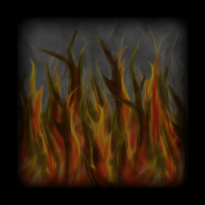
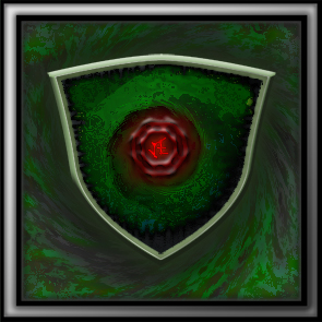
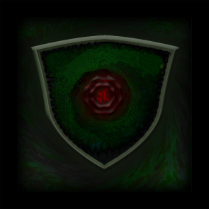
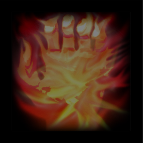
I have Decided your right Slaydon, the Fire shield is a bit.. horrible to look at so i changed it slightly and converted it into a 'Dark Shield' I also added another variation of the hand icon.

New Icons

149931-albums1689-picture12821.jpg
149931-albums1689-picture12822.jpg

New Version of Flame Shield (Dark Shield)
149931-albums1689-picture12827.jpg
149931-albums1689-picture12828.jpg
 
Last edited:
Level 11
Joined
Feb 13, 2004
Messages
108
You put way too much detail in these. Remember they will be 64x64 and half of the stuff won't be visible, just make colors look bad.

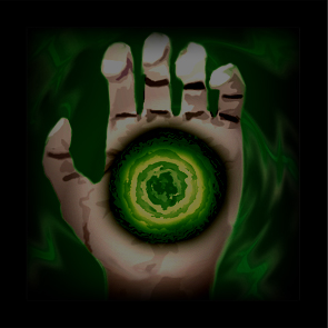
Your green shield, for example: background becomes grey-green mess.
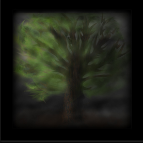
Static purge becomes so dark you can barely tell what's on the icon, which defeats its purpose.

Don't put too much detail in this. If you want them to look more like Blizz icons, use only basic shading and bright colors. Don't worry if it doesn't look good when it's hi-res, only thing that matters is how it looks in 64x64.
 

Attachments

  • shield.jpg
    shield.jpg
    10.2 KB · Views: 102
  • purge.jpg
    purge.jpg
    10 KB · Views: 90
Status
Not open for further replies.
Top