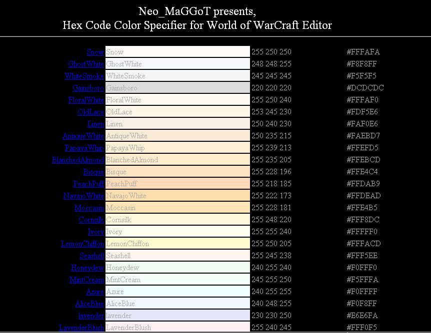
the frontend relly needs to get used to... in other words it hurts users eyes! Try using bright background colors. Black is only used by beginners.
- you dont have a preview of the colors
- never, never, NEVER use black as a background-color
- standard hyperlink colors (blue and lilac/lavender/purple are hard to see on black!)
- there are hundrets of color-calculators in the internet so in this stage of development your "tool" is quite useless.
suggested improvements:
- change the background color to white (or a very very bright color)
- add a preview box for each color. Coloring only characters wont give a good preview
- use dropdown menus instead of multiple lines. this will make your tool look much slighter.
if you need help with CSS, HTML/D-HTML(DOM/Javascript) just lemme know


 Approved