I think that custom game interface was bad choice, it takes lot of space and looks bad, I mean if you pick panda like hero it is fine, but if you pick undead one?
Btw I will check map soon
 EDIT:
Lets see...
EDIT:
Lets see...
Things that I like:
1st - Description (map some, ingame is awesome, maybe few more things to add)
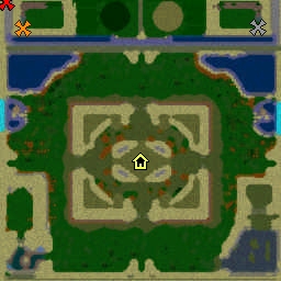
2nd - There is map preview image and custom loading screeen
3th - Select mode (-woe, -aos)
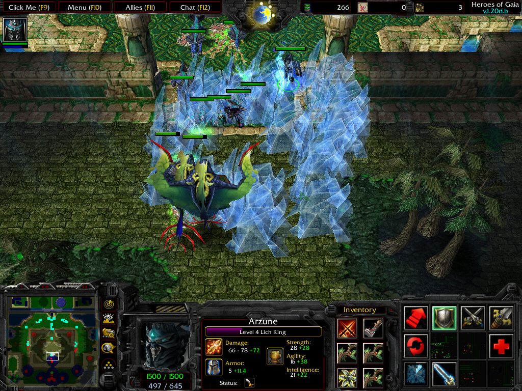
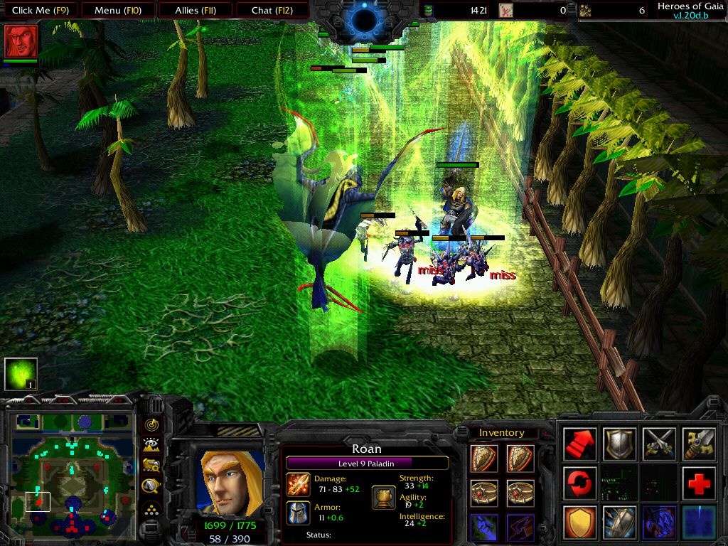
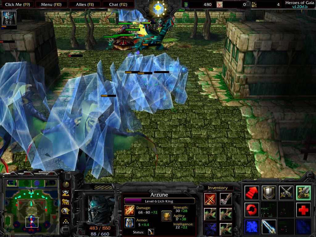
4th - Spell effects (Lightning, sound)
5th - Quest Log
Things that I don't like:
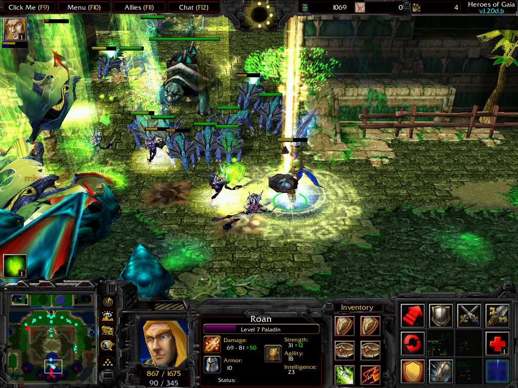
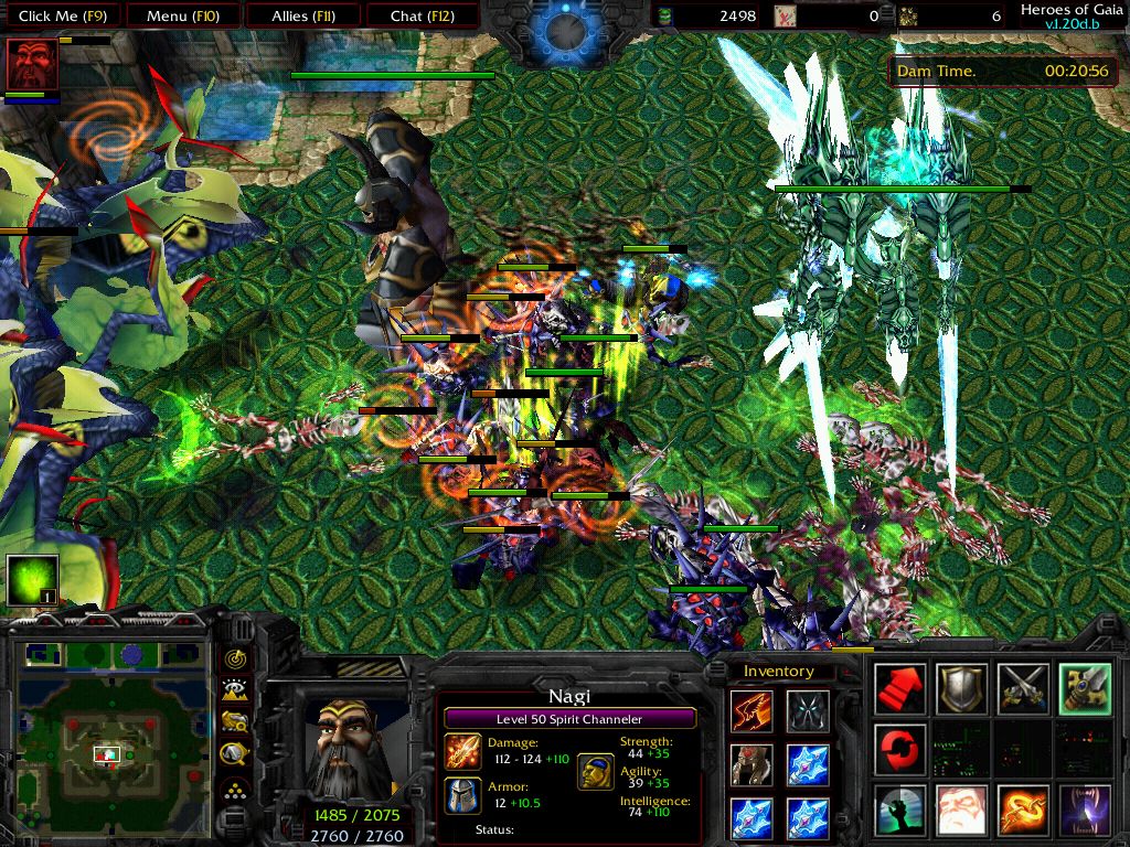
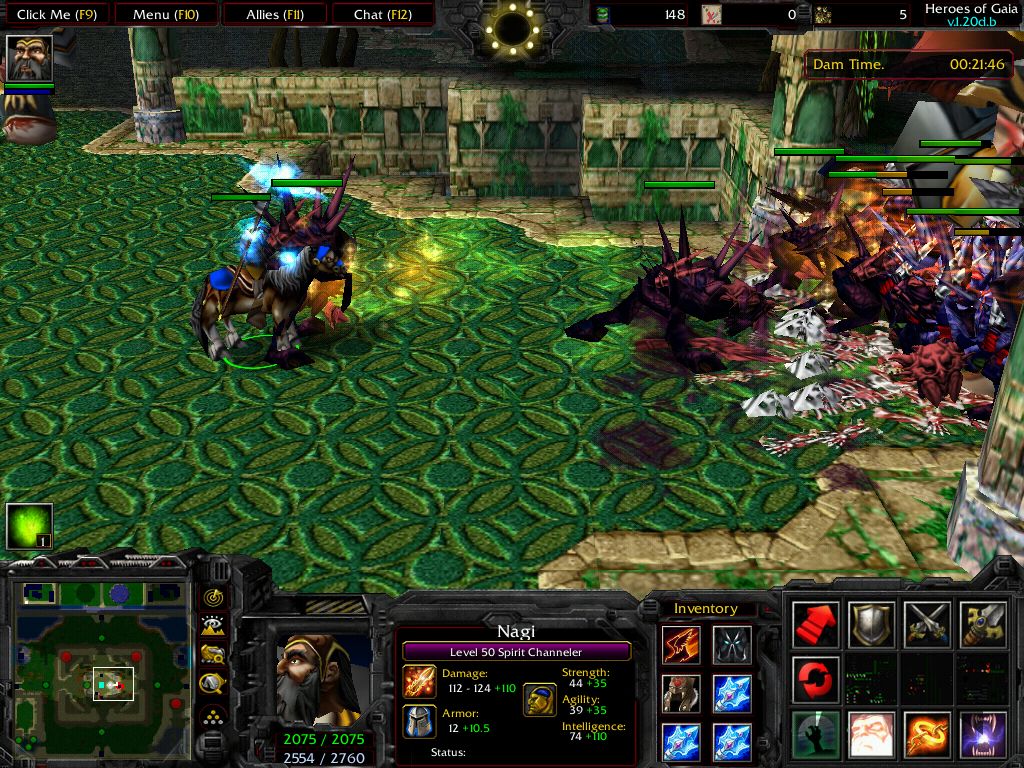
1st - Terrain (2 simple, empty, grrr, also base should be next to place you try to defend)
2nd - Green Icons (where are DISBTN icons?)
3th - Shops looks bad with that wooden fence
4th - No modes (like -ap (only normal mode and this but in woe), -sd etc etc)
5th - Items looks like dota ones (stats)
6th - 80% of map looks like copy of another one! -> No originality
Word or 2 to Author:
Well I know how hard you worked on this map, I created my own version of Dday, Dota etc etc, I lost month or more for each one ^^' but to get back to point, map looks like copy of another one, and that is main problem, sunken ruins was bad choice for this kind of map (but if you replace elf and undead units with naga and sea creatures it can be very good) + you can add shallow and deep water so units can fight on water also, add flying units... Change terrain in one word!
Create something unique! Item icons wasn't very good (some not all ofc), find better ones, black space in background and simple colors looks bad! Add more hints etc etc! And at the end I can't open map, better for you

because I can't check triggers and find any possible memory leak that can be problem! So here you go 1.5/5 (that means 2/5) from me because all that above...
Once again add more stuff and change/improve terrain =
!
2/5
 Approved
")

 - Second Place")


 1/5 (Like What You Did To Night Wish)

