- Joined
- Dec 31, 2005
- Messages
- 712
Hello people o/
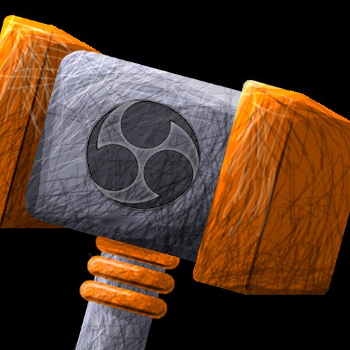
After reading some tutorials I made this icon, but I look at it and I see that it can be better x.x

And the original picture (all divided in layers)

The random black/white lines was the only way I saw to make a realistic shadow/light
Constructive criticism is welcome
Thanks in advance!
Hossomi
EDIT: I'm fixing the lower part position to be in the middle of the hammer (omg was I cross-eyed that moment?)
After reading some tutorials I made this icon, but I look at it and I see that it can be better x.x
And the original picture (all divided in layers)
The random black/white lines was the only way I saw to make a realistic shadow/light
Constructive criticism is welcome
Thanks in advance!
Hossomi
EDIT: I'm fixing the lower part position to be in the middle of the hammer (omg was I cross-eyed that moment?)


