- Joined
- Jun 3, 2005
- Messages
- 6,946


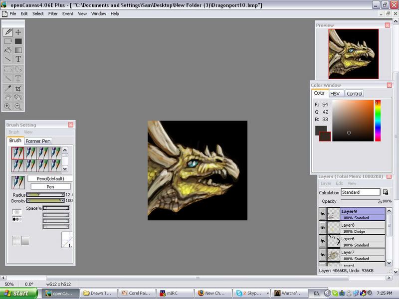
Remember that one is for dragons, not humanoids to wear, and yes, it does look wonky because the neck parts and such are connected with straps (you can't really see it when its shrunk). I'll see about making it clearer.


 also fits the others better.