Community
Projects
Maps
Tutorials
Gallery
Support Us
Install the app
How to install the app on iOS
Follow along with the video below to see how to install our site as a web app on your home screen.
Note: This feature may not be available in some browsers.
-
Listen to a special audio message from Bill Roper to the Hive Workshop community (Bill is a former Vice President of Blizzard Entertainment, Producer, Designer, Musician, Voice Actor) 🔗Click here to hear his message!
-
Read Evilhog's interview with Gregory Alper, the original composer of the music for WarCraft: Orcs & Humans 🔗Click here to read the full interview.
-
The Hive's 22nd Icon Contest: Creep Abilities is now concluded, time to vote for your favourite set of icons! Click here to vote!
-
✅ The POLL for Hive's Texturing Contest #34 is OPEN! Vote for the TOP 3 SKINS! 🔗Click here to cast your vote!

You are using an out of date browser. It may not display this or other websites correctly.
You should upgrade or use an alternative browser.
You should upgrade or use an alternative browser.
DoD2 Terrain Screenshots
- Status
- Not open for further replies.

- Joined
- Aug 3, 2005
- Messages
- 744


A promising project you got there 
Should have placed bottoms one at the top thou, they look better, imo.
Should have placed bottoms one at the top thou, they look better, imo.
Very nice. Needs more tile variation near the roads though
Looks a lot like Tides of Blood :O
~Craka_J
Hmm ive never played tides of blood perhaps ill check it out.
- Joined
- Feb 19, 2006
- Messages
- 237
looks cool, especially the spooky ones.
- Joined
- Jun 14, 2005
- Messages
- 2,506


Well while I think that the terrain is very looks very good, it would look a whole lot better with new fog. Try experimenting with some fog, and try and come up with some fog that suits the terrain a lot more then the normal black fog.
You mean the all incompassing fog you set in map options? yea I havn't really tried anything like that yet I tend to find it can be annoying and hinder gameplay but i will try some stuff out, and what you mean suits it better than the normal black fog im not using any? Also can these fogs be viewed in editor or must i open it in game to look every time?
- Joined
- Aug 3, 2005
- Messages
- 744
Should get a few updates soon.
I'm gonna have to disagree with you Gilles. I think Tides of Blood had better terrain. Tides of Bloods creativity in terrain and tile variation was a lot better than I'm seeing in these screenshots.
~Craka_J
~Craka_J
Really? I thought the middle in TOB was awesome, but the rest was nothing to brag about. I'll have to look again. Maybe it's a subtle terrain! 
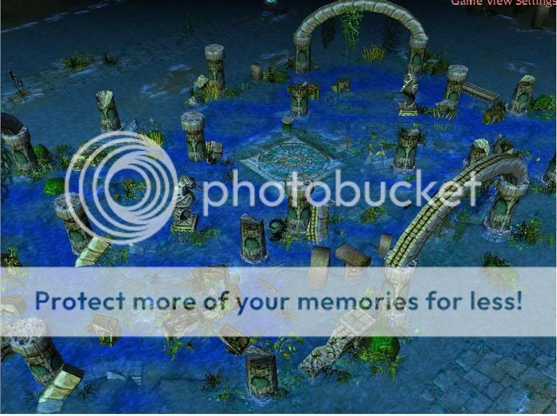
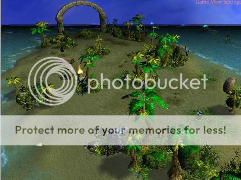
Agreed that this terrain lacks tile variation. Also the paths are too straight. The water area looks pretty nice, maybe too many pillars, and the beach is decent.
Agreed that this terrain lacks tile variation. Also the paths are too straight. The water area looks pretty nice, maybe too many pillars, and the beach is decent.
- Joined
- Feb 27, 2007
- Messages
- 2,069

It looks good, and for a AOS, great!
- Joined
- Oct 14, 2006
- Messages
- 4,161


The undead is great pictures great job!!Good luck on update!
- Joined
- Mar 11, 2007
- Messages
- 2,822

They are great!!All of them!I just didn't like the sea-like one
- Joined
- Aug 13, 2007
- Messages
- 680
I like them, but maybe you could add some fog to the watery screenie aswell
- Joined
- Mar 11, 2007
- Messages
- 2,822
Yeah some blue or gray fog would suit nice!
- Joined
- Sep 27, 2006
- Messages
- 3,746


The undead terrain is spooky as hell, but the rest is a bit shaky with atmosphere.
- Joined
- Mar 11, 2007
- Messages
- 2,822
Very nice screenshot!The angle is ok I think.
- Joined
- Aug 13, 2007
- Messages
- 680
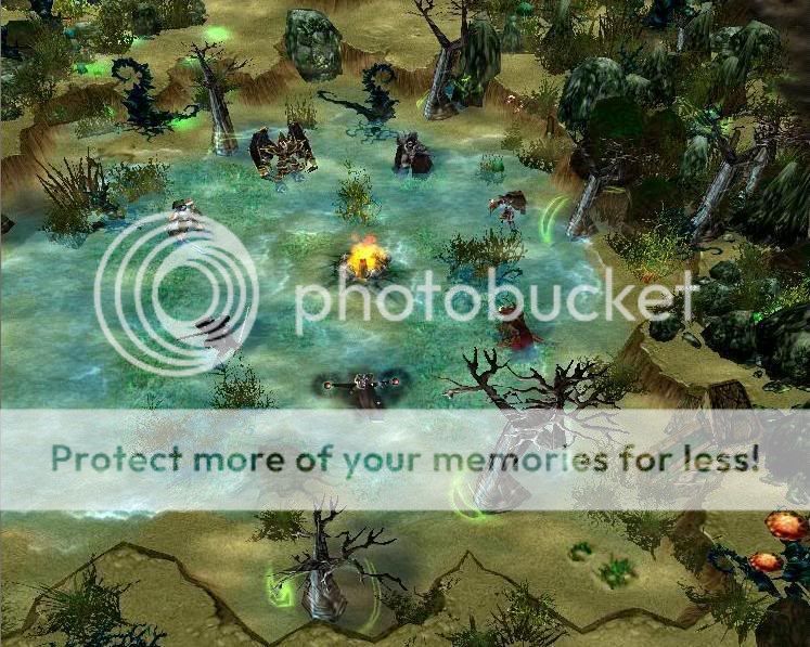
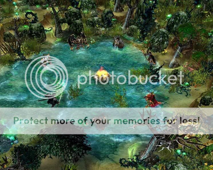
Hero selection area looks good, but the waterfalls need some work
- Joined
- Mar 11, 2007
- Messages
- 2,822
Why everyone's blaming waterfalls?They are good.
- Joined
- Feb 27, 2007
- Messages
- 2,069
Thats a great new one! I think the waterfalls are fine too...
- Joined
- Feb 20, 2007
- Messages
- 338
Of course the shots are from the editor. I will assume that this is for a game, so what we need is to see these areas from the game - be it the cinematic wide-screen or the game with the interface. Things just look a lot different from inside the game than in the editor even with the editor game views there is still some differences.
The angles you have for all of your images supplied, along with the extremely far viewing ability of the editor compared to the game does not allow us to see what the player will see.
I give three examples as attachments:
Editor view: We are able to see to the edges of the map from editor there is no far z limitation.
Specialized Camera View: (Morlune the Mighty) The game camera follows behind the selected unit. In this image we see the short comings of the game map. There is a reason why the default game camera only lowers so far...
Default Game Camera view (Buzan the Fearless) scrolled down to the shallowest angle: We are not allowed to see the horizon or the sky or anything beyond the maximum limitations of far z. In fact is is most likely cut a bit smaller than the Far Z of 5000.
---> Both I used the cheat "iseedeadpeople" in order to see the farthest distance from the unit. The reality is that without that the view is even smaller.<---
Far Z (the distance one can see) in game is only 50000 - In editor terms, 6 large grid squares is about as far as the sky box goes from the selected unit. In my editor view compared to my specialized cam view you can see that many of by world edge trees are not seen in the game the Sky Box is closer than them. I have been battling for a year with my own desire for expansive views and the limited distance of the in game camera. The limit of only 6 large grid tiles of distance has made map making a real chore, there is only so many doodads, hills and what not one can use to make small 'rooms' for the character to be in.
There is a difference between pretty image terrain where the picture is taken from the Editor and used as say desktop wallpaper and in game camera views which have fog of war, black mask, the player interface (frame) and the very limited angle of attack of the camera and distance and all of that to content with. All of those have an impact on the final "how does it look" question.
IF at all possible I would suggest that you take in game shots. If the game has blackmask/fog of war then you need to have an invulnerable unit (Will not be attacked by placed hostiles) to run around from place to place to take screen shots of. His/her area of sight in the Fog and Mask will need to be taken into consideration when "judging" your terrain.
Attachments


- Joined
- Aug 3, 2005
- Messages
- 744
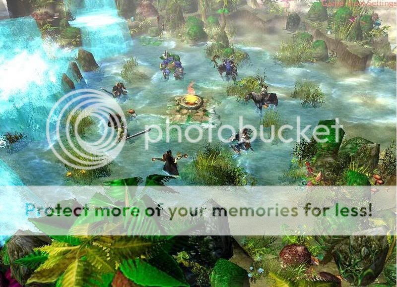
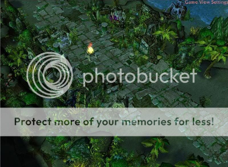
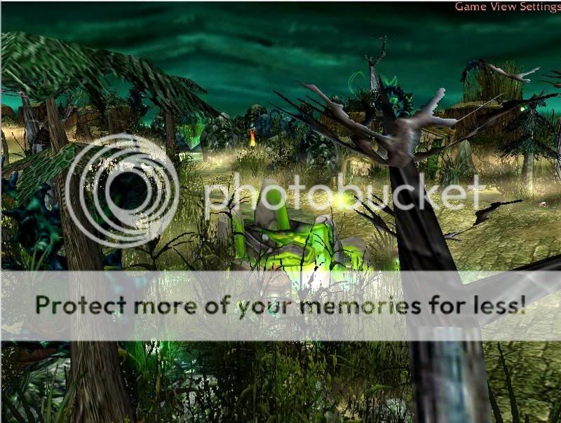
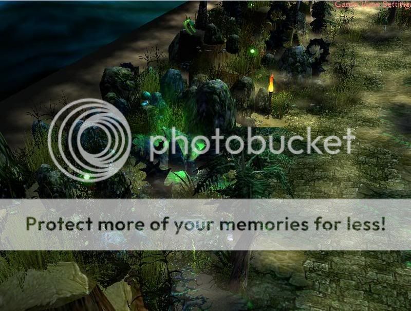
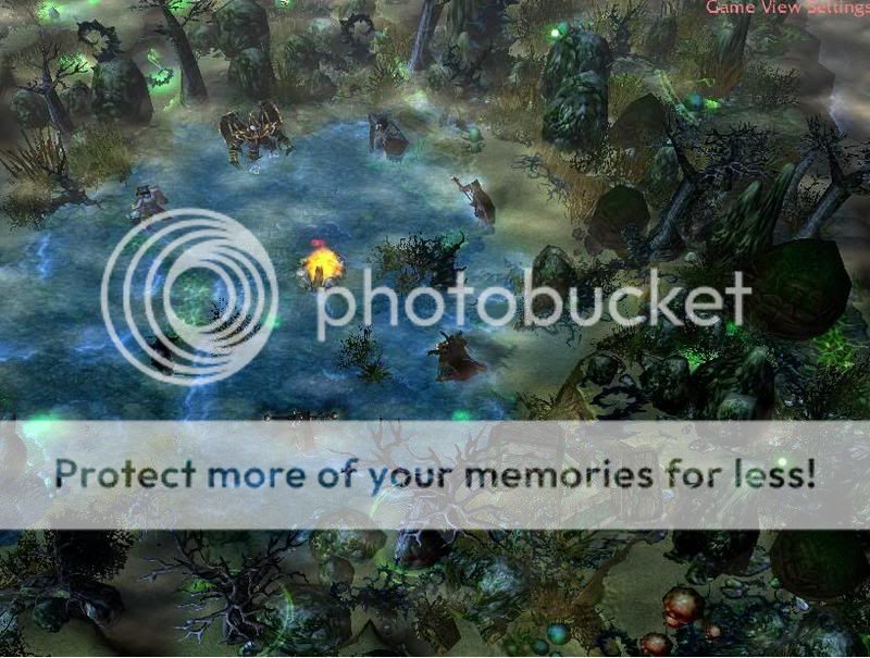
An Early Scourge Selection area.
Very open for suggestions/critique.
Cant place blight in water so looking for ideas of making it more 'dark/evil'.
Very open for suggestions/critique.
Cant place blight in water so looking for ideas of making it more 'dark/evil'.
- Joined
- Aug 13, 2007
- Messages
- 680
Ja can add blight, first raise the ground, add blight and then lower it
- Joined
- Feb 20, 2007
- Messages
- 338
An Early Scourge Selection area.
Very open for suggestions/critique.
Cant place blight in water so looking for ideas of making it more 'dark/evil'.
There is the GUI trigger command:
Environment - Change water tinting color to (100.00%, 100.00%, 100.00%) with 0.00% transparency
You can either tie it into a "unit enters region" or if you are really good you can try to tie it into camera location (I have no idea but read it somewhere else).
This way you could set the water tinting darker when a unit is in a certain area returning it to another tinting when not there.
- Joined
- Mar 11, 2007
- Messages
- 2,822
Ja can add blight, first raise the ground, add blight and then lower it
I would agree.I am not sure if it works though.
- Joined
- Aug 3, 2005
- Messages
- 744
thx for the feedback guys.
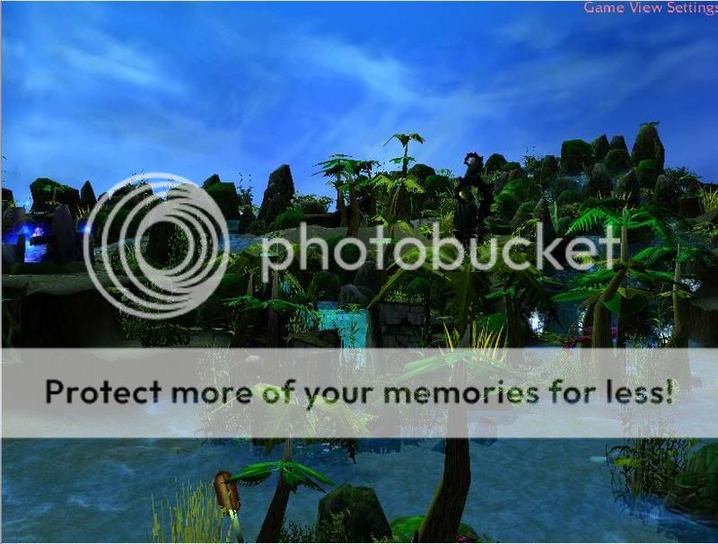
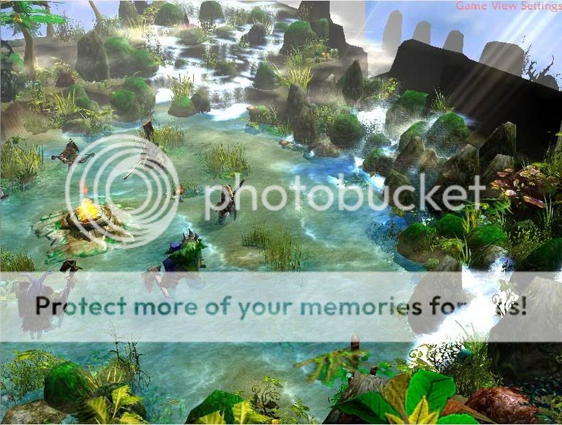
Chainer did a bit more work on both the areas.
Still very much open to feedback, suggestions & critique.
Added more blight, doodads and generally details to the Scourge area.
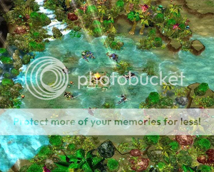
Improved the waterfalls, still need to work on the bottom left one.
Chainer did a bit more work on both the areas.
Still very much open to feedback, suggestions & critique.
Added more blight, doodads and generally details to the Scourge area.
Improved the waterfalls, still need to work on the bottom left one.
- Joined
- Mar 11, 2007
- Messages
- 2,822
Very nice screenshots.The skin for beastmaster is bad.Maybe a closer look?
- Joined
- Feb 27, 2007
- Messages
- 2,069
They look better! The beastmaster skin is fine, if its what I think it is...
Huge improvement on the new terrains! Fix that last one though. The only thing I might want to change is the new waterfall is a bit small. Don't change it, but make the new one a little wider, more like how it is now, but with doodads.
+rep for improvement!
+rep for improvement!
- Joined
- Mar 11, 2007
- Messages
- 2,822
The undead area seems good.To make it better,make the little grass doodads there more dark.
- Joined
- Mar 11, 2007
- Messages
- 2,822
Great!I rate them 8.5/10.I still advice you to change Beastmaster's skin.
- Joined
- Mar 11, 2007
- Messages
- 2,822
They are nice!I don't think it needs more work unless more heroes are coming.
- Joined
- Aug 3, 2005
- Messages
- 744
Yea gradually there will be ")
- Joined
- Mar 11, 2007
- Messages
- 2,822
When will the project finish?

- Status
- Not open for further replies.
Similar threads
- Replies
- 6
- Views
- 1K
- Replies
- 7
- Views
- 1K
- Replies
- 23
- Views
- 3K
- Replies
- 10
- Views
- 2K