Approved


Moderator
M
Moderator
09:34, 4th Oct 2015
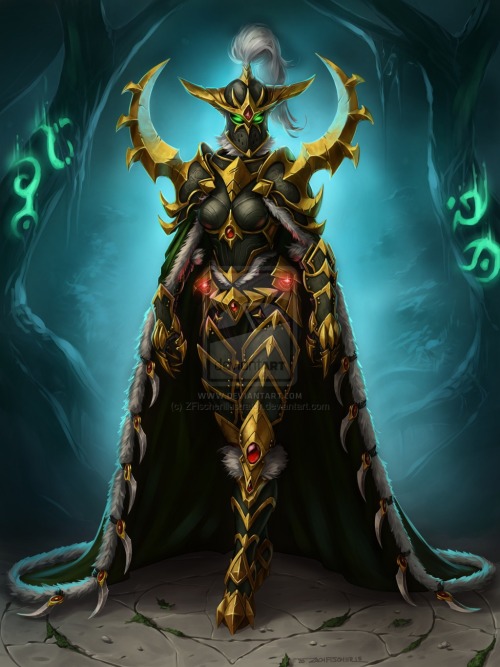
Apheraz Lucent: This one requires a little bit more work to get approved. First of all, when thinking of a blur, I personally imagine a very dark theme. The purple haze lines should be removed to achieve that atmosphere, as they only distract the eye from the main object, which is the Warden here.
The shadows should fade gradually, and currently, the middle and last one seem to be of same opacity.
Last but not least, the Warden herself could do some extra touch-ups. She doesn't fit with the sharp and outlined warcraft style, you could try to define her outlines a little bit more and play with the results.

")