• 🏆 Texturing Contest #33 is OPEN! Contestants must re-texture a SD unit model found in-game (Warcraft 3 Classic), recreating the unit into a peaceful NPC version. 🔗Click here to enter!
  • It's time for the first HD Modeling Contest of 2024. Join the theme discussion for Hive's HD Modeling Contest #6! Click here to post your idea!

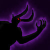
BTNVampire

This bundle is marked as useful / simple. Simplicity is bliss, low effort and/or may contain minor bugs.
Updated it to have more contrast :p

Keywords:
Vampire, Dreadlord, Shadow, Dark, Demon
Contents

BTNVampire (Icon)

Reviews
04:17, 19th Mar 2016 Sin'dorei300: It'd be nice to see some improvements. Read my comment. 01:59, 27th Mar 2016 Sin'dorei300: I don't see too much difference compared to the old one. I recommend you to make some more visible improvements.

Moderator

M

Moderator

04:17, 19th Mar 2016
Sin'dorei300: It'd be nice to see some improvements.
Read my comment.

01:59, 27th Mar 2016
Sin'dorei300: I don't see too much difference compared to the old one.
I recommend you to make some more visible improvements.
 
Level 28
Joined
Nov 12, 2007
Messages
2,340
Interesting, in my screen it is pretty clear! Must be display's configuration.

I think the fact that it was too dark in KILLCIDE's screen is an indication you should brighten the background outlining the vampire, in a way that better emphasises the silhouette.
 
Regarding the vampire related theme, this is a pretty good idea.
With a bit of imagination and effort, some good icons touching the vampiric realm could come out.
Actually, this icon is too dark and too simple.
If u use a dark silhouette, u could help it to stand out with an interesting effect/bg, not only with a simple glow on a black bg.
Be more creative!
Also, this dark silhouette could have some reflections on it, reducing a bit of its flatness in this way.
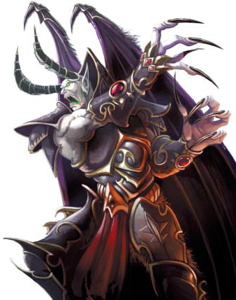
Almost anyone could trace a contour(over a reference pic) to create a silhouette, adding a glow around it.
We can make hundred icons in this way, but i don't recommend it at all. We have some rules to follow.
Why don't u try to draw something using ur skills? :)
Read some of these tutorials that we have here(2D Art Tutorials):
How to Make an Icon
General Icon Process Tutorial
Basic Icons Tutorial
ICONS by Crazyrussian
Basic Icon Guide
, and try to make something on ur own, avoid tracing and CnP.
I'm sure u will succeed if u insist on it. :)
 
Level 12
Joined
Jan 2, 2016
Messages
973
I did try to make it 100% free-hand at 1-st, but it looked ridiculous :p
His head was like a bubble, with antenas :D
(I guess part of the reason for that was because I was in a train and the ride was bumpy, and I couldn't control the mouse too well :p. But even if that wasn't the case, I still doubt it would've looked this good by imagination alone)
It actually turned out that drawing siluets is actually harder than normal drawing.
You need to imagine where the body parts are supposed to be, and stuff like that, while with normal drawing - you just see them xP

But, yeah, I'll read these guides and try to make a better icon next time :)
 
Level 12
Joined
Jan 2, 2016
Messages
973
Okay, I increased the contrast - made the glow brighter, and added another layer to the background, so now it gets darker further from the vampire.
I also added some highlights on the siluet, but they aren't really noticable on the icon xP
 
Top