Follow along with the video below to see how to install our site as a web app on your home screen.
Note: This feature may not be available in some browsers.
Listen to a special audio message from Bill Roper to the Hive Workshop community (Bill is a former Vice President of Blizzard Entertainment, Producer, Designer, Musician, Voice Actor) 🔗Click here to hear his message!
Hi! This is my first icon, it was made in Gimp. Please tell me what I have done good and what I can still improve. Thanks (for future )!
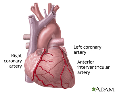
This icon shows heart, you can see some little veins. It has the nasty pink colour which makes the heart look like fresh flesh. It can be used as icon of spell/ability or item.
Thanks for all comments and the advices (probably my spelling is wrong^_^). I will try do heart again, this time it will look more like a heart (like on the graystuff111 picture) and more bloody! Muaha
I think the key to making this icon better is what was said 'making is bloody', is actually just using multiple types of red. Right now, you've probably used only 1 light red. Use some darker and mid-red as well. Check if you can find some images of real hearts instead of schematic ones and you'll see there are a lot of different reds there, including veins.
I just drew something with brush, black colour. Then I used the smudge tool, and I made the shadows with dodge & burn, and I also used the tool that blure and sharpen (I blure it). Then I made new layer which was red, I did the veins - thats it!
This site uses cookies to help personalise content, tailor your experience and to keep you logged in if you register.
By continuing to use this site, you are consenting to our use of cookies.


 Approved
 )!
)! .
.


 Use your imagination to give it the nice feeling ^,^