Moderator
M
Moderator
|
Alright, I will approve this, but please draw your own icons in the future. You are very well capable of that.
|
(5 ratings)
 Approved


|
Alright, I will approve this, but please draw your own icons in the future. You are very well capable of that.
|

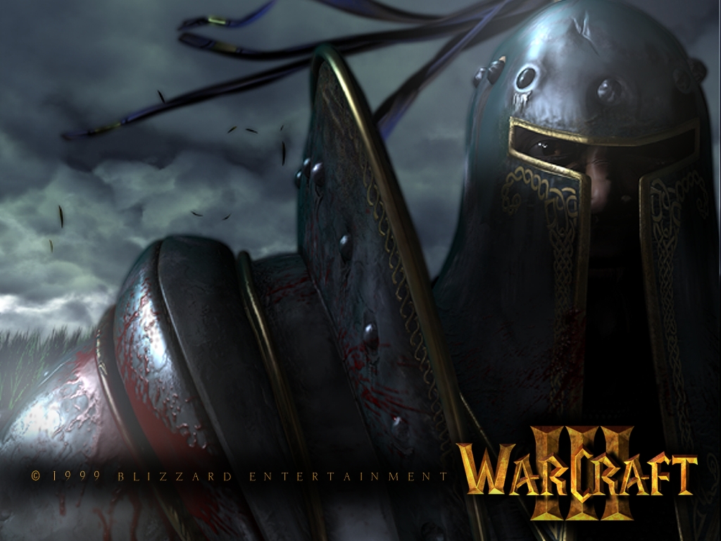
Dude he only added the symbol and some highlights]shadows and i made a huge edit to the icon and a 75% Free Hand Helmet and blood splattersCrop, resize, recolor. Nice use of ACDsee and Button manager, lol.
I don't understand why you've done this... 2/5 you know these kind of icons are not allowed, they get approved in 2% of cases...
Even a typo in the icon description... and someone has already done this this week, but the person that has added highlights and a symbol.
WOW! This is awesome. So dark and cool! I love it! It looks diablo2lish (wow).
5/5 +rep
Yeah, well, linking the original image is mandatory, but I am interested in seeing the file you used to work with. Jolly created an animation where I could grasp the amount of changes he made, I will need to do the same thing here.
Additionally, it is quite unnecessary to upload something very similar to recent submissions. Draw-overs are a good way to gain experience through learning-by-doing, to see how to apply correct light sources, reflections, shading etc.
But: You could have very well chosen a different picture.
Also, you need to fix the [lIMG] tag in your description to make it work ( --> ).[/QUOTE]
Well am i dont know how to make a Animated GIF so i made a Before&After Image
[QUOTE][IMG]http://www.hiveworkshop.com/forums/attachment.php?attachmentid=120298&stc=1&d=1354922722
That was just an example, to tell you how one can show the actual changes.
Do you have larger images available? I can hardly see any detailed changes in these.
That was just an example, to tell you how one can show the actual changes.
Do you have larger images available? I can hardly see any detailed changes in these.
agreed.. it's greatWOW! This is awesome. So dark and cool! I love it! It looks diablo2lish (wow).
5/5 +rep


