Listen to a special audio message from Bill Roper to the Hive Workshop community (Bill is a former Vice President of Blizzard Entertainment, Producer, Designer, Musician, Voice Actor) 🔗Click here to hear his message!
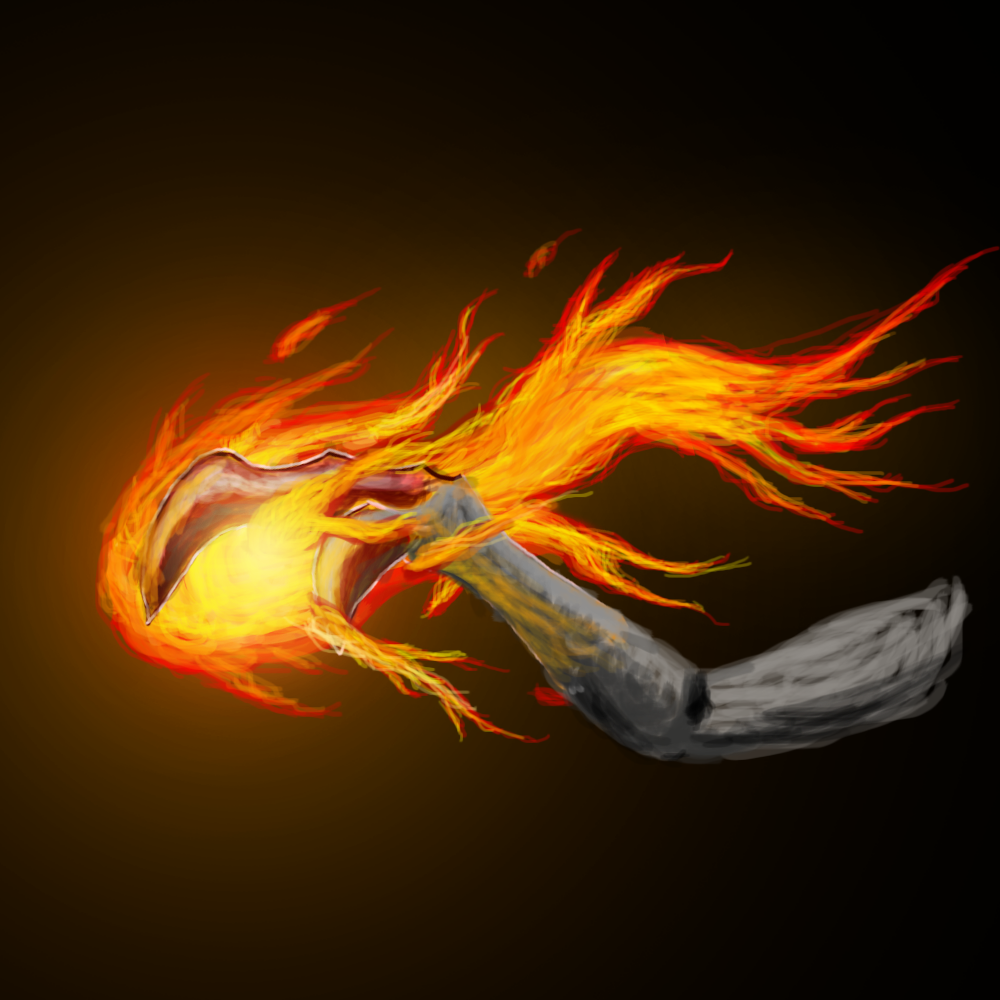
The glow you use as a background really makes the icon seem much more flashy which is great. The fire is also good lookin'. The thing that ruins the icon is the arm-ish thing that the fire surrounds.
It kinda looks like a bone-claw from a bird, is that on purpose?
4/5 for now
edit: when I take a closer look, why is there a yellow highlight on the bone? it doesn't look like fire.
Looks very good. It looks like a claw in the big WIP but in smaller, i kinda see a bird like moltress. ANyways, it looks v cool. 4/5 from me because I would have liked little improvement in the background and even little-little improvement in the flame color definition.
This site uses cookies to help personalise content, tailor your experience and to keep you logged in if you register.
By continuing to use this site, you are consenting to our use of cookies.