• Listen to a special audio message from Bill Roper to the Hive Workshop community (Bill is a former Vice President of Blizzard Entertainment, Producer, Designer, Musician, Voice Actor) 🔗Click here to hear his message!
  • Read Evilhog's interview with Gregory Alper, the original composer of the music for WarCraft: Orcs & Humans 🔗Click here to read the full interview.

[Bane's Gallery]

Status
Not open for further replies.
Level 9
Joined
Sep 6, 2008
Messages
477
Sup guys,
Some would call me a "budding artist" but i find this a rather gay term.
To get better iv been drawing alot anyways ill post my shit here.
(Cartoon style so if you dont want cartoons then.... gtfo?)
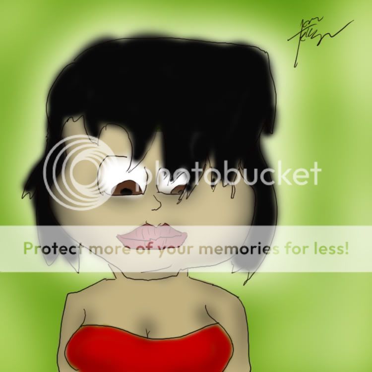
BlackhairedGirl.jpg

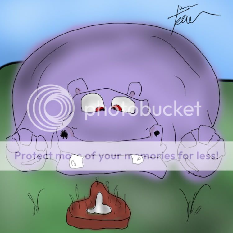
Hippo.jpg

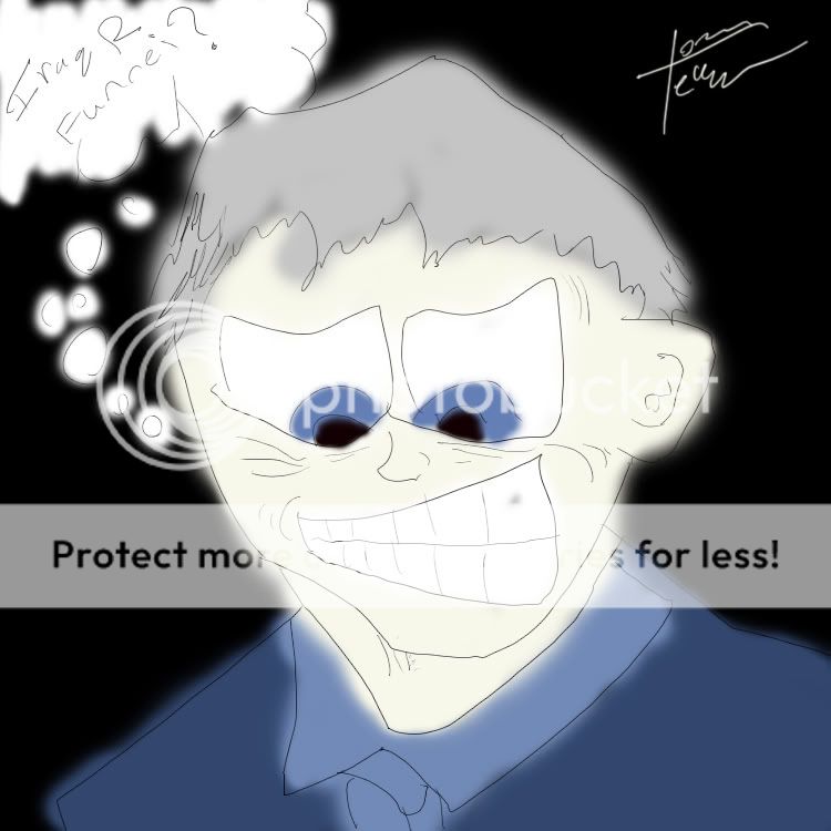
GeorgeBush.jpg
george-w-bush-picture.jpeg


Alot more to come,
-Bane
 

Attachments

  • Blackhaired Girl.jpg
    Blackhaired Girl.jpg
    256.4 KB · Views: 222
Last edited:
Level 28
Joined
Mar 25, 2008
Messages
2,955
Lemme comment :)
I like that comic art in general because it's always funny to see what peoples' fantasy can bring out.
You shall consider making the lips of that woman a bit thinner, as well as putting some shading into the hair as it looks plain now.
Also, try to round up the left shoulder and make the left arm thicker, align the left neck-side to the right and round up the chin.

The hippo is kinda cool - but I'd suggest to put shading on the side(s) of the fingers since they look like paper now but the rest of the hippo doesn't.

To Bush - rounden up the right ear and.. well that's it

Goold luck with your further art ;)
 
Level 9
Joined
Sep 6, 2008
Messages
477
Thank you very much for your critcism squiggy, i really appriciate it.
 
Level 27
Joined
Feb 22, 2006
Messages
3,052
I agree with Nudl9, you don't tend to.. how to put it.. draw within the lines when coloring. While the inking does look pretty solid, the colors are fairly messy and unshaded, and lack overall definition. Try using harder brushes, or at least near the edges, then compensate for the hardness of the edges by applying shadowing and highlighting techniques.
--donut3.5--
 
Level 9
Joined
Sep 6, 2008
Messages
477
Thanks guys ill take this into consideration on my next drawing.
-Bane
 
Level 9
Joined
Sep 6, 2008
Messages
477
Void is correct. These drawings took me maybe 10-15 minutes each
This is because i am pressed for time.
Ill take my time on the next one and youll be able to tell the difference.

-Bane
 
Level 9
Joined
Oct 7, 2007
Messages
599
There's a difference between an experienced artist spending 15 minutes on a drawing (digital or otherwise) and an experienced artist spending 15 minutes. I believe that is what Archian may have been hinting towards?

Quick time aside, you can still tell a little of technique from even quick drawings. I think that you need to practice a little more drawing people, though the hippo fits perfectly with the "cartoony" style.
 
Level 9
Joined
Sep 6, 2008
Messages
477
There's a difference between an experienced artist spending 15 minutes on a drawing (digital or otherwise) and an experienced artist spending 15 minutes. I believe that is what Archian may have been hinting towards?

Quick time aside, you can still tell a little of technique from even quick drawings. I think that you need to practice a little more drawing people, though the hippo fits perfectly with the "cartoony" style.

Well that first statement made no sense whatsoever.
You just compared an experienced artist and an experienced artist... the same thing.
And like i said im a "budding" artist and i realize i have to work on my skills.
I was going for a cartoony style that is why the person doesnt look like a DaVinci.
I can draw realistic much better but i am trying to improve my cartoon side.

Thanks for your crits though,
-Bane
 
Status
Not open for further replies.
Top