Archian
Site Director
- Joined
- Jan 1, 2006
- Messages
- 3,153
Contestants were to retexture a completely custom made model (including the texture) found in Hive's Classic Model Database.
@Footman16 - Second Place Winner
@Vinz - Third Place Winner
| Contestant | Entry |
Footman16 |
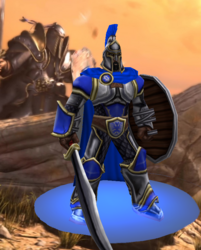
Footman WarriorFootman16's Footman Warrior Entry for Hive's Texturing Contest #31 For this contest I decided to take Murlocologist's amazing Spartan Warrior model and turn it into the best unit in all of Warcraft 3: the Footman! This model was fun but also tricky to work with and so I hope I have done the...
|
Shido |
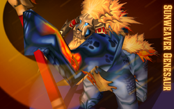
Sunweaver GenesaurEntry for Hive's Texturing Contest #31 Disclamer: nothing. Behind the scene of Sunweaver Genesaur is located here. Version 1.0 Released Bonus Check out the video that include Sunweaver itself as a cameo. Tags: Solar, Genesaur, Sun, Sun Weaver, Sunweaver, Magnataur, Explobomb
|
PrinceYaser |
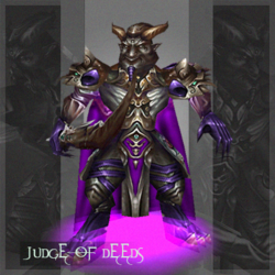
|
~Nightmare |
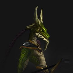
K'NawaHey there! It's been a while since I last made a texture, over three years to be exact. I'm thrilled to share my latest creation, which I made exclusively for The Hiveworkshop's 31st Texturing Contest. This time, I decided to tackle a humanoid dragon texture, something I've always wanted to try...
|
| @Vinz |
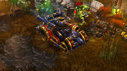
BlitzworgenForged from the memory of cities in ash, and the grave of dreams buried alive... this is the tank that howls, "never again." A retexture of @Deolrin and @Kwaliti's excellent Elite Siege Engine - The Übertank. Entry for Texturing Contest #31 - Repurposing.
|
A.R. |
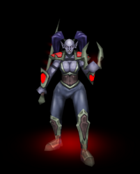
Shadow Council AssassinEntry for Texturing Contest #31 - Repurposing Custom Models. Replaces the texture for Tauer's awesome Garona model. Enjoy! EDIT: Uploaded Ingame Screenshot
|
- 1st place: 750 experience points
- 2nd place: 600 experience points
- 3rd place: 450 experience points
- Entry: 150 experience points
- Judge: 25 experience points per entrant
| frostwhisper | PROXY | Judge average | Poll votes | Poll vote percentage | Result | |||||||
| Contestant | Shading | Concept | Detail | Total /100 | Shading | Concept | Detail | Total /100 | ||||
| 30 | 40 | 40 | 110 | 30 | 40 | 40 | 110 | |||||
| Footman16 | 28 | 38 | 30 | 0.8727272727 | 22 | 26 | 26 | 0.6727272727 | 0.77 | 34 | 0.18 | 53.48 |
| Shido | 26 | 40 | 35 | 0.9181818182 | 20 | 16 | 24 | 0.5454545455 | 0.73 | 25 | 0.13 | 49.14 |
| Prince Yaser | 24 | 32 | 39 | 0.8636363636 | 23 | 16 | 27 | 0.6 | 0.73 | 29 | 0.15 | 49.98 |
| ~Nightmare | 24 | 36 | 40 | 0.9090909091 | 21 | 17 | 28 | 0.6 | 0.75 | 55 | 0.29 | 56.79 |
| Vinz | 23 | 30 | 36 | 0.8090909091 | 23 | 17 | 27 | 0.6090909091 | 0.71 | 39 | 0.20 | 50.71 |
| A.R | 20 | 34 | 32 | 0.7818181818 | 18 | 14 | 20 | 0.4727272727 | 0.63 | 9 | 0.05 | 39.52 |
| Footman Warrior | ||
| Points | Comments | |
| Shading /30: Does the unit fit into the WCIII lighting environment? Is the source of light consistent? Does the unit have a realistic 3D shape enhanced by the shading? Is each individual part shaded according to the material? | 22 | The model fits very well into the wc3 environment, it just lacks the last bit of crispiness and properly enhanced highlights to make it pop. Especially the metal parts are a bit too dimmed down. This becomes increasingly visible when you compare the shield metal and the armor metal. The shield metal (at some parts) has better and brighter highlights than the main body. You've really nailed the look on the teamcolour. |
| Concept /40: Does the design of the unit suit the model it is wrapped on? Has the author come up with creative ways to change parts of the model into something new? Does the unit fit into the style of WCIII? | 26 | Turning a footman into something has been done many times. Turning something else into a footman however is quite unique, and when looking at the base model and the end result of your texture, probably the most creative entry in this regard. Even though I really despise that you chose the blue color instead of some other nice different metal color you immediately recognize the concept of the Warcraft footman behind it. It's still not exceptional, turning a human warrior into another human warrior, but unique enough for my taste. |
| Details /40: Does the unit appear blurry and bland in-game? Are the details appropriate and realistically placed? Are the materials in use easily recognized? | 26 | You did something which I give you huge credits for: You managed to make the different parts of the model/texture stay apart from each other, while not being disconnected frome ach other. This increases the visibility and readibility of the whole unit by a ton, especially from ISO point of view. The style of the metal parts is also very close to the wc3 style, which is a big plus. If only it was a bit less bland in general (circeling back to the missing hihglights here). The weak link is definetly the face, or rather the mouth part of the texture. His mouth feels extremly squished, as if he was whisteling or smirking. There is also not texture for the inside of his mouth, which is a fault of the model and UV, but perhaps you could have worked around that in a better way. |
| 74/110 | ||
| Knawa | ||
| Points | Comments | |
| Shading /30: Does the unit fit into the WCIII lighting environment? Is the source of light consistent? Does the unit have a realistic 3D shape enhanced by the shading? Is each individual part shaded according to the material? | 21 | The shading of the texture is very nice, but the whole texture is overall a bit too dark and lacks some proper highlights in many regions. Especialyl the head, shoulders and chest piece could have used more of the highlights the belt buckle has to offer. The Teamcolor on the shoulder could have used a bit more brightness as well. |
| Concept /40: Does the design of the unit suit the model it is wrapped on? Has the author come up with creative ways to change parts of the model into something new? Does the unit fit into the style of WCIII? | 17 | I really liked the idea and was a big fan, until I realised that, although the original model is a "demon" archer, it still is basically a demonic dragon. And you turned one dragon into another dragon, which still doesn't win the best creativity price. I appreciate the asian vibes you gave it with the curles on his head, but then again I don't really get if that makes the whole character some kind of living statue, or something? There's no indication for this elsewhere on the skin, so that's a bit confusing. Your texture style, as always, is very stylized and the way it fits into wc3 suffers a bit from that, but its not too big of a problem. |
| Details /40: Does the unit appear blurry and bland in-game? Are the details appropriate and realistically placed? Are the materials in use easily recognized? | 28 | The details on the armor and skin are really nicely done, as always. But yet again, combined with the overall thing being too dark, it lacks contrast and harsher details all around, making it also more blurry than it would really need to be. I would have wished you spent the same amount of (attention to) detail on the face, that you spent on the scales or armor for example, as it feels a bit lacking in comparsion. |
| 66/110 | ||
| Judge of Deeds | ||
| Points | Comments | |
| Shading /30: Does the unit fit into the WCIII lighting environment? Is the source of light consistent? Does the unit have a realistic 3D shape enhanced by the shading? Is each individual part shaded according to the material? | 23 | The shading and highlights of the body are exceptionally well done and fit wc3 very well. The Teamcolour on the cape has very dark shades, and the teamcolour on the belt cloth is weirdly dark as well. I don't like the shdaing of the head part though. Even though it is of the same style and quality, it lacks definition to create a proper 3d head shape that tells me what I am looking at. Especially from ISO view it looks off and blends with the body too much. |
| Concept /40: Does the design of the unit suit the model it is wrapped on? Has the author come up with creative ways to change parts of the model into something new? Does the unit fit into the style of WCIII? | 16 | The concept itself is cool, although it is hard to decipher what it is meant to be exactly. Some kind of judge-demon/goat thingy? It essentially turned a red (already asian looking) demon into a pink/grey (asian looking) demon, so it's not exactly the most creative conversion. Even signature parts as the hands, feet and shoulders have stayed basically exactly the same concept wise, just in a different colour and with slightly less or more armor. |
| Details /40: Does the unit appear blurry and bland in-game? Are the details appropriate and realistically placed? Are the materials in use easily recognized? | 27 | The details are very nicely done and are easily distinguishable based onthe material. One could argue that they sometimes become a tad much and it gets kinda messy, and the whole composition and color choice makes the different parts of the model blend together. Especially the purple parts (which I assume to be skin) on the shoulders feel very off and even look like a UV error, especially from ISO POV. This becomes a problem, as they are a main focus point on the model, besides the head. Also, there is no texture for the insides of his mouth, which is a small detail but is very annoying when looking at the portrait. This doesnt fall in effect so much in the original model, because the teeth are hiding a lot there, which you have removed for some reason. |
| 66/110 | ||
| Blitzworgen | ||
| Points | Comments | |
| Shading /30: Does the unit fit into the WCIII lighting environment? Is the source of light consistent? Does the unit have a realistic 3D shape enhanced by the shading? Is each individual part shaded according to the material? | 23 | The shading is well done and looks absolutely clean. However, from my point of view it looks even too clean for warcraft 3, as there is no other metal material in the game that I can think of that shines just this much. Just a tad bit of roughness would have done wonders to remove the "artificial" feel of it a bit. |
| Concept /40: Does the design of the unit suit the model it is wrapped on? Has the author come up with creative ways to change parts of the model into something new? Does the unit fit into the style of WCIII? | 17 | The concept is the weakest part of this submission for sure. It just turned a tank with a wolf head into… a darker tank with a wolf head. It doesn't offer anything fresh or new to the whole concept. "Bonus" points for the "GG" and "WOOF", they are nice touches. ... Also, the fact that the dwarf has his own texture makes the whole skin feel kinda incomplete. |
| Details /40: Does the unit appear blurry and bland in-game? Are the details appropriate and realistically placed? Are the materials in use easily recognized? | 27 | I would have wished for more color variation and easily recognizable different parts of the whole texture. Everything is just purple/blue/greyish + Golden and TC. I… guess I understand that that was the idea of it, it's just not that interesting to look at and makes the whole texture bit blurry and blending together. You really don't get what parts of the tank serve what purpose, e.g. is something an exhaust, a rocket launcher, a fuel barrel... more destinctive details could have elevated the whole design. Especially the wheels are kinda lame. |
| 67/110 | ||
| Shadow Council Assassin | ||
| Points | Comments | |
| Shading /30: Does the unit fit into the WCIII lighting environment? Is the source of light consistent? Does the unit have a realistic 3D shape enhanced by the shading? Is each individual part shaded according to the material? | 18 | The shading is okay overall, but lacks proper defined highlights and darker shadows. It feels like a WIP version of the final skin. With a tad bit more touchups it could have become miles better. Especially the TC areas are kinda bland and unshaded, and the shoulder guards have a greyish-faded color, while the armguards are intense and high contrast. |
| Concept /40: Does the design of the unit suit the model it is wrapped on? Has the author come up with creative ways to change parts of the model into something new? Does the unit fit into the style of WCIII? | 14 | You just turned a literal Shadow Council Assasin (which Garona is) into… a Shadow Council Assassin. It's nice that you chose a dark skinned orc, ase we are lacking them in warcraft 3, but it sadly just adds on top of the fact that the whole color choice and composition makes it stand out more than it should ingame. |
| Details /40: Does the unit appear blurry and bland in-game? Are the details appropriate and realistically placed? Are the materials in use easily recognized? | 20 | Together with the slightly lacking shading and the missing details, the texture/model stands out ingame. Especially the metal parts could have used a lot more details and highlights to make them stand out, right now, they are just grey blobs. Recognizable enough, but could have been improved a lot. |
| 52/110 | ||
| Genesaur | ||
| Points | Comments | |
| Shading /30: Does the unit fit into the WCIII lighting environment? Is the source of light consistent? Does the unit have a realistic 3D shape enhanced by the shading? Is each individual part shaded according to the material? | 20 | At first glance the shading feels very off, but the more you look at it, the more you realise it isnt the case, which is very weird. It is however lacking a few more defined highlights that could have made it pop more. Also some areas, like the face, could have used some more intense shading as well. Especially the face is the weakest point of the whole texture, which is a shame, as it is the focus point as well. The UV of the head is not great, but instead of working around it in a smart way you made it worse foryourself with the straight and thin lines that are not forming any kind of recognizable shapes or facial features whatsoever. |
| Concept /40: Does the design of the unit suit the model it is wrapped on? Has the author come up with creative ways to change parts of the model into something new? Does the unit fit into the style of WCIII? | 16 | While your color scheme and the execution of the skin is quite admireable, the concept in itself is sadly not very unique. You turned a genesaur into… another genesaur. It becomes especially problematic because it's really hard to grasp what it is supposed to be, because the head is a mess of lines and shapes. I strongly suspect it's supposed to be a mask, but it could also be a helmet or just metal skin, for all that I know. The fire theme together with the blueish skin is nice though. |
| Details /40: Does the unit appear blurry and bland in-game? Are the details appropriate and realistically placed? Are the materials in use easily recognized? | 24 | I love the details on the body and the slightly cartoonish flames are fun to look at without standing out too much ingame, as they are very similar to the firelord for example. The only issue I have with the body, is that it's a bit hard to guess if it is skin, fish skin, scales like a lizard has or scales like a fish, a hide or whatever. The "Cleanness" of the whole texture points to something more "soft" whereas I do suppose a Genesaur, being this huge, massive, demi-god like being, would not around with soft skin. The flames together with the hair look really cool though, especially from ISO Pov. |
| 60/110 |
Footman Warrior by Footman16 - 96/110
Shading: 28/30- The skin fits perfectly with the Warcraft environment. Honestly, despite some gripes that I have with your detailing, I think it hits the nail on the head when it comes to fitting with the game's style.
- The skin's biggest strength is the concept - a very smooth conversion from a spartan warrior to a footman. The transformation between unarmored elements and chainmail and plate is seamless. You've turned this relatively-niche model into something that can be used by modders in any Warcraft universe project.
- Some aspects do appear blurry (shoulder pads, helmet - particularly when viewed from portrait distance) but not to a detriment considering the general texture quality in wc3. That said, the metallic elements fall flat in places and could use a bit more shine. The sword's shadow is a bit strong and illogical when looking at the model's curve. I also wish you did more with the shield. I understand the constraints presented by the model, but I feel there was room for more creativity here.
Sunweaver Genesaur by Shido - 101/110
Shading: 26/30- The saturated colors are great, and just the right amount of cartoony to fit with the game's style. I do believe that adding more of a highlight to the fire elements and the light coming from within the spear's tip would go a long way to giving it a more three-dimensional feel.
- To me, this is the most unique entry of the bunch. I appreciate how you've transformed the bony elements into rock/gold, and how you've changed the leaves into something completely unique. All in all great work on the wrap there.
- I love the details you've got going on the skin - particularly the scales. That said, I think a more leathery texture (see Kodo/Thunder Lizard) could benefit this; as it stands it's slightly too smooth. Ditto for the mask and tusks. I'm not too certain if they're meant to be stone or gold. If they're the former - make them a bit rougher, more weathered. If they're the latter - give them more shine.
Judge of Deeds by Prince Yaser - 95/110
Shading: 24/30- The unit fits within the game's lighting environment, however, it does stand out a bit when viewed next to regular units - to the point where I believe it would look better when scaled up. The armor is a bit monochromatic but is very well articulated through the texture's shading.
- Concept-wise, I find your entry somewhat lacking. To me, it still looks like a satyr/demon creature. I am however thrilled at the way you've transformed the original's hair and beard, as well as the way you've re-done just about every part of the armor's design.
- The detailing you've done here is stellar - the metallic shine, the sword hilt, the armor design; honestly I'd give you full points if not for the blurry cape. On that topic, while the cape is a weak point, I understand the limitations you were facing, given how little space the original creator allocated for that element in the model's unwrap.
K'Nawa by ~Nightmare - 100/110
Shading: 24/30- I think you've improved the original with regard to how well it fits in the game. I do however think that the skin could use a bit more contrast. Warcraft is very cartoony - I wouldn't hate seeing this with brighter highlights and darker shadows across the board.
- I think you've done a great job here. The transformation from a distinctly demonic to a distinctly reptilian creature is great. I also love how the armor meshes well with the motifs we've seen in Warcraft armor.
- This is the skin's biggest strength in my opinion. The materials feel distinct. Metal feels like metal, cloth feels like cloth, and skin feels like skin. This is miles ahead of the original in terms of detailing particularly on the armor and weapon.
Blitzworgen by Vinz - 89/110
Shading: 23/30- All things considered, I think your entry is veering into being slightly too dark for the Warcraft lighting environment. That said, I think the highlights make up for it to an extent. They are excellent, and you've really nailed the idea of a uniform light source.
- This is the area I find a bit lacking. I recognize that a siege engine is a siege engine, and you've made a choice in keeping it as such, however, the end result is not particularly unique next to the original. A couple of highlights for me are how you've put an accent on the wolf motif and how unique your use of team color is compared to the original.
- Your entry quite literally shines here. Great use of contrast between the darker and illuminated parts of the texture. The metal truly feels like metal (in fact more so than the original). Sadly, not a lot of material variety here, but again - this all comes down to the choice of model and I think you've done a great job taking something entirely made of metal and not turning it into a metallic blob. Also - love the "woof".
Shadow Council Assassin by A.R. - 86/110
Shading: 20/30- Unfortunately, while Warcraft's lighting does well with bright overly-saturated skin tones, it kind of fails with darker, more monochromatic ones, and your texture demonstrates this. I wish you kept more team color on the arms and legs. I believe that combined with more stark highlights, this could alleviate the blobby nature of the skin when looked at from an in-game perspective.
- Taking your entry at face value I didn't see much in the way of uniqueness. It basically transforms an orc assassin into an orc assassin. When comparing the unwrapped textures and looking at your entry side-by-side with the original, however, I grew to appreciate how much you've actually changed. The clothes, the armor and weapon style, even the haircut. You've achieved a solid transformation of a very rigid concept.
- Other than the shoulder plates, it is kind of hard to determine which parts of the texture are clothed and which aren't. I think the pants in particular look blurry and the shin guards could use a bit more of a highlight to them. On the flip side, I think the detailing you've done on the shoulder pads is wonderful, and a big improvement to the original.
Contest | Poll
Assigned staff: @Archian
Last edited:


