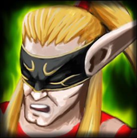
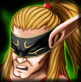
Nicely drawn, style is very fitting to warcraft. However, at the moment it appears to be too bright. Add some more contrast for hair. Try to come up with more defined shading. Some parts are too much blending together, for example, his hair and forehead, and details of mouth, nose, wrinkles in icon size aren't as visible as in full size. Of course, many details get lost in transition, but try to make them more defined. Green effect in the background in my opinion is overwhelming. Maybe make it thinner with adding more black to the background.


 Approved
") So far here is the new update.
So far here is the new update.